Dick-pic (pronounced dik-pik)
A picture of a human’s penis, if taken and
disseminated in a certain context.
Dick became the pet-form name circa 1550
(though some etymologists suspect it had earlier been in use) for Richard via
being the rhyming nickname for Rick, Richard's original affectionate
diminutive. Richard being (1) among the
commonest English names and (2) exclusively male, it quickly become a synonym
for "fellow; lad" and thereby a generally used word to refer to men,
individually and collectively; from this connection came the use of dick as
slang for that exclusively male body part.
Anything claimed to be an authoritative list of the slang senses must
be viewed with scepticism because many forms are very old and the surviving
written records are not a comprehensive catalogue of what was often an exclusively
oral dialect so the date of origin is uncertain. The meaning "penis" is attested
from 1891 in a dictionary of farmer's slang and was said (predictably) to have
been well-known British army slang but, perhaps regionally, the use could date
back a century or more. Most sources
note "dick" in this context is thought now less offensive than once
it was but for those still disturbed, there's a goodly number of
alternatives.

Pic of Dick Face: The Honorable Richard Face (1943-2023), former New South Wales (NSW) minister of gaming
& racing (1995-2003).
The vulgar slang
nouns dickhead & dickface (a stupid or contemptible person) are attested
only from circa 1969 so Richard Face’s parents can't be accused of making what might
now be thought an unwise choice.
Interestingly, although presumably not unaware of the linguistic
possibilities his name offered, Richard Face was either indifferent or saw some
political advantage in brand-name awareness because he chose to remain a
Richard (and, by implication, a "Dick") despite being christened Jack Richard Face. Whether he ran the usual focus groups to find which worded best (Dick Face or Jack Face) isn't known. In time, he did live up to his name, in 2004 fined
Aus$2500 an given a three-year good behaviour bond for lying to the NSW Independent Commission against Corruption (ICAC),
the magistrate's rationale for not imposing a custodial sentence being (1) he
was no longer a police officer and therefore "not directly involved in the
administration of justice", (2) had an "exemplary record of public
service", (3) had been under stress, was depressed and a heavy drinker at
the time of his lie, (4) had shown remorse and pleaded guilty, (5) had
"not committed perjury" or "sworn false evidence" and (6)
"did not engage in persistently false swearing over sustained periods of
time."

Pic was first recorded circa 1885 as a
shortening of picture (image, likeness, photo, etc). Picture was from the Middle English pycture, from the Old French picture, from the Latin pictūra (the art of painting, a
painting), from pingō (I paint); a
doublet of pictura. The plural is pics but pix is common in casual
& commercial use so the accepted alternative plural of dick-pics would be dick-pix. The linguistically fastidious used to be troubled by spellings which respected only the pronunciation (pix, nite, lite, luv etc) but even before the internet their use in advertising and brand names had made them so common the battle obviously was lost. In
structural linguistics, the technical term for such words is “eye dialect”,
used to describe a deliberate misspelling of words to suggest a particular
pronunciation, dialect, or informal tone, even though the intended
pronunciation remains the same. The use
(apart from alternative spellings or misspellings which would have predated the
modern practice) seems to have been popularized (and to some extent thus legitimized)
in commerce for purposes of advertising or branding and from here it was picked
up in casual writing where it can impart variously feelings of playfulness or the "modern". The Ford Ka (1996–2021) and
Chevrolet Cruze (2008–2023) were both named using the technique and familiar examples
include Krispy Kreme, Dunkin’ Donuts and Froot Loops but it was also a literary
device in fiction as early as the nineteenth century, used by Mark Twain (1835-1910) to evoke Southern
American speech patterns and Charles Dickens (1812–1870) to summon the sound of
what was perceived as “typical” working-class speech. George Bernard Shaw (GBS; 1856-1950), a proponent of the internationalist Esperanto language and often
(understandably) critical of English spelling rules, in Pygmalion (1913) used phonetic spellings not
only to reflect variations in diction and accents but also to contrast the
difference between “proper” and informal speech, a central theme of the play. In modern use, because the forms often use
fewer characters, the practice became a staple of texting (SMS; short message
service) which for a certain demographic in the now distant pre-social media, pre-smartphone
era became the preferred means of communication.

Dick
pics and their role in politics.
As the
downfall of disgraced New York politician Anthony Weiner (b 1964) illustrates,
politicians should avoid dick-pics on the basis of “good rarely come of it”
but, done carefully, they do have a place. In 1956,
the Republican Party’s campaign committee for the 1956 US presidential election
included the slogan “I Like Ike”, taking advantage of the great
popularity of Dwight Eisenhower (1890-1969; US president 1953-1961) who was
seeking re-election. As a companion
slogan, the committee used “We Like Dick” to support Eisenhower’s running
mate Richard Nixon (1913-1994; US vice-president 1953-1961 & president 1969-1974). To cover both, there were also posters and
campaign buttons with “I Like Ike and Dick” and the party enjoyed
great success, their ticket securing 57.4% of the popular vote and carrying the
Electoral College 457-73 (41 states to 7).
Thus encouraged, when Nixon ran for president in 1960, among the promotional
materials used were posters and campaign buttons using a variation: “The Nation Needs
Dick!” In 1960, things didn’t
go so well with the Democratic Party’s nominee John Kennedy (JFK, 1917–1963; US
president 1961-1963) winning by “an electoral eyelash”: the popular vote split 49.72-49.55%
in Kennedy’s favour and he took the Electoral College 303-219 although he
carried on 22 states to Nixon’s 26. So, the
“The Nation
Needs Dick!” campaign nearly worked because in the popular vote
Kennedy prevailed only by the twentieth century’s narrowest margin: 34,220,984
to 34,108,157. That tight result has
always fuelled the idea the documented electoral fraud in several states robbed
Nixon of a victory and he had no doubts, hosting a subdued Christmas party in
Washington DC a few months later he told his guests: “We won, but they stole it from us.” Despite that, things were done differently in
1960 and although he’d be told by advisors there was enough evidence of fraud
for him to challenge the result, he declined on the basis of the damage it
might do to the country, telling his staff: “Nobody steals the presidency of the United
States.”
Slot-shot (pronounced slot-shot)
A picture of a human female’s genitalia, if
taken and disseminated in a certain context.
Slot in the sense of a "bar or bolt
used to fasten a door, window etc" entered Middle English circa 1300 from the
Middle Dutch or Middle Low German slot,
from the Old High German sloz &
German Schloss (bolt, bar, lock,
castle), from the Proto-Germanic stem slut-
(to close). The anatomical use to
describe the "hollow at the base of the throat above the breastbone"
was a late fourteenth century adoption from the Old French esclot (hoof-print of a deer or horse) of uncertain origin, but
this sense is probably obsolete except in historic references. Slot meaning a "a narrow, elongated
depression, groove, notch, slit, or aperture, especially a narrow opening for
receiving or admitting something" dates from the 1520s, the idea later
developed to suggest putting something "where it belongs" but this
seems to have been adopted only in the mid-1960s.
Shot (in the sense of the firing of a bow
(later applied to firearms etc)) was from pre-900 Middle English, from the Old
English sc(e)ot & (ge)sceot
and was cognate with the German Schoss
& Geschoss. It was related to the Old Norse skot and the Old High German scoz (missile). The sense of shot as the "view from a
camera" isn't attested until 1958 although it had been used in the
cinematic sense since 1922 to describe the process of recording movies (mov(ing
picture) + -ies) since 1922 and may thus have enjoyed earlier use. As used to refer to individual pictures,
printed usually on cardboard or special photographic paper, it dates from the
late 1930s, the specialized use in law enforcement (as mugshot) began in the US
in 1950.
Of context
A “Liz
& Dick pic”: Lindsay Lohan (b 1986) & Grant Bowler (b 1968) during the filming
of Liz & Dick (2012), a “biopic”
of the famously tempestuous relationship between the actors Elizabeth Taylor
(1932–2011) & Richard Burton (1925–1984).
The car is a Mercedes-Benz 600 (W100; 1963-1981) four-door Pullman with
the vis-a-vis seating. The flag-staffs (fitted in this instance above the front wheel arches) were usually fitted to cars used by the governments or the corps diplomatique. The dick-pic, the practice of someone (usually male)
sending another (usually female) an unsolicited picture of (what is usually
their own) penis isn’t a recent invention but the extraordinary latter day spike
in the numbers sent is a genuine cultural phenomenon. It’s socially and technologically
deterministic, something made possible by (1) the permissive social attitude of
the participating demographic, (2) the ubiquity of their possession of
high-definition cameras, (3) the removal from the process of third-parties (especially
those who once developed and printed the physical images), (4) the extent of
digital connectivity between members of the demographic and (5), the marginal
financial cost of the transactions. It’s
an interesting development in that in the West, the history of the depiction of
nudity is overwhelmingly female so “pictures of genitalia sent by phone” is a genre in the annals of the nude
(technically probably the naked) untypically dominated by the male body.
Generally uncontroversial if either requested or
welcomed by a recipient with whom an appropriate level of emotional capital has
already been built, dick-pics are notorious for the negative emotions induced
in those receiving them as something unsolicited and unwelcome. So, unless the intention is actually to
shock, offend or upset (and among the demographic, that is sometimes a thing)
they’re best avoided; good rarely seems to come of them and in some
jurisdictions, there are circumstances in which sending a dick-pic can be an
offence which can result in the sender being placed for life on a
sex-offender’s register; it depends on the context.
Dick-pic detail from Michelangelo
Buonarroti’s (1475–1564) David
(1501-1504), Galleria dell'Accademia, Florence.
Michelangelo’s David, a six-ton, 17-foot (5.2 m) tall
symbol of divine victory over evil is art as a sculpture or in depiction and,
despite the visible penis, in the West is usually thought not obscene. In another context it can be, the erection of
some inventive interior decorating required to conceal the offensive bits when
a 3D-printed replica was displayed at the 2021 Dubai Expo. It happens in the West too. In the nineteenth century the Grand Duke of
Tuscany presented Queen Victoria with a full-sized replica of the original which
she found so confronting that hurriedly a proportionally accurate fig leaf was crafted,
kept in readiness for any royal visits to be hung from two strategically placed
hooks. Even in the twenty-first century,
replicas have attracted complaints, the argument being the context of a museum
which people choose to visit being different for places where encounters may
happen by chance. Obscenity and
offensiveness thus are situational constructs and a dick-pic exchanged between
consenting adults is different from discovered in other circumstances; it
depends on the context.

It’s
assumed because there are few reports of women sending pics of their genitalia
that the practice is notably less common than the dick-pic and while that’s not
an accepted way to draw a definitive conclusion from two data sets, few doubt
it’s true. There are surely many reasons
that’s the case and the paucity of examples is probably the reason a standardized
female equivalent of “dick-pic” seems not to have evolved. Suggestions have included “gash-flash”, “trap-snap”
and “clamagram” but the most phonetically pleasing are probably “pussy-portrait” and “slot-shot”, the latter a
metaphor which references the slot on a machine which is a perfect fit for
coins of a certain denomination. For
women who find artistically limiting the idea of a static slot-shot, for
US$149, there’s the Svakom Siime Sex
Selfie Stick (SSSSS), a USB-rechargeable video-recorder-vibrator which offers,
especially for those with basic video-editing skills, the chance to create a clip of an organism from the inside. Thus the "clit-clip", a bit of digital
one-upmanship (that may not be quite the right noun) on any "dick-pic".
Available in violet, khaki & black, she can
be connected to the USB port of a PC or Mac and there's a downloadable app for MacOS, Windows (XP SP2 onwards), iOS and Android. The camera is a seemingly modest .3 megapixel unit but given the environment in which she'll be operating, that's more than adequate;
videos are saved in the familiar mp4 format, the product & software manuals are both
downloadable and there's an instructional video on the Svakom website. Whisper-quiet to ensure privacy, battery-life is said to be around two hours
of "continuous use" so one can understand why women might prefer such a device to most men. The
manufacturer refers to the SSSSS as "she" rather than "he" (or
even "it"), an interesting assignment of notional gender given the anatomical
emulation.
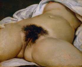
L'Origine
du monde (The Origin of the World (1866)), oil on
canvas by Gustave Courbet (1819-1877), Musée d'Orsay, Paris.
The recumbent
female has, off and on, been a staple of Western art since Antiquity but there
was something about French artist’s Gustave Courbet’s L'Origine du monde which was so provocative that publicly, it wasn’t exhibited for 120 years.
A slot-shot writ large, it’s still a work which many institutions avoid,
even those sanguine about female nudity (and nakedness) in artistic and other
contexts, one columnist noting recently the painting “… if indeed it can be called erotic…” was “…still unsuitable for publication in a paper with a general readership.” Perhaps it’s because it so differs from the
long traditions of the nude, a study more gynecological than artistic or maybe
it’s the lush and untended growth of pubic hair, something which seems often to
disturb though it may be anatomically accurate: One Russian gynecologist was
asked whether the model was a virgin and, after casting his professional eye,
answered with an emphatic “Nyet”. There’s also the objectification, the
decapitation of the subject reducing the work somehow to a slot-shottish
case-study for the male gaze, a reductionism which has for decades attracted
criticism from feminists. When
depictions of L'Origine du monde have
appeared in bookshops and galleries, there’s often been controversy, sometimes
requiring the summoning of the gendarmerie although the Musée d'Orsay reports
the work appears on one of their gift-shop’s best-selling post-cards so there's that.

The head presumptive (publicized in 2013).
Commissioned
by Ottoman-Egyptian diplomat Halil Şerif Pasha (Khalil Bey 1831-1879) as an
addition to his famous collection of erotica, ever since first it was seen,
historians of art have debated among themselves the identity of
the model, their short-list with some glee referred to as Les suspects habituels de Gustave
(Gustave’s usual suspects). No
conclusion has ever been agreed although the factions promote their theories, one
based on an analysis of the joining edges of the respective canvases, an allegedly matching upper-section displayed in 2013. The Musée d'Orsay issued a statement saying L'Origine du monde is, as it exists, a
complete work and not part of a larger whole.
The mystery continues.
Highlight of Coastal Carolina University vs East Carolina University, Clark-LeClair Stadium, East Carolina University, Greenville, North Carolina, 8 March, 2025.
There are
also “butt pics”. In March 2025 a user
posted on X (formerly known as Twitter) a clip from ESPN’s coverage of a baseball
game between Coastal Carolina University and East Carolina University (Coastal
Carolina won 9-11-1 to 1-6-0) which showed two women, one snapping what quickly
was described as a “butt-pic” of the other.
Almost instantly viral, the tweet gained more than 10 million views,
numbers the ESPN programmers doubtless wish college baseball could generate. The two protagonists were said to be “not
identified” but presumably promotional opportunities on Instagram and TikTok
beckon and there may soon be OnlyFans accounts.