Thursday, October 24, 2024

Consigliere

Consigliere (pronounced kawn-see-lye-re)

(1) A member of a criminal organization or syndicate who serves as an adviser to the leader (associated historically with legal advisors in the Italian Mafia and similar structures in other places).

(2) In modern use, an advisor or confidant.

(3) A surname of Italian origin (originally occupational).

1969 (in common use in English): An un-adapted borrowing of the Italian consigliere (councilor) (the feminine form consigliera), from consiglio (advice; counsel), from the Latin cōnsilium (council) from cōnsulō, the construct being con- (from the preposition cum (with), from the Old Latin com, from the Proto-Italic kom, from the primitive Indo-European óm (next to, at, with, along).  It was cognate with the Proto-Germanic ga- (co-), the Proto-Slavic sъ (with) and the Proto-Germanic hansō.  It was used with certain words to add a notion similar to those conveyed by with, together, or joint or with certain words to intensify their meaning) + sulo (from the primitive Indo-European selh- (to take, to grab)). + -ium (the –ium suffix (used most often to form adjectives) was applied as (1) a nominal suffix (2) a substantivisation of its neuter forms and (3) as an adjectival suffix.  It was associated with the formation of abstract nouns, sometimes denoting offices and groups, a linguistic practice which has long fallen from fashion.  In the New Latin, as the neuter singular morphological suffix, it was the standard suffix to append when forming names for chemical elements).  Consigliere is a noun, the noun plural is consiglieri or (in English) consiglieres.

Because of the way Google harvests data for their ngrams, they’re not literally a tracking of the use of a word in society but can be usefully indicative of certain trends, (although one is never quite sure which trend(s)), especially over decades.  As a record of actual aggregate use, ngrams are not wholly reliable because: (1) the sub-set of texts Google uses is slanted towards the scientific & academic and (2) the technical limitations imposed by the use of OCR (optical character recognition) when handling older texts of sometime dubious legibility (a process AI should improve).  Where numbers bounce around, this may reflect either: (1) peaks and troughs in use for some reason or (2) some quirk in the data harvested.

Consigliere entered general use in 1969 when it appeared in the novel The Godfather by Mario Puzo (1920–1999), the first of what became a series of five (not wholly sequential and the last co-authored) works revolving around a fictional Italian-American Mafia family.  Use spiked after 1972 when the first of three feature film adaptations was released.  Advisors and confidants of course exist in many parts of society but the significance of the use of “consigliere” is the historic baggage of it being associated with mafiosi (in the Italian Code of Criminal Procedure anyone a part of a criminal (mafia-like) association formed by three or more individuals).  So it’s a loaded word although in Italian there are notionally innocuous forms including consigliere comunale (town councillor), consigliere delegato (managing director) and consigliere d'amministrazione (board member).  It Italian, the related forms include the adjective consigliabile (advisable, the plural being consigliabili), the transitive verb consigliare (to advise, to suggest, to recommend, to counsel), the noun & verb consiglio (advise, counsel; council (in the senses of "an assembly", the plural being consigli)) and the adjective (and in Latin a verb) consiliare (board; council (as la sala consiliare used in the sense of "council chamber")

So a consigliere is a trusted advisor or counselor, historically associated with the Italian Mafia but later also with organized crime in general though the suggestion of a link with things Italian (not necessarily Sicilian) remained strong.  Within organized crime, not all consiglieri were legal advisors although in fiction that does seem to be a common role but all in some way offered “behind the scenes” strategic guidance.  Consigliere can be used metaphorically in a non-criminal context but because of connotations, if the individuals involved have some Italian ancestry, there can lead to accusations of “ethnic stereotyping” and the best neutral descriptors are probably adviser (or advisor) or councillor (counselor in US use) and there are also specific versions such as “legal counsel” “political advisor” etc.

Consulente di moda Kim Kardashian (left) with the client Lindsay Lohan (right).  The consulente di moda (fashion advisor) is a specialized fork of the consiglieri and before she became one of the internet’s more remarkable installations, Kim Kardashian (b 1980) was a “personal stylist” & “wardrobe consultant”, her clients including Paris Hilton (b 1981) and Lindsay Lohan (b 1986).

There are similar terms with their own connotations.  "Camarilla" describes a small, secretive group of advisors or influencers who manipulate decisions behind the scenes and is often used in a political context; notable members can be described as an “éminence grise”.  The term "grey eminence" was from the French éminence grise, (plural eminences grises or eminence grises and literally “grey eminence” and the French spelling is sometimes used in the English-speaking world).  It was applied originally to François Leclerc du Tremblay (1577–1638), also known as Père Joseph, a French Capuchin friar who was the confidant and agent of Cardinal Richelieu (1585–1642), the chief minister of France under Louis XIII (1601–1643; King of France 1610-1643).  The term refers to du Tremblay’s influence over the Cardinal (cardinals in the Roman Catholic Church enjoying the honorific “your eminence”), and the colour of his habit (he wore grey).  Aldous Huxley (1894–1963) sub-titled his biography of Leclerc (L'Éminence Grise (1941)): A Study in Religion and Politics and discussed the nature of both religion & politics, his purpose being to explore the relationship between the two and his work was a kind of warning to those of faith who are led astray by proximity to power.  Use of the term éminence grise suggests a shadowy, backroom operator who avoids publicity, operating in secret if possible yet exercising great influence over decisions, even to the point of being “the power behind the throne”.

In this a gray eminence differs from a king-maker or a svengali in that those designations are applied typically to those who operate in the public view, even flaunting their power and authority.  Probably the closest synonym of the grey eminence is a “puppetmaster” because of the implication of remaining hidden, and although never seen, the strings they pull are if one looks closely enough.  The svengali was named for the hypnotist character Svengali in George du Maurier’s (1834–1896) novel Trilby (1894); Svengali seduced, dominated and manipulated Trilby who was a young, half-Irish girl, transforming her into a great singer but in doing so he made her utterly dependent on him and this ruthlessly he exploited.

From the New York Post, 23 October 2024.

So given all that it was interesting in October 2024 to note the choice of words made by elements of the Murdoch press in reporting the latest legal setback suffered by Rudy Giuliani (b 1944), a politician and now disbarred (struck-off) attorney who first achieved worldwide fame was the mayor of New York City (1994-2001) at the time of the 9/11 terrorist attacks on the World Trade Center.  That later would be turned into infamy with antics such as his later (unintended) cameo in a satirical film and his role as legal counsel to MAGA-era (Make America Great Again) Donald Trump (b 1946; US president 2017-2021), notably his part in the matter of Dominion Voting Systems v Fox News (Delaware Superior Court: N21C-03-257; N21C-11-082) which culminated (thus far) in Fox settling the matter by paying Dominion some US$790 million, the alternative being to continue the case and allow more of Fox’s internal documents to enter the public domain.

In choosing to describe Mr Giuliani as Mr Trump’s “consigliere”, a person or persons unknown within the Murdoch press presumably pondered which noun to use and there certainly were precedents for others to appear, the corporation’s outlets at times having previously described him as “Mr Trump’s personal attorney”, “Head of the Trump legal team” and even “Donald Trump’s cybersecurity advisor”, the last engagement perhaps one of the less expected political appointments of recent decades.  What of course made the use “consigliere” interesting was (1) Mr Giuliani being the son of parents who both were children of Italian immigrants and (2) Mr Trump being a convicted felon so those not of a generous nature might suspect the New York Post was doing a bit of “ethnic stereotyping”.  However, it’s not a unique use because Mr Giuliani has been described as Mr Trump’s “consigliere” by publications which exist at various points on political spectrum including the New York Post (2016), Aljazeera (2018), the Washington Blade (a LGBTQQIAAOP newspaper) (2019), The Economist (2019), the Washington Post (2019), The Nation (2022), Vanity Fair (2022) and Salon.com (2023).  Whether the connotations of the word have become strengthened since Mr Trump gained his unique status as a convicted felon can be debated but the thoughts of the now homeless Mr Giuliani presumably are focused elsewhere.

Wednesday, October 23, 2024

Renaissance

Renaissance (pronounced ren-uh-sahns, ren-uh-zahns, ren-uh-zahns, or ri-ney-suhns)

(1) As “the Renaissance”, the description of great revival of classical art, literature, and learning in Europe, the conventionally dated between the fourteenth & seventeenth centuries, marking the transition from the medieval to the modern world.

(2) The period during which this revival occurred.

(3) Of or relating to this period.

(4) The forms and treatments in art, architecture, literature and philosophy during the period even if not including elements suggesting a revival of classical forms; extended widely (furniture, wallpaper etc).

(5) Used loosely, any sustained or dramatic revival in the world of art and learning, notably the so-called “Chinese Renaissance” (1917-1823) associated with the “New Culture movement”.

(6) A renewal of life, vigor, interest, etc; a rebirth or revival (used of people, institutions and ideas).

(7) Relating to furnishings or decorations in or imitating the style of the Renaissance, in which motifs of classical derivation frequently appear.

(8) Used sometimes ironically, a reference to any of the adaptations of the architectural styles associated with the Renaissance in foreign architecture (some playful, some ghastly), either as isolated detailing or entire buildings.

Late 1860s (as renascence since circa 1840): In the sense of “the great period of revival of classical-based art and learning in Europe that began in the fourteenth century”, the word was from the French renaissance des lettres (revival of the arts), from the Old French renaissance (literally “rebirth”, usually in a spiritual sense), from renastre (to grow anew (of plants)) (which exists in Modern French as renaître (be reborn), the construct being renaiss- (stem of renaistre (to be born again), from the Latin renāscī (be born again, rise again, reappear, be renewed) (the construct being re- (used in the sense of “again”)) + nāscī (be born again, rise again, reappear, be renewed) + -ance.  In the Old Latin, gnasci was from the primitive Indo-European root gene- (give birth, beget).  The suffix -ance was an alternative form of -ence, both added to an adjective or verb to form a noun indicating a state or condition, such as result or capacity, associated with the verb (many words ending in -ance were formed in French or by alteration of a noun or adjective ending in –ant).  The suffix -ance was from the Middle English -aunce & -ance, from the Anglo-Norman -aunce and the continental Old French -ance, from the Latin -antia & -entia.  The –ence suffix was a word-forming element attached to verbs to form abstract nouns of process or fact (convergence from converge), or of state or quality and was from the Middle English -ence, from the Old French -ence, from the Latin –entia & -antia (depending on the vowel in the stem word).  The Latin present-participle endings for verbs stems in -a- were distinguished from those in -i- and -e- and as the Old French evolved from Latin, these were leveled to -ance, but later French borrowings from Latin (some of them subsequently passed to English) used the appropriate Latin form of the ending, as did words borrowed by English directly from Latin, thus diligence, absence etc.  There was however little consistency, English gaining many words from French but from the sixteenth century the suffix –ence was selectively restored, such was the reverence for Latin.  The use in a historical context has a specific, limited definition but in a general sense the synonyms include rejuvenation, renewal, resurgence, revitalization & revival.  The related forms are the Italian rinascenza & rinascirnento.  Renaissance is a noun & adjective and renaissancey is an adjective; the noun plural is renaissances.

Although the use of the word Renaissance was a nineteenth century thing, the significance of what had happened in Europe centuries earlier had long been studied by historians and a term to describe the period (“the revival” or “revival of learning”) was in use by at least 1785.  Use extended (with a lower-case “r”) in the 1850s to the resurgence of just about anything long been in decay or disuse (especially of learning, literature, art).  The term “Renaissance man” was in use by 1885 and initially meant literally “a man alive during the Renaissance” but by the turn of the century it was being used to refer to the sort of “idealized man” imagined as an exemplar of the virtues and characteristics of those described by the historians who seems to see as much perfection in them as they did in the worthies of the Classical age.  The use to refer to those alive with such excellent qualities (humanism, scholarship, varied attainments, freedom of thought and personality) dates from the late 1940s and, perhaps surprisingly, “Renaissance man” didn’t wait for second-wave feminism (1960s-1980s) bur appeared almost simultaneously.  Technical terms (neo-Renaissance, Renaissance revival, Renaissance festival, Renaissance fair, anti-Renaissance, post-Renaissance, pre-Renaissance, pro-Renaissance etc were created as required.

Just about any sort of revival can be styled “a renaissance”.

The spelling renascence is slightly older, in texts since circa 1840 and purely French while the later renaissance emerged during the late 1860s and was Latinate, associated with historical scholarship.  The spelling renaissance has long been preferred but without the initial capital either can be used of anything suggesting a sense of revival or rebirth.  Some style guides suggest the use with the capital letter should be restricted to the flowering of European culture which began in Italy in the fourteenth century but others acknowledge such a use is appropriate also for certain other defined epochs such as the so-called “Chinese Renaissance” (1917-1823) associated with the “New Culture movement”.  The revival of interest in the texts of Classical authors resulted in many words from Greek & Latin being absorbed into English and this had the effect of many French loan-words acquired over the centuries being re-spelled on the models of the forms from Antiquity.  The relationship between renascence & renaissance is an example of that phenomenon, happening in the mid-nineteenth century.  However, the older form did retain its charms for some and the English poet (and what would now be called a “social commentator”) Matthew Arnold (1822–1888) preferred “renascence” and created something of a fashion (ie an affectation) for the word among those who fancied themselves “Renaissance men”.

The ideas of the Renaissance is understood as marking the end of the Middle Ages but unlike some dramatic act (such as the fall of the Western Roman Empire), there’s no exact date on which one era ended and the other began but nor does it make sense to speak of a period between the two, thus the long practice vaguely to refer to the Renaissance “beginning late in the fourteenth century an continuing even until the sixteenth” (by which time it had reached even barbaric lands like England).  As the scholarship of the period (especially of the visual art) grew, historians refined things by distinguishing between the early, middle, high and late Renaissance, again not exactly delineated but defined more by recognizable evolutions in architectural & artistic style.  From the beginning though, what was obvious was that the Renaissance was something admirable, an return to the imagined perfection of the Classical age and thus a contrast with the unlamented Middle Ages (the so-called “medieval period” and, more revealingly, known as also as the “Dark Ages”) which were regarded by historians as priest-ridden, backward, superstitious, uncultured, ignorant, narrow and inhibited by a dogmatic theology which crushed and punished thought.  The Renaissance was extolled as learned, civilized, broadminded, progressive, enlightened and free-thinking.

Scuola di Atene (School of Athens, 1509-1511), fresco by Raphael (Raffaello Sanzio da Urbino, 1483–1520) on a commission from Julius II (1443–1513; pope 1503-1513) Stanza della Segnatura (Stanze di Raffaello), Palazzi Pontifici (Apostolic Palace), Vatican City.  Julius II was a Renaissance pope with all that implies and while they all did things in their own way, their general philosophy was best summed up in a phrase attributed to Leo X (1475–1521; pope 1513-1521), one of the four Medici popes and remembered (fondly by a few) for his observation “God has given us the papacy, let us enjoy it” and although historians have their doubts he ever uttered the words, his conduct while on the throne of Saint Peter made clear if he didn't say it, he should have.  The “High Renaissance” was the period between the 1490s and 1520s and although the art historians usually don’t claim the period of necessity produced the finest works, it remains an orthodoxy that much of what was created best represents what might be called the “cultural zeitgeist”.  Raphael’s School of Athens depicted a gathering of philosophers, scholars and artists, with Aristotle (right) and Plato (left) in the centre, walking among a clutter of figures, most in animated discussion about obviously serious matters while the odd solitary figure sits quietly reflecting.  As an image, critics would now say the artist was laying the message on “with a trowel” but he certainly encapsulated the era’s idealized view of the Classical world.

Scholarship as early as the nineteenth theory (which would now be classed as “revisionist”) challenged the tradition views of Antiquity, the Middle Ages and the Renaissance and the notion of several renaissances, each succeeding the other and gaining a kind of momentum from its predecessor(s) and some even suggested the beginning of the era could be regarded as somewhere in the twelfth century, something quite plausible of the architecture though perhaps not of the painting but vernacular literatures were developing, there was some interest in the Latin classics, Latin poetry and Roman law and Greek philosophy and scientific understandings were being translated.  Tellingly too, Arab scientific discoveries were becoming and the first European universities were being founded so which the influence of the Church remained strong, it was a time not devoid of intellectual and creative activity but then neither was the Middle Ages wholly barren of such things.  One charming irony about the extraordinary art and architecture which appeared in Italy during the Renaissance was that the loveliness stands starkly in contrast to the appalling moral character of the patrons who commissioned much of it, some of the popes and cardinals, the latter in the era having gained such squalid reputations that the word “cardinal” was long used as an insult in Rome.  Historians tell these tales with some relish.

Monday, October 21, 2024

Biscione

Biscione (pronounced bisch-sho-nee)

Pre 1100: An Italian word, the construct being bisci(a) (snake) +‎ -one (the augmentative suffix).  Biscione is a masculine augmentative of the Italian feminine noun biscia (grass snake, a corrupted form of the Late Latin & Vulgar Latin bīstia), from bēstia (beast) of unknown origin.  Biscione is a noun; the noun plural biscioni (used in English also as bisciones).

(1) In heraldry, a heraldic device consisting of a large snake “giving birth” to a child through its mouth (not devouring the infant as it may appear).

(2) A surname of Italian origin.

The Biscione is known also as the vipera (viper) and in the Milanese dialect as the bissa.  In heraldry, the symbol is used as a charge (any emblem or device occupying the field of an escutcheon (shield)), over Argent (a tincture of silver which appears usually as a shade of white) and often in Azure (a range of blue).  The snake is depicted in the act of “giving birth” to a human through its mouth and while anatomically improbable, it was doubtless always understood and something symbolic.  Historically, what emerged was depicted as a child but in the more sensitive twentieth century this tended to be blurred into something recognizable merely as “human of no distinct age or gender”.  It has been the emblem of the Italian Visconti family for almost a millennium.

A biscione used by the Visconti family on their crest and coat of arms.

The origins of the symbol are obscure but there are the inevitable (and of the fanciful) medieval tales including that it was (1) taken as a prize of war from a standard or shield of a Saracen killed by Ottone Visconti (1207–1295; Archbishop of Milan 1262-1295 and the founder of the Visconti dynasty) during the Barons' Crusade (1239-1241) or (2) to honor Ottone Visconti for having killed the drake Tarantasio, an enormous snake which dwelled in Milan’s now vanished Lake Gerundo and ate the local children; the serpent feared also because its venomous breath polluted the water and made men ill.  Less bloodthirsty (and thus less popular) is the story it all began with a bronze souvenir in the shape of a serpent, brought to the city from Constantinople (modern-day Istanbul in the Republic of Türkiye) by Arnolf II of Arsago (circa 950-1018; Archbishop of Milan 998-1018).  It’s said the archbishop used the symbol wisely during the episcopate and it became so associated with Milan the city and its citizens embraced its use.  Most prefer the tale from the thirteenth century Crusade and it would explain why the child was often said to be “a moor”.

Although it’s not thought related, serpents have much occupied the minds of those in Christendom, notably the one coiled around the lush foliage in the Garden of Eden who tempted Eve with forbidden fruit, her weakness leading to the downfall of mankind and our eternal sin, thus establishing one of the central tenants of the Church: Women are to blame for everything bad.  There’s also a reference to beasts and a new-born child about to be devoured in the vivid imagery of chapter 12:1-4 in the New Testament’s Book of Revelation (King James Version (KJV, 1611)):

1 And there appeared a great wonder in heaven; a woman clothed with the sun, and the moon under her feet, and upon her head a crown of twelve stars:

2 And she being with child cried, travailing in birth, and pained to be delivered.

3 And there appeared another wonder in heaven; and behold a great red dragon, having seven heads and ten horns, and seven crowns upon his heads.

4 And his tail drew the third part of the stars of heaven, and did cast them to the earth: and the dragon stood before the woman which was ready to be delivered, for to devour her child as soon as it was born.

Not wholly improbable as an Eve for the third millennium, while on holiday in Thailand, just after Christmas 2017, Lindsay Lohan was bitten by a snake and while said to have made a full recovery, there was never any word on fate of serpent.  The syndicated story on the internet attracted comment from the grammar Nazis who demanded it be verified the snake really was taking a Thai  holiday.

Alfa Romeo and the biscione

Alfa Romeo Automobiles SpA is based in the northern Italian city of Turin and for much of the twentieth it wrote an illustrious history on road and track before losing its way in the 1980s; it’s now one of the fourteen brands under the corporate umbrella of the multinational Stellantis (headquartered (for various reasons) in the Netherlands).  Alfa Romeo was founded in 1910 as A.L.F.A. (Anonima Lombarda Fabbrica Automobili (which translates literally as “the Anonymous car company of Lombardy).  It was in 1915 A.L.F.A. was acquired by Italian Engineer Nicola Romeo (1876–1938) who in 1920 added his name and turned the company into an industrial conglomerate encompassing not only passenger & racing cars but also a product range as diverse as heavy machinery, aero engines and a bus & truck division.

Biscione bas relief, Piazza Duomo Oggiaro, Milan.

The Anonima (anonymous) was a reference to the legal structure of a “Società anonima” (S.A) which designated a class of limited liability company, a common device still in countries which have maintained the traditions of the Code Napoléon (the codified Napoleonic civil law (1804)).  Originally, it provided for shareholders remaining anonymous and able to collect dividends by surrendering coupons attached to their share certificates in an “over-the-counter” transaction, paid to whoever held the paper.  The attraction was the certificates could be transferred in secret and thus nobody (not the company management nor the regulatory authorities) necessarily knew who owned the shares.  That system was obviously open to abuse and abuse there was, tax evasion, money laundering, related party transactions and bribery soon rife, prompting governments to legislate and while SAs and the later SpAs (Società per azioni, most accurately translated as “joint-stock company”) no longer offer shareholders the same degree of anonymity, devices such as intricate structures made up of trusts, and holding companies can be used to at least obscure the identities of ultimate beneficiaries.  The tradition of concealment continues in many places, including common law jurisdictions in which the Code Napoléon was never part of the legal system.  Some are more helpful than others and although, despite the urban myth, it’s apparently never been possible to turn up at the counter of the famously “flexible” Delaware Division of Corporations and register an entity as being owned by "M. Mouse, D. Duck & E. Bunny", the US state is said still to be “most accommodating”.

Whether true or not, the industry legend is the Alfa Romeo logo was adopted because high on the wall of the Filarete Tower in Milan’s Piazza Castello were mounted several heraldic interpretations of the Biscione Visconteo, the coat of arms of the city of Milan and of the Visconti family which first ruled it in 1277 when Ottone Visconti assumed the Dominium Mediolanense (Lordship of Milan).  Late in 1910, waiting for the No. 14 tram to arrive for his journey home, was a draftsman from the A.L.F.A. design office and he was so taken with the symbol he sketched the first take of the corporate logo which remains in use to this day.  The biscione and a representation of Milan's official flag (a red cross on a white background) are the two elements which have remained constant in all nine version of the logos used in the last 115 years-odd.

The Alfa Romeo logo since 1910.

The original (1910-1915) version featured a biscione (either devouring or producing a child, Moor or Ottoman Turk (depending on which legend one prefers)) while the crown on the snake's head functioned to distinguish the official Milanese symbol from that used by the Visconti family for various escutcheons while the words ALFA at the top and MILANO at the bottom were separated by two figure-eight "Savoy Knots," a symbol of the royal House of Savoy, a branch of which reigned in Italy between unification in 1861 and the abolition of the monarchy in 1946.  The “Romeo” name was appended in 1920, reflecting the change in the corporate identity and in 1925, a gold laurel leaf surround was added to commemorate the Alfa Romeo P2’s victories in the European Grand Prix at Circuit de Spa-Francorchamps in Belgium and the Italian Grand Prix at Monza.

Alfa Romeo Typo 158s (Alfetta), 1950 British Grand Prix, Silverstone Circuit, England, May 1950.  The Alfettas finished 1-2-3.

When by referendum, the Italian people voted to establish a republic (the monarchy tainted by its support for the fascist regime (1922-1943) of Benito Mussolini (1883-1945; Duce (leader) & prime-minister of Italy 1922-1943)), the knots from royal regalia were replaced by some nondescript waves but more obvious was the switch from the multi-color design to a simple gold-on-black, a change necessitated by the damage the country’s industrial capacity had suffered during the war, one victim of which was the factory producing the badges.  The simplified version was short-lived but suited the times because it was easier to mass-produce with the available machine tools and the heterochromatic look would return in 1950, the year the pre war Alfa Romeo tipo 158 (Alfetta) would prevail in the in inaugural Formula One World Championship, the tipo 159 retaining the driver’s title the following year.

Umberto II while Prince of Piedmont, a 1928 portrait by Anglo-Hungarian painter Philip Alexius László de Lombos (1869–1937 and known professionally as Philip de László).  Note the ruffled collar and bubble pantaloons.

Umberto Nicola Tommaso Giovanni Maria di Savoia (1904–1983) was the last king of Italy, his reign as Umberto II lasting but thirty-four days during May-June 1946; Italians nicknamed him the Re di Maggio (May king) although some better-informed Romans preferred regina di maggio (May queen).  At the instigation of the US and British political representatives of the allied military authorities, in April 1944 he was appointed regent because it was clear popular support for Victor Emmanuel III (1869-1947; king of Italy 1900-1946) had collapsed.  Despite Victor Emmanuel’s reputation suffering by association, his relationship with the fascists had often been uneasy and, seeking means to blackmail the royal house, Mussolini’s spies compiled a dossier (reputably several inches thick), detailing the ways of his son’s private life.  Then styled Prince of Piedmont, the secret police discovered Umberto was a sincere and committed Roman Catholic but one unable to resist his "satanic homosexual urges” and his biographer agreed, noting the prince was "forever rushing between chapel and brothel, confessional and steam bath" often spending hours “praying for divine forgiveness.  After a referendum abolished the monarchy, Umberto II lived his remaining 37 years in exile, never again setting foot on Italian soil.  His turbulent marriage to Princess Marie-José of Belgium (1906-2001) produced four children but historians consider it quite possible none of them were his.

Benito Mussolini in 1930 Alfa Romeo 6C 1750 SS, Rome, April 1931.  With periodically updated coachwork, the 6C was in almost continuous production between 1927-1954, a few hundred made even during World War II (1939-1945).

In 1960 only detail changes to the logo were introduced but in 1972, not only did the wavy line vanish but so did “Milano”, a recognition the company had opened a new production plant at Pomigliano d'Arco near the southern city of Naples, built to construct the new Alfasud (the construct being Alfa + sud (south)), something encouraged (and subsidized) by the national government, anxious to reduce crime and unemployment in the south.  The Alfasud was an outstanding design but, for a variety of reasons including troubled industrial relations and political instability, the Neapolitan plant was beset by problems which were visited upon the unfortunate Alfasud, many of which rusted away with some haste.  As if to exorcise the memory of the Alfasud, in 1982 the design was again revised, producing what has to date proved the longest-lasting iteration, remaining in use until 2014.  It was essentially a modernization exercise, the graphics simplified and the font switched to the starker Futura, the revision in 2015 more subtly austere still.

Alfa Romeo Giulia Super Biscione: A 1969 model in Bianco Farina (Pininfarina White, left) and the C-Pillar Biscione on a 1970 model in Rosso Alfa (Alfa Red, right).  Farina is reference to the Italian design and coach-building house with which Alfa Romeo had a long association, the factory at times also offering Rosso Pininfarina (Pininfarina Red) and Blu Pininfarina (Pininfarina Blue).

The “Biscione” version (1969-1973) of the Alfa Romeo Giulia (type 105, 1962-1978) was mechanically identical to other Giulias built at the same time, the package exclusively a trim level, the same concept Ford used in their “Ghia” ranges (the badge added to various blinged-up models between 1973-2008).  The trim features which appeared on the Biscione Giulias weren’t always exclusive, some appearing at various times on other Giulias but there seems to have been a standard specification for the Bisciones (that plural form preferable in this context) and all included:

A sunken Alfa Romeo badge on the trunk (boot) lid.
A chrome centre strip on the hood (bonnet).
Chrome strips on A pillar & roof.
Chrome spears on the rockers (used also on the Berlina models and different from those on other Gulias).
Serpent badges (ie biscioni, in green or black) on the C-pillars (external).
A partially black headliner.
Chrome surroundings on the B pillar interior light switches.
Velour & moquette used for floor coverings rather than rubber mats.

Silvio Berlusconi, Fininvest and the biscione.

M2 corporate logo (left) and Fininvest corporate logo (right).

Finanziaria di Investimento-Fininvest SpA (Fininvest) is a holding company which holds the equity division of the Berlusconi family.  It was founded in 1975 by the estimable Silvio Berlusconi (1936-2023; prime minister of Italy 1994-1995, 2001-2006 & 2008-2011) who has thus far proved irreplaceable in the part he played on the European political stage.  Like many things associated with Mr Berlusconi, Fininvest has not been without controversy including intriguing accounts of the way its initial capital was provided in physical cash (unfortunately whether the bundles of lira notes were emptied from suitcases, paper bags or potato sacks has never been disclosed) and the curious phenomena of the way in which laws under which the company or its founder were facing charges mysteriously were repealed prior to the cases going to trial.  Fininvest is now chaired by Mr Berlusconi’s oldest daughter, Maria "Marina" Berlusconi (b 1966).

Sunday, October 20, 2024

Heterochromatic

Heterochromatic (pronounced het-er-uh-kroh-mat-ik or het-er-oh-kruh-mat-ik)

(1) Of, having, or pertaining to more than one color (especially as related to relating to heterochromia (in medicine & ophthalmology, the anatomical condition in which multiple pigmentations or colorings occur in the eyes, skin or hair).

(2) Having a pattern of mixed colors.

(3) Of light, having more than one wavelength.

(4) In genetics, of or relating to heterochromatin (in cytology, tightly coiled chromosome material; believed to be genetically inactive).

1890–1895: The construct was hetero- + chromatic + -ic.  The hetero- prefix was from the Ancient Greek ἕτερος (héteros) (the other (of two), another, different; second; other than usual) and was itself an ancient compound, the first element meaning "one, at one, together", from the primitive Indo-European root sem- (one; as one, together with), the second cognate with the second element in the Latin al-ter, the Gothic an-þar and the Old English o-ðer "other."  It's familiar in constructs such as “heterosexual”, “heterogeneity” etc.  In Classical Greek, there was quite a range of application including Heterokretes (true Cretan (ie one bred from the old stock)), heteroglossos (of or from a foreign language), heterozelos (zealous for one side (ie “one-eyed” in the figurative sense)), heterotropos (of a different sort or fashion (literally “turning the other way”) and the useful heterophron (raving (literally “of other mind” (ie “he’s barking mad”))).  The adjective chromatic dates from the turn of the seventeenth century and was used first of music in the sense of “involving tones foreign to the normal tonality of the scale, not diatonic” and was from the Latin chromaticus, from the Ancient Greek khrōmatikos (relating to color, suited for color) (which was applied also to music), from khrōma (genitive khrōmatos) (color, complexion, character (but used mostly metaphorically of embellishments in music); the original meaning was “skin, surface”.  In the Greek, khrōma was used also for certain modifications of the usual diatonic music scale but quite why it came to be used of music remains unclear, the most supported speculation being the influence of the extended sense of khrōma ("ornaments, makeup, embellishments) via the idea of it being “characteristic” of a musical scale or speech.  The -ic suffix was from the Middle English -ik, from the Old French -ique, from the Latin -icus, from the primitive Indo-European -kos & -os, formed with the i-stem suffix -i- and the adjectival suffix -kos & -os.  The form existed also in the Ancient Greek as -ικός (-ikós), in Sanskrit as -इक (-ika) and the Old Church Slavonic as -ъкъ (-ŭkŭ); A doublet of -y.  In European languages, adding -kos to noun stems carried the meaning "characteristic of, like, typical, pertaining to" while on adjectival stems it acted emphatically; in English it's always been used to form adjectives from nouns with the meaning “of or pertaining to”.  A precise technical use exists in physical chemistry where it's used to denote certain chemical compounds in which a specified chemical element has a higher oxidation number than in the equivalent compound whose name ends in the suffix -ous; (eg sulphuric acid (H₂SO₄) has more oxygen atoms per molecule than sulphurous acid (H₂SO₃).  Heterochromatic, heterochrome & heterochromous are adjectives, heterochrony, heterochromia & heterochromatism are nouns and heterochromatically is an adverb; the noun plural is heterochromias.

The obvious synonym is monochromatic (although is modern use that’s come often to mean “black & white” rather than “a single color”.  The -mono- prefix was from the Ancient Greek μόνος (mónos) (alone, only, sole, single), from the Proto-Hellenic mónwos and the ending may be compared with οἶος (oîos) (only, single) from óywos.  The etymology of the initial element remains murky but may be from the primitive Indo-European men- (small) and it may be compared with the Ancient Greek μανός (manós) (sparse, rare), the Armenian մանր (manr) (slender, small) and even the Proto-West Germanic muniwu (small fish, minnow).  The sense it’s understood in photography dates from 1940 when (presumably almost instantly), the verbal shorthand became “mono”, exactly the same pattern of use when the need arose to distinguish between color printers and those using only black consumables.  The word was used as an adjective after 1849 although monochromatic (of one color, consisting of light of one wavelength and probably based either on the French monochromatique or the Ancient Greek monokhrōmatos) had been used thus since at least 1807 (presumably it pre-dated this because the adverb monochromatically is documented since 1784).  The alternative forms are both self-explanatory: unicolour used usually single solids and monotint, rare and used mostly as a technical term in art-production where, properly, it describes a reproduction of a multi-color image using just shades of a single color.  Monochrome is a noun & adjective, monochromaticity, monochromy & monochromist are nouns, monochromic is an adjective and monochromatically is an adverb.

The rarer Sectoral heterochromia.

In medicine & ophthalmology, heterochromia describes a coloration variously of hair, skin and the eyes but it’s used most commonly of eyes.  At the cellular level, heterochromia is a function of the production, delivery, and concentration of the pigment melanin and the condition may be inherited or caused by genetic mosaicism, chimerism, disease, or injury.  It is not uncommon in certain breeds of domesticated animals (notably those subject to breeding programmes which tend to reduce the gene pool and cats with a predominantly white coat).  In clinical use heterochromia of the eye is known as heterochromia iridum or heterochromia iridis and can be complete, sectoral, or central.  The complete heterochromia is the best known by virtue of being the most photogenic for Instagram and other purposes: it exists when one iris is a wholly different color from the other.  In sectoral heterochromia, part of one iris is a different color from the rest while in central heterochromia, typically there is a ring around the pupil (less commonly seen as spikes radiating from the pupil) in a different color.

Ms Amina Ependieva (b 2008, left) was born in Grozny, the capital city of Chechnya, Russia; she has two rare, genetic conditions: (1) albinism which reduces the quantity the pigment melanin in the skin and (2) heterochromia, the latter manifesting as her having with one blue and one brown eye.  Ms Ependieva was photographed in 2019, aged eleven.  Some with heterochromatism select their pets in the spirit of cross-species solidarity (centre) and it can run in families (right).  The cats most affected are those with predominately white coats and the most common combination of eye color is yellow and blue eye.  The condition does not affect vision.

Bilateral gynandromorphs: butterfly (left), bird (centre) & lobster (right).  The visually related phenomenon is gynandromorphism (an organism (most typically an insect, crustacean or bird) with both male and female attributes & characteristics, the construct being the Ancient Greek γυνή (gynē) (female) + νήρ (anēr) (male) + μορφή (morphē) (form).  In Western science it was first extensively documented in (notably where it was most obvious: in Lepidoptera (butterflies and moths)) but it has since been identified in literally dozens of species.

Lindsay Lohan likes the heterochromatic look, whether in the vertical (Mercedes-Benz Fall 2004 Fashion Week, Smashbox Studios, Culver City, California, September, 2003, left), horizontal (Maxim Hot 100 Party, Gansevoort Hotel, New York, May 2007, centre) or variegated (ABC’s Good Morning America studios, New York, November 2022, right).

1971 BMW 2800 CS with heterochromatic headlights.  Produced between 1968-1971 the 2.8 litre 2800CS was the first in the E9 line.  It was succeeded the 3.0 litre 3.0 CS, CSi & CSL and the 2.5 litre 2.5 CS, produced variously between 1971-1975.  Stylistically, the E9 was BMW finest achievement.

In Europe and beyond, yellow headlights are still seen because although few jurisdictions still mandate their use, for some they’ve become an aesthetic choice.  Between 1936-1993, French law required all vehicles to have yellow headlights, the intent being to reduce glare and improve visibility in foggy or rainy conditions, the science being the belief yellow light (which has a longer wavelength) reduced eye strain and made driving at night safer by “cutting through” mist and fog more effectively than white light.  The German philosopher Goethe (Johann Wolfgang von Goethe (1749–1832)) was said to be heterochromatic and he was interested in eyes & color, in 1810 publishing a 1,400-page treatise on the topic, asserting he was the first to questioned the validity of Sir Isaac Newton’s (1642–1727) ideas about light and color: “That I am the only person in this century who has the right insight into the difficult science of colors, that is what I am rather proud of, and that is what gives me the feeling that I have outstripped many.”  Goethe did misinterpret the results of some of Newton’s experiments, thinking he was explaining their invalidity but he did reformulate the topic of color in an entirely new way.  While Newton had viewed color as a physical “process” in which light entered the eye after striking and reflecting off an object, Goethe was the first to explain the sensation of color is shaped also by our perception (the mechanics of human vision and by the way our brains process information (the eyes being an out-growth of the brain).  So, explained Goethe, what we see is a construct of (1) the properties of the object, (2) the dynamics of lighting and (3) our perception.

Thursday, October 17, 2024

Slant

Slant (pronounced slant or slahnt)

(1) A surface, structure, line etc at a slope or in an oblique direction.

(2) In (US) football, an offensive play in which the ball-carrier runs toward the line of scrimmage at an angle (known also as the “slant-in”, a pass pattern in which a receiver cuts diagonally across the middle of the field).

(3) In prosody, as “slant rhyme”, a synonym for the “half rhyme”, “near rhyme” & “quasi-rhyme” (a form of imperfect rhyme in which the final (coda) consonants of stressed syllables (and, in modern English poetry, any following syllables to the end of the words) are identical in sound, but the vowels of the stressed syllables are not.

(4) In typography, a synonym of slash (/, particularly in its use to set off pronunciations from other text (not used in IT where the distinctions are between the forward-slash (/) and the back-slash (\) which nerds call respectively the slash and the slosh.

(5) In biology, a sloping surface in a culture medium.

(6) In hydro-carbon extraction, as “slant drilling”, a technique in which the drilling is undertaken at an oblique angle rather than the traditional vertical orientation.

(7) In extractive mining, as type of run in which a heading is driven diagonally between the dip and strike of a coal seam.

(8) In informal use, a glance or look.

(9) To veer or angle away from a given level or line, especially from a horizontal; slope (in to incline, to lean).

(10) Figuratively, to have or be influenced by a subjective point of view, bias, personal feeling or inclination etc (often as “slant towards”, “slanted view” etc); a mental leaning, bias, or distortion (“feminist slant”, “MAGA slant”, “liberal slant”, “business slant” etc).

(11) To cause to slope.

(12) Figuratively, to distort information by rendering it unfaithfully or incompletely, especially in order to reflect a particular viewpoint (more generously sometimes described as “spin” or “massaged”).  The concept is known also as “angle journalism” (the particular mood or vein in which something is written, edited, or published).  In Scots English, the meaning “to lie or exaggerate” captures the flavor.  When used to describe the composing, editing, or publishing of something to attract the interest of a specific sub-group (a “slanted” story), “slanted towards” is necessarily pejorative if used only to suggest something optimized to appeal to a certain market segment or demographic (ie it’s more like “aimed at” or “intended for”).

(13) In slang, as “slant eye” (a racial slur now listed as disparaging & offensive), a reference to people from the Far East (applied historically mostly to the Chinese & Japanese), based on the shape of the eyes.  The variants included “slit eye”, “slitty-eyed” & “slopehead”, all equally offensive and now proscribed.

(14) In painting (art) a pan with a sloped bottom used for holding paintbrushes; a depression on a palette with a sloping bottom for holding and mixing watercolors; a palette or similar container with slants or sloping depressions.

(15) In US regional slang, a sarcastic remark; shade, an indirect mocking insult (archaic).

(16) In US slang, an opportunity, particularly to go somewhere (now rare).

(17) In historic Australian colonial slang, a crime committed for the purpose of being apprehended and transported to a major settlement.

Circa 1480s: From the Middle English –slonte or -slonte, both aphetic (in phonetics, linguistics & prosody, “of, relating to, or formed by aphesis” (the loss of the initial unstressed vowel of a word)) variants of aslant, thought to be of Scandinavian origin.  The other influence was probably the earlier dialectical slent, from the Old Norse or another North Germanic source and cognate with the Old Norse slent, the Swedish slinta (to slip) and the Norwegian slenta (to fall on the side), from the Proto-Germanic slintaną (which, in turn, was probably in some way linked with aslant.  Slant & slanting are nouns, verbs & adjectives, slanted is a verb & adjective, slantish is an adjective, slantwise is an adjective & adverb and slantingly & slantly are adverbs; the noun plural is slants.  The pleasing adjective slantendicular is listed by some as non-standard and presumably is proscribed in geometry and mathematics because it's an oxymoron; it’s a portmanteau word, the construct being slant + (perp)endicular.  It may be useful however in commerce or engineering where it might be used to describe something like a tool with a shaft which at some point assumes an oblique or skewed angle.   So it’s there to be used and slantindicular should be applied to stuff which is neither wholly nor fully slanted and in architecture, such structures are numerous.  In commerce, it could be used as a noun.

The noun slant by the 1650s was used to mean “an oblique direction or plane” and began in geography & civil engineering (of landforms, notably ski-slopes), developed from the verb or its adjective.  The now familiar (in the Fox News sense) meaning “way of regarding something, a mental bias” dates from 1905 while the derogatory slang sense of “a person of Asian appearance” came into use some time in the 1940s, a direct descendent from the earlier "slant-eyes", documented since 1929.  The verb slant is documented since the 1520s in the sense of “obliquely to strike (against something)”, an alteration the late thirteenth century slenten (slip sideways), the origin of which is murky but etymologists have concluded it came (via a Scandinavian source (noting the Swedish slinta (to slip)) and the Norwegian slenta (to fall on one side), from the Proto-Germanic slintanan.  The intransitive sense of “to slope, to lie obliquely” was in use by the 1690s, while the transitive sense of “to give a sloping direction to” had emerged by the early nineteenth century.  As early as the late fifteenth century forms were in use as an adverb, the adjectival use attested from the 1610s.  The technical use in literary theory as “poetic slant rhyme” was first used in the mid 1920s (assonance or consonance) although such lines had appeared for centuries, used sometimes deliberately as a device, sometimes not.  In the following stanza by English poet Peter Redgrove (The Archaeologist, published in Dr Faust's Sea-Spiral Spirit (1972)), the second and third lines contain a form of slant rhyme while the first and fourth have pure rhymes:

So I take one of those thin plates
And fit it to a knuckled other,
Carefully, for it trembles on the edge of powder,
Restore the jaw and find the fangs their mates.

Slanted right: You are watching Fox.

While it’s unlikely volumes of the poetry of Emily Dickinson (1830–1886) sit upon the bookshelves of those members of the Fox News audience who have bookshelves, they likely would concur with her words: “Tell the truth but tell it slant.  Slanted reporting” has become something which in recent years has attracted much attention (and much hand-wringing by the usual suspects) as an increasingly polarization of positions has been alleged to be a feature of political discourse in the West.  There is little doubt the effect (as reported) is obvious but there’s some debate about both the mechanics and the implications of the phenomenon.  As long ago as 2018, a study found that although the tenor and volume of things on X (formerly known as Twitter) was found to be increasingly toxic and surging, the number of active users engaged in these political polemics was found to be tiny and their effect was distorted by (1) the huge number of tweets they tended to post, (2) the propensity of their fellow-travelers to re-tweet and (3) the use of bots which were more prolific still.  If anything, recent voting patterns suggest it would seem the views of the general population appear to be trending away from the extremes towards the more centralist positions offered by independents or small-parties, something most obvious in Australia where compulsory voting exists.  Outfits like Fox News offer a slanted take on just about everything (and promote country & western music which truly is inexcusable) but this is something which has been identifiable in the news media as long as it’s existed and their blatant bias is hardly subversive or threatening, simply because it is so blatant.  What was most interesting in what emerged from the recent defamation suit filed by Dominion Voting Systems against Fox News suggested the network’s stance on things was motivated more by the financial imperative than ideological purity.  Intriguingly, what some analysts concluded was that if the universe shifted and the Fox News audience transformed into a bunch of seed-eating hippies, there would follow Fox’s editorial position, the slant being towards the advertising revenue rather than a particular world view.  Of course, there are some slants which are unalterable and dictated by ideological purity but with commercial media, it’s likely sometimes cause is confused with effect.

The New Statesman, 14-20 June 2024: A publication with a leftist slant depicting the European right, slanted to the right.

Founded in 1913 by Sidney (1859–1947) & Beatrice Webb (1858–1943) with patronage from George Bernard Shaw (GBS; 1856-1950) and other worthies from the socialist Fabian Society.  Its circulation was at its highest during the high-water mark of British socialism under Harold Wilson (1916–1995; UK prime minister 1964-1970 & 1974-1976) but, now with print and digital editions in the common manner, it has survived and while unashamedly left-wing (the editorial boards preferring terms like “progressive” & “liberal”), it also has an emphasis on culture and literature, a mix similar to The Spectator (right) and The Economist (centre-right).  Unlike the Spectator which picks up readers from across the spectrum because the often punchy writing attracts (as well as those who read it on the basis of "know thy enemy"), the published surveys suggest The New Statesman's readership tends to be from the left.

The Leaning Tower of Pisa (left) and Lindsay Lohan in The Parent Trap (1998) in front of London’s perpendicular Big Ben (1859) (right).  The architect’s original name for the latter was a typically succinct “Clock Tower”, chosen because it housed the “Great Bell of the Great Clock of Westminster” but it was in 2012 renamed “Elizabeth Tower”, marking the Diamond Jubilee of Elizabeth II (1926-2022; Queen of the UK and other places, 1952-2022), something little noted by Londoners or those beyond who continue to prefer the nickname “Big Ben” although strictly speaking that’s a reference only to the “Great Bell” a 13.5 ton (13.7 tonne) casting in bell metal (a bronze which is an alloy of about 77% copper & 23% tin).  The origin of the nickname is contested but there are no romantic tales, all the possible inspirations being worthy white men as was the Victorian way.

Although in Italy alone there are seven leaning towers (three of which stand (ie lean) in Venice), it’s the torre di Pisa (Tower of Pisa) which is by far the best-known and a frequent Instagram prop.  Built between 1173-1372, the structure in the Piazza del Duomo (Pisa’s Cathedral Square) is the campanile (the freestanding bell tower) of the adjacent Pisa Cathedral and the famous lean of some 4o (actually somewhat less than its greatest extent after more than a century of compensating engineering works) was apparent even during construction, the cause the softness of the sub-surface.  That geological feature has however contributed to the tower’s survival, the “rubber-like” sponginess below acting to absorb movement and despite a number of severe earthquakes in the region over the centuries, the tower remains.  It is of course known as the leaning tower than a sloping, oblique or slanted tower, probably because of the conventions of use which evolved in English.

The words “sloping”, “oblique”, “slanted”, & “leaning” all describe something not vertical or horizontal there tend to be nuances which dictate the choice of which to use.  Sloping generally is used of something which inclines or declines at a gentle or continuous angle, the implication being of a gradual or smooth transition from elevation to another, such as the way a hillside rises gradually rises to its summit.  Oblique is mostly a matter of specific angles and is thus common is mathematics, geometry and engineering.  Again, it’s a reference to something neither parallel nor perpendicular to a baseline but it tends to be restricted to something which can be defined with an exact measurement; in geometric or technical use, an oblique line or angle is one neither 90o nor perfectly horizontal.  Slanted describes something positioned at a diagonal, often used to imply a more noticeable or sharp angle but also is widely used figuratively, metaphorically and in idiomatic phrases.  Leaning refers to something tilted or positioned at an angle due to external pressure, the object in an unstable position and in need of support.  The implication carried is that something which “slants” is designed thus to do while something which “leans” does so because of some design flaw or unexpected external force being applied so it’s the leaning and not the sloping tower of Pisa, even though the structure has assumed quite a slope.

Slanting Engines

On a slant: Diagram of the mounting of the M194 straight-six engine in the Le Mans winning Mercedes-Benz 300 SL (W194) canted at a 40o slant (left); the Mercedes-Benz M196 straight-eight engine schematic (centre) and installed in a 1954 W196R "Streamliner" at a 53o slant (right).  The two large donut-like objects at the front are the inboard, finned brake drums; at the time, the engineers maintained disk brakes were "not yet ready for use". 

There are “slant” engines and they exist in three configurations.  The first is simply a conventional in-line engine (straight-six, straight-eight etc) which, when installed in a vehicle, is fitted with the block canted to the left or right, the objective being a lower hood line which means a better aerodynamic outcome.  A classic example was the Mercedes-Benz W196R Formula One racing car (1954-1955) in which the straight-eight was canted to the right at a 53o angle, the technique carried over when the same structure was used to produce the W196S (1955) used to contest the World Sports Car Championship.  Rather opportunistically, the W196S was dubbed the 300 SLR (one of which in 2022 became the world's most expensive used car, selling at a private auction for US$142 million) as a form of cross promotion with the 300 SL (W198, 1954-1956) Gullwing then in production, even though the two types shared little more than nuts, bolts and a resemblance.  The 300 SL did however also have its straight-six engine sitting at a slant, this time canted at a 50o angle and although the factory never published an estimate of the reduction in drag, it’s long been presumed to be “at least several percent”.  Another advantage of the configuration was it made possible the use of “long-tube” runners for the induction system, taking advantage of the properties of fluid dynamics to permit them to be tuned either for mid-range torque or top-end power.  The concept used math which had been worked out in the nineteenth century and had often been used in competition but it wasn’t until 1959 when Chrysler in the US released their picturesque induction castings that the system, imaginatively named the “Sonoramic”, reached a wider audience.

Chrysler Slant Six (170 cid, 1963) schematic.

The “true” slant engines were those with a slanted block atop an otherwise conventional arrangement of components, the best known of which was Chrysler’s long-serving “Slant Six”, produced in displacements of 170 cubic inch (2.8 litre, 1959-1969), 198 cubic inch (3.2 litre, 1970-1974) and 225 cubic inch (3.7 litre, 1960-2000).  The block of the Slant Six was canted to the right at a 30o and like Mercedes-Benz, Chrysler took advantage of the space created to the left to produce some wide induction runners, the most extravagant those used by the special Hyper Pack option package which used a four barrel carburetor, enabling the engine to produce power which made it competitive with many V8 powered machines.  Although the name “Slant Six” became famous, it was only in the mid-sixties it caught on, Plymouth originally calling the thing a 30-D (a reference to the a 30o slant), hardly very catchy and something to which only engineers would relate and Slant Six was soon preferred although the aficionados really like “tower of power” and the engine even today still has a devoted following.

Chrysler Slant Six with Hyper Pak in 1962 Plymouth Valiant V-200.

Chrysler didn’t restrict the Sonoramics to the big-block V8s, using it also on the short-lived (1960-1962) Hyper Pak performance option for the both 170 cubic inch (2.8 litre, 1959-1969) and 225 cubic inch (3.7 litre, 1987-2000) versions of the Slant Six, the engineers taking advantage of the space afforded by the canted block to permit the curvaceous intake runners nearly to fill the engine bay.  The Hyper Pak wasn't seen in showrooms but was available as an over-the-counter kit (literally a cardboard box containing all necessary parts) from Dodge & Plymouth spare parts departments and its life was limited because it became a victim of its own success.  Although less suitable for street use because it turned the mild-mannered straight-six into something at its best at full throttle, in the race events for which it was eligible it proved unbeatable, dominating the competition for two years, compelling the sanctioning body cancel the series.

Manifold porn: The Slant Six's angle meant there was much space available to the left and a range of intake manifolds followed, some of which remain available to this day.  Using variations of the sonoramic tuning, manifolds were produced for single, two & four barrel carburetors and between 1965-1968, Chrysler's Argentine operation produced the Slant Six in a version with twin single barrel carburetors.  The use of the properties of fluid dynamics to gain power or torque as desired quickly was adopted by the industry as an engineering orthodoxy.

Some myths seem to have become attached to the Hyper-Pak.  What seems to be true is the original kit, sold in 1960 for the 170 engines used in competition, was a genuine homologation exercise and as well as the intake manifold & Carter AFB four barrel carburetor, it included all the internal parts such as the high-compression pistons, the high-lift camshaft and the valve train components needed to support the consequently higher engine speeds.  Because the competition rules allowed modifications to the exhaust system, on the track the cars ran tubular steel headers which fed an open exhaust, terminating in the racers' preferred “dump pipe”.  After the requisite number of “complete” kits were sold, thus fulfilling the homologation demands, the kits were reconfigured and included only the “bolt-on” parts such as the induction system and a camshaft which, while more aggressive than the standard unit, wasn’t as radical as the one used on the track but could be used in conjunction with the standard valve train and Chrysler’s TorqueFlite automatic, thus expanding the Hyper-Pak’s appeal.

At the same time, the availability was extended to the larger 225 which between 1961-1963 was also available with an aluminum block, thus becoming one of the small number of engines configured with the combination of an aluminum block with a cast-iron head.  US manufacturers were at the time aware the trend was for cars to continue getting bigger so they were interested in ways to reduce weight.  However, despite saving some 70 lbs (32 KG), Chrysler’s aluminum block was, like General Motors’ (GM) 215 cubic inch (3.5 litre) V8, short-lived (though the V8 after being sold to Rover enjoyed a long, lucrative and prolific second life, not finally laid to rest until 2006) for not only were teething troubles encountered with the still novel method of construction, the accountants made clear using cast iron was always going to be cheaper so the industry just accepted weight gain and whenever required, increased displacement to compensate, an approach which persisted until the first oil shock of the early 1970s.

1970 Dodge Challenger (1970-1974) with 225 Slant Six.

Until 1973, both the Challenger & the corporation's companion E-Body pony car (the Plymouth Barracuda (1969-1974)) was available with the Slant Six (198 & 225) although the fitment rate was under 10%, unlike the early pony cars (Ford Mustang, Chevrolet Camaro and the early Barracudas) where the six-cylinder versions would at times be close to 40% of production.  Many of the surviving Slant Six Challengers & Barracudas have been "re-purposed" as clones of the more desirable versions with potent small or big-block V8s.  Because of the rarity, exceptional examples of slant-six E-body cars do trade in a niche in the collector market. 

Although it was the longer lived 225 version which gained the Slant Six its stellar reputation for durability and the ease with which additional power could be extracted, there's always been a following for the short-stroke 170 because of its European-like willingness to rev, the characteristics of the over-square engine (unique among the slant-six's three displacements (170-198-225)) unusually lively for a US straight-six.  Despite some aspects of the specification being modest (there were only four main bearings although they were the beefy units used in the 426 cubic inch Street Hemi V8), for much of its life it used a tough forged steel crankshaft and high-speed tolerant solid valve lifters; it proved a famously robust engine and one remarkably tolerant of neglect.  Despite that, after the Hyper Pak affair, Chrysler in the US showed little interest in any performance potential, knowing the US preference for V8s, something which doomed also Pontiac's short-lived single overhead camshaft (SOHC) straight-six (1966-1969).  A version of the 225 with a two-barrel carburetor (rated at 160 horsepower, an increase of 15 over the standard unit) was offered in some non-North American markets where V8 sales were not dominant and it proved very popular in South Africa, Australia, New Zealand and Central & South America but only when tighter US emission regulations forced its adoption did a 225 with a two barrel carburetor appear in the home market though there it was installed to restore the power losses suffered after the emission control plumbing was added rather than seek gains.

Pontiac Trophy 4 cutaway.

Making a straight-eight or V8 by combining two in-line fours has been done a few times and many have been successful (although Triumph managed to create a truly horrid one for the otherwise lovely Stag).  Less common is making a four from an eight but that’s what Pontiac did when they conjured their 194.5 cubic inch (3.2 litre) four by using one bank of their 389 cubic inch (6.4 litre) Trophy V8 and it was (just about) literally cut in half, meaning the cylinders were canted to the right by 45o (the V8 obviously in a conventional 90o configuration).  To emphasize the family connection with the highly regarded Pontiac Trophy V8, the smaller offspring was called the Trophy 4 (although it was at time also dubbed the Indy 4 or Indianapolis 4 which even at the time sounded ambitious).  It did work and the economic advantages for the manufacturer (use of common components and the same assembly line) were compelling but the limitations inherent in a four-cylinder of such a large displacement were apparent in the rough-running and wear on critical parts and it was available only between 1961-1963 and used in a single model, the compact (in US terms) Tempest.

Pontiac 389 cubic inch V8 and "Tri-Power" (three Rochester two-barrel carburetors) induction in 1966 GTO convertible; one of these is more sought after than two Trophy 4s and worth more than twice as much.

The Pontiac V8 which provided the bones for the Trophy 4 was unusual compared with the US industry's post-war practice in that although its displacement ranged between 265-455 cubic inches (4.3-7.5 litres), only one block was used whereas others would produce several, the most common distinction being the "big block" and "small block", terms which were not always indicative of relative internal capacity but were literal in terms of external dimensions.  Ford muddied the waters a bit when one "big block" was continued in production after another (even bigger) "big block" was released and this had led some to prefer the opportunistically coined "mid block" but that's always been too nerdy for most who continue to prefer the well-understood small-big distinction.  All Oldsmobile's post-war V8s also shared the one basic block but the division followed the usual practice of using a "tall deck" version (ie one with metal added to the casting to permit a longer stroke) for the larger displacement iterations whereas Pontiac chose to use a unique "short deck" casting for some in the last days before General Motors (GM) extended the intra-divisional sharing of engines, something which doomed the Pontiac V8.  The fact that the external dimensions of the Pontiac V8s were almost all identical, regardless of displacement intrigued some who saw a simple, cheap path to power, replacing a 326 cubic inch (5.3 litre) V8 with a 455 cubic inch version a remarkably simple process.  However, as some soon found out, just because it fitted under the hood didn't mean other components would tolerate the increase in power and torque, something which applied especially to some of Pontiac's novel (and short-lived) engineering in the early 1960s such as the flexible driveshaft (the so-called "rope-drive") or the rear-mounted transaxle;  quickly, things would break.

Diagram showing balance shaft locations.

Bigger even than the Pontiac Trophy 4, large displacement four cylinder engines were once common although some were exceptional.  Fiat in 1910 built two of their S76s to contest the world LSR (land speed record) and they were an hefty 28.4 litres (1730 cubic inch), the “Beast of Turin” using its then impressive 290 horsepower (216 kW) to attain a one-way speed of 132.27 mph (213 km/h) but, because it was not possible for the team to make the “return run” (ie in the opposite direction) within the stipulated one hour, the LSR remained with the Blitzen Benz which in 1909 had set a mark of 125.94 mph (202.65 km/h).  On land, never again would anyone build a four with the capacity to match the Beasts of Turin but units with displacements approaching 5.0 litres (305 cubic inch) were not uncommon during the inter-war years.  However, the technology of the internal combustion engine (ICE) greatly advanced during World War II (1939-1945) and one consequence of that was engine speeds rose and less displacement was required for a specific output, both factors which conspired to make the big fours unfashionable.  They did however make a comeback in the 1970s when the clever trick of “balance shafts” enabled the inherently chronic second order harmonic vibrations to be “dampened out” and Porsche between 1991-1995 produced a 3.0 litre (183 cubic inch) range which used the technique.  The balance shaft was invented early in the twentieth century by English engineer Frederick Lanchester (1868–1946) but it was Mitsubishi which in the 1970s patented their “Silent Shaft” system and although Porsche developed their own version, they worked out the Japanese design was superior so used that instead, paying Mitsubishi a small royalty (under US$10) for each one installed.  A balance shaft uses two counterweights (looking something like small hockey pucks with the shaft running through them), set some 1½ inches (40 mm) apart and turns at twice the engine-speed.  With one shaft mounted high on one side of the engine and the other low on the opposite side, the pair counter-rotates, balancing the large reciprocating mass.  In that, the balance shafts can be thought of as a variation of a crankshaft's harmonic balancer.

Headlights on a slant

The one-off, 1938 Jaguar SS100 fixed head coupé (FHC) “Grey Lady” which demonstrates the traditional placement when four lights were used.

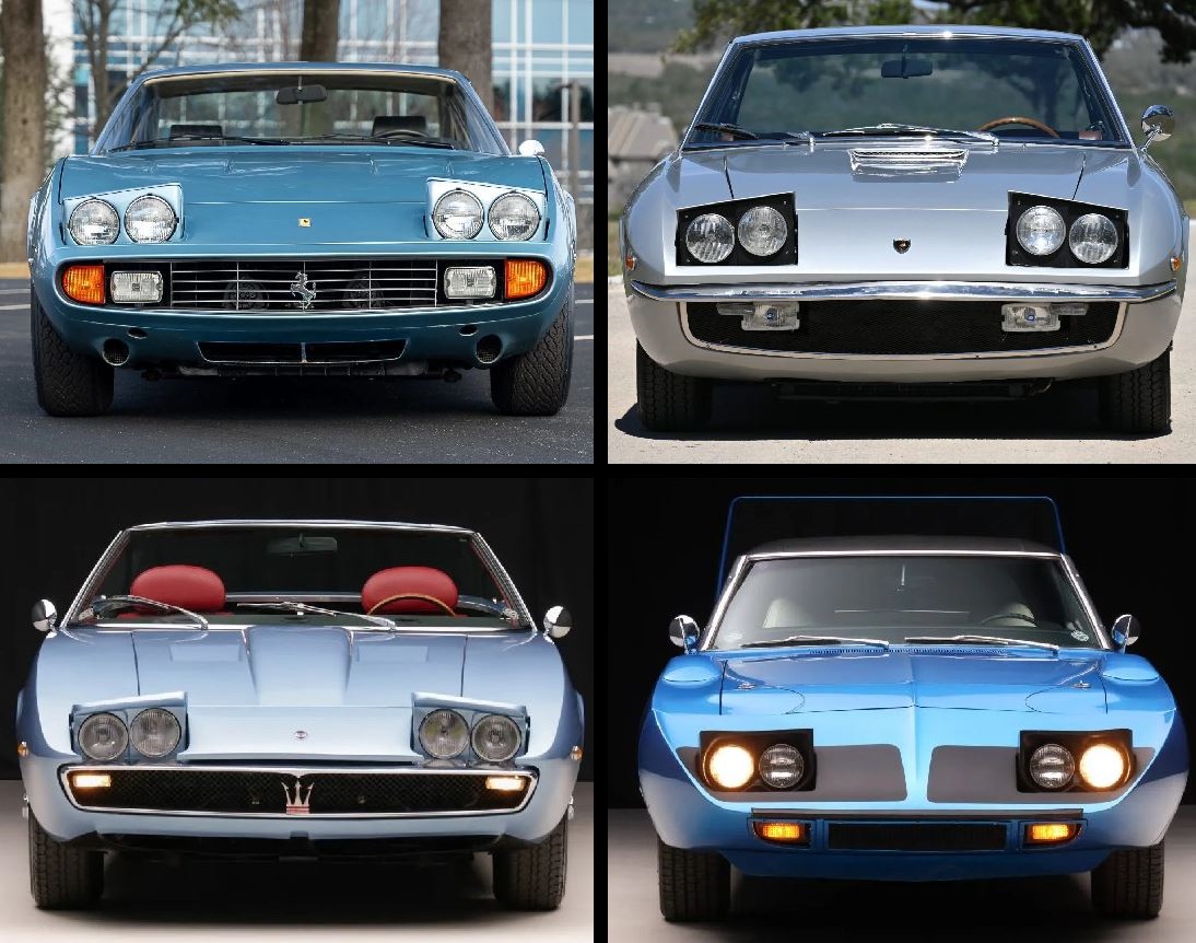
Headlights at a slant (mounted diagonally and known also as "canted") have also been a thing.  The inclination designers for decades felt to use a diagonal arrangement for headlights began innocently enough in the pre-war years when it emulated the usual practice of placing a pair of driving lamps or for lights inboard of the main headlamps and lower down, mounted typically on the bumper bar or its supporting brackets.  Most headlamps until the late 1930s were in separate housings, as were the auxiliary devices and even cars which integrated them into the coachwork adopted the same geometry.  This was due in part to the evolutionary nature of automobile styling which has often tried to avoid the “shock of the new” and in part to regulations, especially those which applied in the US.

Jaguar S-Type (1963-1968, left), Vanden Plas Princess R (1964-1968, centre) and Volvo 164 (1968-1975, right).

Although most would regard the technique which essentially integrated the driving lamps/fog lamps into the coachwork as just a variation on the diagonal theme, professional designers insist not; they say this is just wrapping enveloping bodywork around an existing device.  Also, the professionals prefer the term “canted headlamps” because “diagonal” has a more precise definition in mathematics.

Rover 3.5 Coupé (P5B 1967-1973, left) and Packard Coupe (1958) (right)

While the US manufacturers usually re-tooled in 1957-1958 after regulations had been changed to allow quad head-lamps, the British were often fiscally challenged and needed to continue to use existing sheet metal.  A design like the Vanden Plas Princess R (and the companion Wolseley 6/99 & 6/110 (1959-1968)) has sufficient space to allow the diagonal placement but the Rover P5 (1958-1967) with its wider grill precluded the approach so the expedient solution was to go vertical.  Although obviously just “bolted on”, such was the appeal of the P5B it just added to the charm.  It could have been much worse because less charming was the 1958 Packard Coupe, produced by Studebaker-Packard, the company an ultimately doomed marriage of corporate convenience which seemed at the time a good idea but proved anything but. Studebaker-Packard lacked the funds to re-tool to take advantage of the rules allowing four head-lamps but without the feature their cars would have looked even more hopelessly outdated than they anyway did so cheap fibreglass “pods” were produced which looked as “tacked on” as they were.  They were the last Packards made and Studebaker’s demise followed within a decade.

1963 Zunder

The Zunder ("spark" in German) was produced in Argentina between 1960-1963 and used the power-train from the Porsche 356.  The body was fashioned in fibreglass and was one of the many interesting products of the post war industry in Brazil and Argentina, the history of which is much neglected.  By the standards of time, it was well-built but as a niche product, was never able to achieve the critical mass necessary to ensure the company’s survival and production ceased in 1963 after some 200 had been built.

Buick Electra 225 (First generation 1959–1960, left) and (Lincoln) Continental Mark III (1958-1960, right).  The Buick adopted horizontal headlamps in 1960.

In the late 1950s, most US manufacturers did have cash to spend and the industry spirit at the time was never to do in moderation what could be done in excess although by comparison with the Lincoln, the Buick verged on the restrained.  Tellingly, the Buick sold well while the Continental was such a disaster Ford considered sending Lincoln to join Edsel on the corporate scrapheap and the nameplate was saved only because it was possible at low cost to re-purpose a prototype Ford Thunderbird as the new Continental.  Rarely has any replacement been such a transformation and the 1961 Continental would influence the design of full-sized American cars for twenty years.  It used horizontally mounted head-lamps.

1961 Chrysler 300 G.

Chrysler’s “Letter Series 300” (1955-1965) coupes and convertibles were the brightest glint in the golden age in which Detroit’s power race was played out in the big cars, an era which would be ended by the introduction of the intermediates and pony cars in the 1960s.  The 300G (1961) was visually little changed from the previous year’s 300F but the simple change to diagonal headlamps was transformative.  There were those who didn’t like the look but generally it was well received and as a first impression, the feeling might have been Chrysler had mastered the motif in a way the Continental Mark III proved Ford just didn’t get it.

1961 DeSoto Adventurer (left), 1962 Dodge Dart (centre) and 1963 Dodge Polara (right).

However, Chrysler’s designers in the early 1960s may have decided they liked diagonal headlamps which was good but seemingly they liked them so much they though the buyers should be offered as many permutations of the idea as could be made to work on a production line.  What’s remarkable is not that the public didn’t take to the approach but that it took the corporation so long to admit the mistake and try something more conventional.  Just to hedge their bets, while Dodge, Plymouth and DeSoto all had headlamps mounted at an obvious degree of cant, on the Chryslers the effect was so subtle one really needed to hold a spirit level to the front end to confirm there was an slant, albeit one imperceptible to the naked eye.  The one division which never were the diagonal way was the Imperial but it’s headlamp treatment was more bizarre still.

1961 DeSoto styling proposal (September 1958) for the 1961 range.

For DeSoto, things could have looked worse even than they did, some of the implementations of the diagonal motif which went as far as clay models or actual metal prototypes so bizarre one wonders what external influences were being studied (or inhaled).  As it turned out, 1961 would be the end of the line for DeSoto, a nameplate which had been successful as recently as the mid 1950s.  Its demise was little to do with diagonal head-lamps (though they didn’t help) but a product of Chrysler’s other divisions expanding their ranges up and down, encroaching on a market segment DeSoto once found so lucrative.  The phenomenon was a harbinger of the eventual fate of marques like Mercury, Pontiac, Oldsmobile and Plymouth.

Retractable headlights: 1972 Ferrari 356 GTC/4 (top left), 1968 Lamborghini Isoero (top right), 1967 Maserati Ghibli Spyder (bottom left) and 1970 Plymouth Superbird (bottom right).

Although sometimes the diagonal placement of headlights was a deliberate choice by the stylist, it could be something dictated by the body's shape and this was the case when quad units were used in conjunction with retractable housings.  On most cars the diagonal motif appeared with the outboard lights mounted noticeably higher than those inboard but, because of the slope, when retractable lights were used the inner lights could sit higher, the visual effect sometimes exaggerated because the angle the housing (following the horizontal nose-line) assume when erected made the inboard lights seem higher still.  It was a product of shape and not something inherent to the “pop-up” retractable technique: The 1969 Dodge Daytona and 1970 Plymouth Superbird (both homologation exercises for use on the NASCAR (National Association for Stock Car Auto Racing) ovals & tracks) both had their four headlights aligned in the horizontal.

1964 Bentley S3 “Chinese-eye” two-door saloon by Mulliner, Park Ward (MPW).  MPW was in 1961 created as the in-house coach-building division of Rolls-Royce by merging Park Ward (a subsidiary since 1939) and H. J. Mulliner (a subsidiary since 1959).  In 1991 the operation was shut down but the Mulliner name endures as Bentley’s “personal commissioning division” which offers services ranging from high-priced bling to bespoke coach-built bodies.

Bentley’s Continental “sports saloon” was in 1952 introduced on the R-Type chassis, the line continued (with some sacrifice in individuality) with the S-Type generation of six-cylinder cars in 1955.  When the S2 was released in 1959, the external appearance was little changed although under the bonnet (hood) there was the new 6¼ litre V8 which faithfully would serve for some six decades until 2020 when the last was fitted to a Bentley Mulsanne although by then, there were few parts able to be interchanged with those in the original run.  With the debut of the V8, it was no longer possible to purchase a Bentley with a manual transmission and, unlike some of the S3 range, all the Continentals had coach-built bodies from H J Mulliner, James Young or Park Ward.  The Mulliner (and later MPW) cars featured slanting nacelles for the quad headlights and quickly these gained the sobriquet “Chinese eye” which, surprisingly, seems to have survived the linguistic treadmill and the term still is used by the trade servicing the collector community.

Clockwise from top left: Fiat 8V (1952-1954), Gordon-Keeble GK-1 (1961-1967), Jensen C-V8 (1962-1966) and Triumph Vitesse convertible (1962-1971).

Perhaps surprisingly, the French majors were never much enamored, presumably because Citroën and Renault didn’t like to be thought imitative and Peugeot was too conservative.  Some of the Europeans did dabble with the idea, embracing it as an expression of modernity although the then radical treatment of the head-lamps sometimes struck a discordant note when the look was grafted onto something where the rest of the platform was so obviously from one or two generations past.  Fiat’s exquisite 8Vs didn’t all get the diagonal look but those which did remain the most memorable of the few of the breed built.  An unqualified aesthetic success was the Gordon-Keeble built to aviation standards and powered by a Chevrolet V8 in Corvette tune.  It deserved to succeed but floundered as much of the British industry did in the era because of a lack of capitalization and an accounting operation which didn’t match the quality of the engineering.  More commercially successful was the Jensen C-V8 but while the distinctive front end now makes it much prized by collectors, at the time it was less admired and its very presence served only to emphasize how antiquated the rest of the styling had become.  For its replacement, Jensen tuned to an Italian styling house and the Interceptor, introduced in 1966 and remembered for the vast expanse of rear glass, is now thought a classic of the era.  The one which sold best was the Triumph Vitesse, one of a number of variations built on the robust and versatile separate chassis of the Herald (1959-1971) including the Spitfire and GT6.  Although not exactly the BMW M3 of its day, the six-cylinder engines did provide effortless performance and the Vitesse’s front end actually lived on in India (though without the torquey straight-sixes) to enjoy an "Indian summer" but curiously, the inner headlights weren’t fitted.

Gilding the lily: The Lancia Fulvia coupé (1965-1976) before & after.

The lovely, delicate lines of the Lancia Fulvia were perfect and really couldn’t be improved.  The unfortunate facelift with the canted lights was no improvement.