Narthex (pronounced nahr-theks)
(1) In church architecture, a portico (enclosed passage) at the west end of a basilica or church, usually at right
angles to the nave and located between the main entrance and the nave.
(2) In botany, a taxonomic genus within the family
Apiaceae (umbelliferous plants), now included in Ferula, Narthex asafoetida and
thus obsolete.
1665-1675:
From the Medieval Latin narthex, from the Medieval
Greek narthex (enclosed porch, enclosure (the earlier meaning was “box”), from the Ancient Greek νάρθηξ (narthēx) (giant fennel, scourge (and later
“casket” (the Modern Greek νάρθηκας (nárthikas)),
and, on the basis of the suffix, probably a pre-Greek word. The connection between the giant fennel plant
and boxes is that the fibre from the stems of the plant was used to make boxes. In Greek, the word was linked also to νάρδος
(nárdos) (nard plant, spikenard,
nardin, muskroot). The Modern Greek νάρθηκας (narthekas) long
ago relinquished the early senses and now means either the feature in church
architecture or the brace of a sprained
wrist or sling of a broken arm. The plant
was well known in Greek mythology. In the
Θεογονία (circa 730–700 BC) (Theogonía
(the genealogy or birth of the gods)), known in the West as The Theogony, an epic poem of a thousand-odd
lines by the (8th-7th century BC) poet Hesod, it was in hollow
fennel stalks that Prometheus conveyed fire from Heaven to Earth. In Armenia the name for a narthex is gavit.
The adjectival form was narthecal
and the plural either narthexes or narthices,
the English form preferable for most purposes.
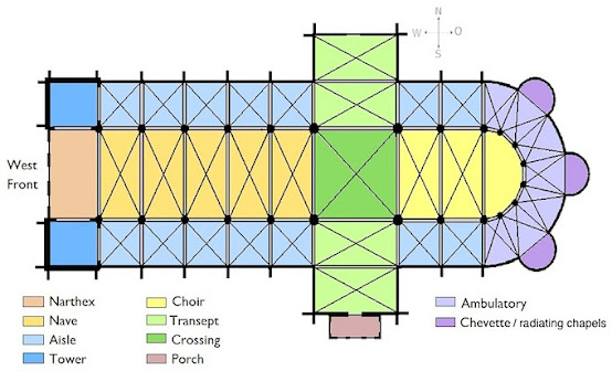
Narthexs
were part of many early Christian and Byzantine basilicas and churches, located
traditionally to the west of the nave and functioned (1) as a lobby area and
(2) as the place where penitents
were required to remain. Although
the archaeological record suggests there may have been some early churches with
annexes or even small separate structures located nearby which fulfilled the
latter function, narthexes seem quickly to have been integrated. That means that structurally and
architecturally, a narthex was part of the building but theologically was not,
its purpose being to permit those not entitled to admission as part of the
congregation (mostly catechumens and penitents) nevertheless to hear the
service and (hopefully) be encouraged to pursue communion.
For
ceremonies other than services, the narthex was otherwise a functional space, the
church’s baptismal font often mounted there and in some traditions (both
Eastern & Western) worshipers would sometimes anoint themselves and their
children with a daub of holy water before stepping foot in the nave and some
branches of the Orthodox Church use the narthex for funeral ceremonies. There were also architectural variations in
the early churches which persisted in larger building and cathedrals, the
narthex divided in two, (1) an esonarthex (inner narthex) between the west wall
and the body of the church proper, separated from the nave and aisles by a wall,
trellis or some other means and (2) an external closed space, the exonarthex
(outer narthex), a court in front of the church façade with a perimeter defined
by on all sides by colonnades.
In the
Western Church, reforms removed the requirement to exclude from services those
who were not full members of the congregation which of course meant the narthex
was rendered technically redundant. However, the shape churches had assumed with a
narthex included had become part of the tradition of the Church so architects
continued to include the space, both as part of the nave structure and
something semi-separated. They attracted
a number of names, borrowed mostly from secular buildings including vestibule, porch,
foyer, hallway, antechamber, anteroom,
entrance, entry, entryway, gateway, hall, lobby, portal & portico, the
choice dictated sometimes by local tradition, sometimes by the nature of construction
and sometimes, it seems to have been entirely arbitrary. In the Eastern Orthodox Church, the esonarthex
and exonarthex retained distinct liturgical functions, some rituals terminating
in the exonarthex while services still exclusively penitential services are usually
chanted in the esonarthex. In dialectal
northern English, the casual term for the penitents forced to remain in the narthex
was “the narts”.
The
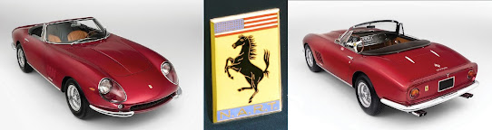
NART Ferrari spiders
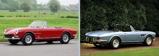
1966 Ferrari 275 GTS
Although
Ferrari produced the 275 GTB (berlinetta (coupé)) (1964-1968) and 275 GTS (spider
(roadster)) (1964-1966) in unison with substantially the same mechanical
specification, the two had completely different coachwork, sharing not one external
panel. Styled by Pininfarina, the 275
GTS, elegant and well-proportioned, recalled the earlier 250 Cabriolets and buyers
appreciated the sophistication of the improved specification but Luigi Chinetti
(1901-1994), Ferrari's North American distributer, remembering the sensuous lines
of the 250 California Spider (1957-1960), asked the factory for a run of
spiders (roadsters) based on the 275 GTB.
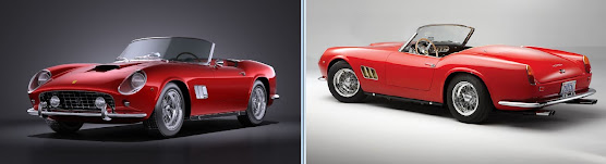
1960 Ferrari 250 California Spyder
Ferrari
commissioned its traditional coachbuilder, Carrozzeria Scaglietti, to produce
the series and in 1967, the first tranche of ten of a planned twenty-five was
completed and delivered to the United States.
The spiders were based on the newly-released 275 GTB/4 which included a
number of refinements to the original series, most notably the twin-cam heads,
the factory rating the 3.3 Litre (201 cubic inch) V12 at 300 horsepower, a lift
of 20 over the earlier single-cam engines.
Because Chinetti’s competition department was called the North American
Racing Team (NART), the ten roadsters have always been referred to as the “NART
Spiders” and although the factory never adopted the designation, Chinetti added
to the tail of each a small cloisonné badge with the team's logo. Interestingly, the factory also continued to
list the cars as 275 GTB/4s, even though the usual naming convention would have
been to designate them as 275 GTS/4s, a hint perhaps from Ferrari that it
really wasn’t their idea.
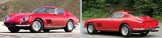
1967 Ferrari 275 GTB/4
The
addition of the badge, an unusual addition to anything from Scaglietti
workshops, was not unreasonable given the spiders were very much a
co-production, Chinetti receiving technical assistance and the precious benefit
of official status from the factory but it was made clear that financial
responsibility for the project lay exclusively with the US operation which
would be required to pay for each prior to delivery. On that basis things proceeded but, modified
from production 275 GTB/4’s with (then typically Italian) labour-intensive coach-building
techniques, the spiders were expensive and sales were slow, American buyers
more seduced by Ferrari's new and more luxuriously trimmed and cheaper 330 GTS; even then
air-conditioning was a persuasive inducement and the more spartan NARTs languished
for some months in Chinetti’s showroom waiting for someone with a longing for the
ways things used to be done. As a
consequence, it was only that first run of ten which was built but they’ve
since become highly prized by collectors, NART #10709 in August 2013 selling at
auction for US$27.5 million (including commission) at RM Sotheby's in Monterey,
California.
1969 Ferrari 275 GTB/4 NART Spider
Daytona 24 Hours, 1967: First-Ferrari 330 P3/4 (#23; Chris Amon & Lorenzo Bandini),
Second-Ferrari 330 P4 (#24; Mike Parkes & Ludovico Scarfiotti and
Third-Ferrari 412 P (#26; Pedro Rodriguez & Jean Guichet.
However,
despite the modest demand for the NART spiders, Ferrari must have been
convinced the concept was viable with full factory backing and when, in 1968,
the 275 GTB/4 was replaced with the 365 GTB/4 (1968-1973), a companion spider
was listed as an official model, again built by Carrozzeria Scaglietti. This model came to be known as the Daytona in
recognition of Ferrari’s 1-2-3 finish in the 1967 24 Hours of Daytona even
though the cars which contested the race were different models, the connection
being some photographs from the race which were used in promotional material when the
365 GTB/4 was released. It was the first
new model since the 1-2-3 finish and the name stuck, an attachment about which Ferrari seemed never much enthused although views seem to have
softened over the years and "Daytona" appears now even on the corporate website. The V12 was now 4.4 litres (268 cubic inches)
and generating some 340-355 horsepower (depending on market) although the
figure on which many fixated was the claimed top speed of 174 mph (280 km/h), the
need to out-pace the mark of 171 mph (275 km/h) set by the Lamborghini Miura P400 in 1966 said to
be one of the design objectives. Quite a
few verified Ferrari’s claim; few attempted it in the somewhat trickier to handle Miura although contemporary reports confirmed the factory's number. The Ferrari might actually have gone faster, given enough road. Luigi Chinetti (1901–1994), who drove the competition version of the Daytona in the 1971 Le Mans 24 hour classic (the last year before the 3.7 mile (6 km) Mulsanne straight was spoiled by the chicanes the FIA imposed) reported than on Mulsanne it never actually stopped accelerating. Remarkably, the Daytona finished fifth, even winning the mysterious Index of Thermal Efficiency. Whatever it was, Ferrari must have been content with the thing's terminal velocity but Lamborghini wanted bragging rights and the more powerful Miura P400 S debuted in 1969 with a claim of 180 mph (290 km/h) which Autosport magazine in 1970 almost matched, clocking 288.6 km/h (179.3 mph). That turned out to be the decade's high-water mark, the succeeding P400 SV more powerful still but a little slower because the aerodynamics were slightly compromised by the need to add a little width to accommodate some needed improvements and the use of fatter tyres which absorbed a surprising amount of energy. It would be many years before a production car went faster than the P400 S.
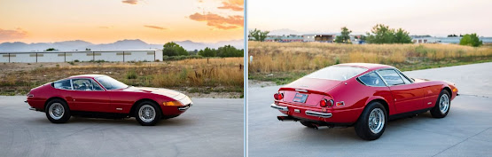
1972 Ferrari 365 GTB/4 (Daytona)
What
was however learned from 275 NART experience was that the customers had become sybarites
who wanted cars which looked like the austere roadsters of old but fitted with
the accruements of modernity, air conditioning, power steering and electric
windows. On that basis the Daytona entered
production and in what was by then a much more competitive market, the approach
was vindicated, the Daytona close to doubling the sales of its predecessor,
including 122 Spyders (eight of which were RHD (right hand drive)). Intriguingly, within
a few years of the end of Daytona production ending, the realization hit that
there wouldn’t again be something like the 365 GTS/4, the days of the big,
front-engined V12s thought over and even if one returned, the feeling in the
1970s was that government regulations would be there would be no more roadsters
and interest in Daytona Spyders began to spike. With only 122 produced, the math of the supply-demand
curve was predictable and prices of Spiders soared above the Berlinetta, the
factory having made more than ten times as many of them.
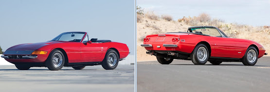
1971 Ferrari 365 GTS/4 (Daytona Spyder)
Thus stimulated
was the roofectomy business which had long been part of the coach-building trade
but few conversions were potentially as lucrative as a Daytona. Done properly, the results could be
satisfactory but, beyond the roof, there were a number of differences between
the two and not all were done in a way which exactly followed the originals, the most obvious difference being in the trunk's (boot) lid, the coupe’s trunk shorter and sloped while the Spyder’s is longer and flatter. A similar difference exists on most of the Mercedes-Benz W111 (1961-1971) & W112 (1962-1967) coupés converted into cabriolets. However it’s done, a genuine Scaglietti Spider is going to be worth some
multiple of a conversion in similar condition, which may now attract little premium
over a Berlinetta, originality now more of a fetish than it was in the 1970s
and 1980s. Other popular candidates for conversion include the Mercedes-Benz 280 SE 3.5 Coupés (1968-1971) on which an exact conversion is also time-consuming which is why most are inexact), Maserati Ghiblis (1967-1973) and the early (S1 1961-1967) Jaguar E-Types (1961-1974), technically a simpler job, especially in years gone by when suitable cars were both cheaper and more numerous.
In 2013, the New York Times
reported Ferrari, unhappy about what they regarded as fakes being traded, were
going to try to pressure the high-end auction houses not to host such sales but the industry persists and there are a
number of replica 275 NARTs although, not all were based on a twin-cam original,
industry sources suggesting a premium above a Berlinetta of 20% at most. The nomenclature is also a footnote. To date, Ferrari's only Spyders have been the 250 GT California (1957–1963), the 365 California (1966) and the 365 GTS/4 (Daytona, 1971–1973). Other than those, it's been Spiders (or Cabriolets for the 2+2s) all the way but the factory's website seems for all (two seat) purposes to have standardized on Spider and whatever the original designation, the coachwork now is listed as "two seat spider". Not all have caught up with the factory's retrospective re-dubbing and in the collector market, it's not uncommon to see "Spyder" still used of the Daytonas.
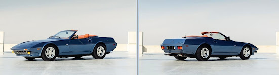
1976 Ferrari 365 GTB/4 NART by Michelotti
In a
footnote to the Daytona’s history, either not discouraged by his experience with
the 275 NART or impressed by the prices the ten were commanding, Luigi Chinetti
commissioned the construction of five 365 GTB/4 Daytona NART Spiders, the
design turned over to Giovanni Michelotti (1921–1980). In the spirit of 1950s minimalism, Michelotti’s
first design, shown at the 1974 Turin Motor Show featured cut-down doors and a
removable targa top but the second, built for the 1975 24 Hours of Le Mans, was
more a conventional race-car, its lines attuned to aerodynamic enhancement
although it never made the event because of a dispute with the notoriously
difficult stewards. Still interested in
the concept however, in 1976 Chinetti ordered three more NART Daytonas from
Michelotti, configured this time as road-cars with air conditioning and electric
windows, the target market the US. Unlike
the 275 NARTs, the three NART Daytonas really were used cars, production of the
originals having ceased in 1973. One of
them has been a fixture on the show and auction scene for a while, Michelotti using
it as a display piece and it spent two years as an exhibit at the Le Mans
Museum before bouncing around the premium auction circuit where it’s exchanged
between collectors at increasingly higher prices. The wedge shape certainly marks the design as a product of the age but so did the detailing: instead of a delicate cloisonné on the tail, NART was printed in big, bold, upper-case letters.