Grammatology (pronounced gram-uh-tol-uh-jee)
(1) Historically,
the scientific study of systems of writing.
(2) In
latter-day use, a critique of orthodox linguistics.
Early 1800s
(in its original sense): The construct was gramma(r) + -t- + -ology; the modern (some
would say post-modern) re-purposing was first used in 1967. Dating from the mid fourteenth century, grammar
was from the Middle English gramery
& gramere, from the Old French gramaire (classical learning), from the unattested
Vulgar Latin grammāria, an alteration
of the Classical Latin grammatica,
from the Ancient Greek γραμματική (grammatikḗ) (skilled in writing), from γράμμα
(gramma) (line of writing), from
γράφω (gráphō) (write), from the
primitive Indo-European gerbh (to
carve, to scratch). It displaced the native
Old English stæfcræft; a doublet of glamour, glamoury, gramarye & grimoire. In English, grammar is used to describe the system of rules and principles for
the structure of a language (or of languages in general) but in colloquial use
it’s applied also to morpology (the internal structure of words) and syntax (the
structure of phrases and sentences of a language). In English, generative grammar (the body of
rules producing all the sentences permissible in a given language, while
excluding all those not permissible) has for centuries been shifting and it’s
now something policed by the so-called “grammar Nazis”, some of whom insist on
enforcing “rules” regarded by most as defunct as early as the nineteenth
century.
The suffix -ology was formed from -o- (as an
interconsonantal vowel) + -logy.
The origin in English of the -logy suffix lies with loanwords from the
Ancient Greek, usually via Latin and French, where the suffix (-λογία) is an
integral part of the word loaned (eg astrology from astrologia) since the sixteenth century. French picked up -logie from the Latin -logia,
from the Ancient Greek -λογία (-logía). Within Greek, the suffix is an -ία (-ía) abstract from λόγος (lógos) (account, explanation,
narrative), and that a verbal noun from λέγω (légō) (I say, speak, converse, tell a story). In English the suffix became extraordinarily
productive, used notably to form names of sciences or disciplines of study,
analogous to the names traditionally borrowed from the Latin (eg astrology from
astrologia; geology from geologia) and by the late eighteenth
century, the practice (despite the disapproval of the pedants) extended to
terms with no connection to Greek or Latin such as those building on French or
German bases (eg insectology (1766) after the French insectologie; terminology (1801) after the German Terminologie). Within a few decades of the intrusion of
modern languages, combinations emerged using English terms (eg undergroundology
(1820); hatology (1837)). In this evolution,
the development may be though similar to the latter-day proliferation of
“-isms” (fascism; feminism et al). Grammatology
& grammatologist are nous, grammatological is an adjective and
grammatologically is an adverb; the noun plural is grammatologies.

Google ngram (a quantitative and not qualitative measure): Because of the way Google harvests data for their ngrams, they’re not literally a tracking of the use of a word in society but can be usefully indicative of certain trends, (although one is never quite sure which trend(s)), especially over decades. As a record of actual aggregate use, ngrams are not wholly reliable because: (1) the sub-set of texts Google uses is slanted towards the scientific & academic and (2) the technical limitations imposed by the use of OCR (optical character recognition) when handling older texts of sometime dubious legibility (a process AI should improve). Where numbers bounce around, this may reflect either: (1) peaks and troughs in use for some reason or (2) some quirk in the data harvested.
Grammatology
in its re-purposed sense was from the French grammatologie, introduced to the world by French philosopher
Jacques Derrida (1930-2004) in his book De
la grammatologie (Of Grammatology (1967)).
It may be unfair to treat Derrida’s use as a “re-purposing” because
although the word grammatology (literally “the study of writing”) had existed
since the early nineteenth century, it was a neologism, one of an expanding
class of “-ology” words (some of them coined merely for ironic or humorous effect)
and there was prior to 1967 scant evidence of use, those studying languages,
literature or linguistics able satisfactorily to undertake their work without much
needing “grammatology”. On the basis of
the documents thus far digitized, “grammatology” was never an accepted or even
commonly used term in academia and although it seems occasionally to have been
used variously in fields related to “the study of writing systems” (apparently
as a synonym for paleography, epigraphy, writing-system classification or
orthographic description) it was only in passing. Until the modern era, words “going viral”
happened relatively infrequently and certainly slowly and, as used prior to
1967, “grammatology” was attached to no theoretical construct or school of
thought and described no defined discipline, the word indicative, empirical and
neutral. If “pre-modern” grammatology
could be summed up (a probably dubious exercise), it would be thought a
technical term for those concerned with scripts, alphabets, symbols and the
historical development of writing systems.
Tempting though it may seem, it cannot be thought of as
proto-structuralism.
The novelty Derrida introduced was to argue the need for a discipline
examining the history, structure and philosophical implications of writing, his
particular contention that writing is not secondary to speech, a notion at odds
with centuries of Western metaphysics. At
the time, it was seen as a radical departure from orthodoxy, Derrida exploring
(in the broadest imaginable way), the possibilities of writing, not simply the
familiar physical inscriptions, but anything that functions as “trace,” “differance,”
or symbolic marking, the core argument being writing is not secondary to speech
(although in the narrow technical sense it may be consequent); rather, it
reveals the instability and “constructedness” of language and thereby meaning.

Ambitiously, what Derrida embarked upon was to do to the study something like what Karl Marx (1818-1883) claimed to have done to the theories of Hegel (Georg Wilhelm Friedrich Hegel (1770-1831)): “turn things on their head”, a process that can be classified under four themes: (1) Writing as prior to speech (as opposed to the earlier “Writing is derivative of speech”). What this meant was writing had to be considered as “originary”, implying structures of difference could precede both writing and speech. (2) Writing (the act as opposed to the content) as a philosophical concept rather than a finite collection of technical objects to be interpreted or catalogued on the basis of their form of assembly. (3) Grammatology becomes a critique (as opposed to the earlier descriptive tool) of science, reimagining it as a critical discipline exposing the logocentrism of Western thought. Logocentrism describes the tendency to prioritize “logos” (in academic use a word encompassing words, speech or reason), as the ultimate foundation for truth and meaning (with speech often privileged over writing). Logocentrism was at the core of the Western philosophical tradition that assumed language accurately and directly can express an external reality, the companion notion being rational thought represents the highest form of knowledge. Derrida labelled this a false hierarchy that devalued writing and other non-verbal forms of communication and feeling. (4) Writing is expanded beyond literal inscriptions. Whereas the traditional Western view had been that writing was simply the use of an alphabet, cuneiform, hieroglyphs and such, what Derrida suggested was the concept of writing should be extended to any system of differences, traces, or marks; the condition for meaning itself.
So Derrida took grammatology from an dusty corner of the academy where it meant (for the small number of souls involved) something like “a hypothetical technical study of writing systems” and re-invented it as a philosophical discipline analysing the deeper structures that make any representation or meaning possible. The notion of it as a tool of analysis is important because deconstruction, the word Derrida and other “celebrity philosophers” made famous (or infamous depending on one’s stance on things postmodern) is often misunderstood as something like “destruction” when really it is a form of analysis. If Derrida’s subversive idea been presented thirty years earlier (had the author been able to find a publisher), it’s possible it would have been ignored or dismissed by relative few who then read such material. However, in the post-war years there was an enormous expansion in both the number of universities and the cohorts of academics and students studying in fields which would come to be called “critical theory” so there was a receptive base for ideas overturning orthodoxy, thus the remarkable path deconstruction and postmodernism for decades tracked.

Deconstruction in art, Girl With Balloon by street artist Banksy, before, during & after a (successful) test deconstruction (left) and in its final form (right), London, October 2018.
There is an ephemeral art movement but usually it involves works which wholly are destroyed or entirely disappear. Banksy’s Girl With Balloon belonged to a sub-category where (1) the deconstruction process was part of the art and (2) the residual elements were “the artwork”. Banksy’s trick with this one was as the auctioneer’s hammer fell (at Stg£1m), an electric shredder concealed at the base of the frame was activated, the plan being to reduce the work “to shreds” in a pile below. However, it’s claimed there was a technical glitch and the shredder stopped mid-shred, meaning half remained untouched and half, neatly sliced, hung from the bottom. As a headline grabbing stunt it worked well but the alleged glitch worked better still, art experts mostly in agreement the work as “half shredded” was more valuable than had it been “wholly shredded” and certainly more than had it remained untouched in the frame. Thus: “meaning is just another construct which emerges only through differences and deferrals”.
From a
distance of sixty-odd years, in the milieu of the strands of thought which are
in a sense part of a “new orthodoxy”, it can be hard to understand just what an
impact Derrida and his fellow travellers (and, just as significantly, his
critics) had and what an extraordinary contribution deconstruction made to the
development in thought of so many fields.
Derrida in 1967 of course did not anticipate the revolutionary movement he
was about to trigger, hinted at by his book starting life as a doctoral thesis
entitled: De la grammatologie: Essai sur
la permanence de concepts platonicien, aristotélicien et scolastique de signe
écrit. (Of Grammatology: Essay on the Permanence of Platonic, Aristotelian
and Scholastic Concepts of the Written Sign). A typically indigestible title of the type
beloved by academics, the clipping for wider distribution was on the same basis
as Adolf Hitler’s (1889-1945; Führer (leader) and German head of government
1933-1945 & head of state 1934-1945) publisher deciding Mein Kampf (My
Struggle) was snappier than Viereinhalb
Jahre (des Kampfes) gegen Lüge, Dummheit und Feigheit (Four and a Half
Years [of Struggle] Against Lies, Stupidity and Cowardice). There’s a reasons authors usually don’t have
the final say on titles and cover art.
Derrida acknowledged linguistics in the twentieth century had become a sophisticated form of study but maintained the discipline was failing to examine its most fundamental assumptions; indeed his point was those core values couldn’t be re-evaluated because they provided the framework by which language was understood. What Derrida indentified as the superstructure which supported all was the commitment to the primacy of speech and presence and because the prevailing position in linguistics was that speech was primary, the assumption worked to shape all that followed. It was the influence of the Swiss philosopher & semiotician Ferdinand de Saussure (1857–1913) which was profound in positioning speech as the natural, original, living form of language with writing as a secondary, derivative (and, in a sense, artificial although this was never wholly convincing) representation of speech. What made the Saussureian position seem compelling was it sounded logical, given the consensus it was human speech which predated the development of writing, the latter thus the product of the former and so persuasive was the thesis the hierarchy came to provide the framework for other disciplines within linguistics including phonology (the study of the way sounds function in languages) and morphology (the study of the internal structure of morphemes (the smallest linguistic unit within a word able to support a meaning)that can carry a meaning. What this meant was syntax was also defined by speech (writing a mere convenient means of exchange) with phonetics (the study of the physical sounds of human speech) the true source of the material language. Thus for generations, in academic discourse, historical linguistics were documented primarily by an analysis of changes in sound with orthography (the methods by which a language or its sounds are represented by written symbols); a mechanical by-product.

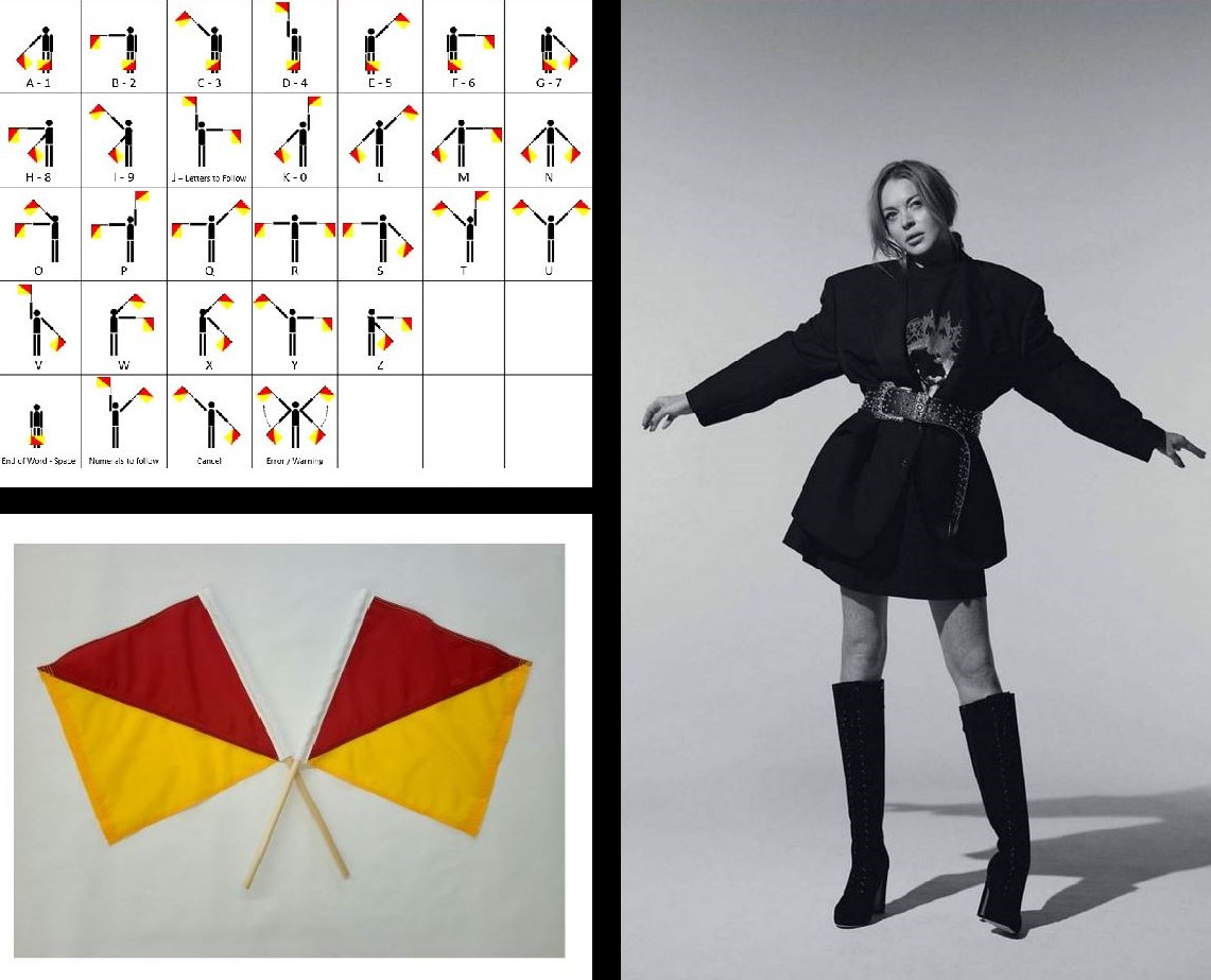
Deconstruction in fashion. Lindsay Lohan in Theia gown, amfAR gala, New York City, February 2013 (left) and after “deconstruction by scissors” (right).
All gowns are “constructed” (some 3D printed or even “sprayed-on”) but sometimes circumstances demand they be “deconstructed”. On the night, the shimmering nude and silver bugle-beaded fringe gown from Theia’s spring 2011 collection was much admired but there was an “unfortunate incident” (ie the fabric was torn) and, apparently using a pair of scissors, there was some ad-hoc seamstressery to transform the piece into something described as a “mullet minidress”. That turned out to be controversial because the gown was on loan for the night but such things are just part of the cost of doing business and, with its Lohanic re-imagining, it’s now an artefact.
Derrida didn’t dispute the historic timelines; his point was that in defining linguistics based on this hierarchy, it became impossible to question the orthodoxy from within. In a classic example of how deconstruction works, he argued the hierarchy was based not on the historical sequence of events (ie writing coming after speech) but was a culturally defined attachment to the idea of presence, voice and authentic meaning; with speech entrenched in its primacy, no discipline within linguistics was able fully to study writing because of this structural prejudice positioning writing as an auxiliary system, a mere notation of sounds encoding the pre-existing spoken language. That didn’t mean writing couldn’t be studied (as for centuries it had been) but that it could be considered only a tool or artefact used to record speech and never a primary object of meaning. While there were all sorts of reasons to be interested in writing, for the reductionists who needed to get to the essence of meaning, writing could only ever be thought something mechanistic and thus was philosophically uninteresting. So, if linguistics was unable to analyse writing as (1) a structure independent of speech, (2) a fundamental element of thought processes, (3) a source of new or changed meanings or (4) a construct where cultural and philosophical assumptions are revealed, that would imply only speech could create meaning with writing a mere form of its expression. Daringly thus, what Derrida demanded was for writing to be seen as conceptually prior to speech, even if as a physical phenomenon it came later. In 1967, linguistics couldn’t do that while maintaining the very foundations on which it was built.

At this
point things became more technical but Derrida did provide a simplified model, explaining
linguistics existed as the study of signs and not of traces, his work depending
ultimately on certain distinctions: (1) Signs assume stable signifieds and (2) traces
imply meaning is always deferred but never present. For orthodox linguistics to work, the
assumption had to be that signs enjoy a stability of meaning within a system;
this Derrida dismissed as illusory arguing (1) meaning is just another
construct which emerges only through differences and deferrals, (2) no
signified is ever (or can ever fully be) “present” and (3) speech is no closer
to meaning than writing. By its own
definitions in 1967, linguistics could not accommodate that because (1) its
methods depended on systematic relations sufficiently stable to permit analysis,
(2) it needed constant objects (definable units such as phonemes, morphemes and
rules of syntax), syntactic structures) and (3) it relied on signs which could be
described with the required consistency (ie “scientifically”). Any approach grounding in trace and
difference lay beyond the boundaries of orthodox linguistics.
So the conflict
would seem irreconcilable but that’s true only if viewed through the lens of a
particular method; really, linguistics was empirical and grammatology was philosophical
and in that were alternative rather than competing or even parallel paths. If linguistics was a system of codification,
then grammatology was a critique of the foundations of linguistics and Derrida
made clear he was not attempting to reform linguistics simply because that couldn’t
be done; any attempt to interpolate his ideas into the discipline would have meant
it ceased to be linguistics. He wanted a
new discipline, one which rather than empirically describing and categorising
language and its elements, stood back and asked what in the first place made
such systems possible. That meant it was
a transcendental rather than empirical process, one studying the conditions of
representation and the metaphysics implicit in the idea of signification. Writing thus was not merely marks on a
surface but a marker of a difference in being.
The twist
in the tale is that although De la
grammatologie was highly influential (especially after an Edition appeared
in English in 1976), grammatology never became a defined, institutionalised
academic field in the way Derrida envisioned it at least supplementing
departments of linguistics, anthropology and philosophy. That was due less to the well-documented phenomenon
of institutional inertia than it proving impossible for any consensus to be
reached about what exactly “grammatological analysis” was or what constituted “grammatological
research”. Pleasingly, it was the
structuralists who could account for that by explaining grammatology was a
critique of the metaphysics underlying other disciplines rather than a method
for generating new empirical knowledge.
Fields, they noted, were likely organically to grow as the tools produced
were picked up by others to be applied to tasks; grammatology was a toolbox for
dismantling tools.

Even if
Derrida’s concepts proved sometimes too vague even for academics the influence
was profound and, whether as a reaction or something deterministic (advances in
computer modelling, neurology and such), the discipline of linguistics became
more rather than less scientific, the refinements in the field of generative
grammar in particular seen as something of a “doubling down” of resistance to Derrida’s
critique, something reflected too in anthropology which came even more to value
fieldwork and political economy, philosophical critiques of writing thought
less helpful. So the specialists not
only clung to their speciality but made it more specialized still. Grammatology did however help create
genuinely new movements in literary theory, the most celebrated (and subsequently
derided) being deconstruction where Derrida’s ideas such as interpretation being
an infinite play of differences and the meaning of texts being inherently
unstable created one of the more radical schools of thought in the post-war
West, introducing to study concepts such as paratext (how academics “read
between and beyond the lines) the trace (the mark of something absent, a
concept that disrupts the idea of pure presence and self-contained meaning) and
marginalia (used here as an abstract extension of what an author may have “written
in the margins” to encompass that which may seem secondary to the main point
but is actually crucial to understanding the entire structure of thought,
blurring the (literal) line between what lies inside and outside a text).

The
movement became embedded in many English and Comparative Literature departments
as well as in post-structuralism and Continental philosophy. Modern beasts like media studies &
cultural theory are (in their understood form) unthinkable without deconstruction
and if grammatology didn’t become “a thing”, its core elements (difference,
trace etc) for decades flourished (sometimes to the point of (published)
absurdity) and although not all agree, some do argue it was Derrida’s
subversion in 1967 which saw the field of semiotics emerge to “plug the gaps” left
by the rigidity of traditional linguistics.
Of course, even if grammatology proved something of a cul-de-sac,
Derrida’s most famous fragment: “Il n'y a
pas de hors-texte” (literally “there is no outside-text”) endured to
underpin deconstruction and postmodernism generally. Intriguingly for a concept from linguistics,
the phrase took on a new life in the English-speaking world where it came to be
understood as “everything is text”, an interpretation which created a minor
publishing industry. In English, it’s a marvellously
literalist use and while it does to an extent overlap with the author’s
original intention, Derrida meant there is (1) no access to pure, unmediated
presence and (2) no meaning outside interpretation and no experience outside
context. In using texte he was referring to the interplay of differences, traces,
relations, and contexts that make meaning possible (ie not literally the words as
they appear on a page). What that meant was
all acts were “textual” in that they must be interpreted and are intelligible
only within systems of meaning; the phrase a philosophical statement about signification
and mediation, not characters printed on page.

However,
demonstrating (in another way) the power of language, the “everything is text”)
movement (“cult” may once have been a better word) in English came to be understood
as meaning no reality could exist beyond language; everything (literally!) is
text because it is words and discourse which both construct and describe
reality. That notion might have remained
in an obscure .ivory tower were it not for the delicious implication that
values such as right & wrong and true & false are also pieces of text
with meanings able to be constructed and deconstructed. That meant there was no stable “truth” and nothing
objectively was “wrong”; everything just a construct determined by time, place
and circumstances. That Derrida never
endorsed this shocking relativism was noted by some but academics and students
found so intoxicating the notion of right & wrong being variables that “everything
is text” took on a life of its own as a kind of selective nihilism which is, of
course, quite postmodern. Again,
language was responsible because the French texte
was from the Latin textus, from texō (weave) and while in French it can
mean “text” (in the English sense), among philosophers it was used metaphorically
to suggest “weave together”; “an interconnected structure” in the sense of the Latin
textus (woven fabric); it was this
meaning Derrida used. Had the
English-speaking world remained true to the original spirit of Il n'y a pas de hors-texte it would have
entered the textbooks as something like “There is nothing outside the interplay
of signs and contexts; There is no meaning outside systems of interpretation”
and perhaps have been forgotten but “everything is text” defined and seduced a
movement. Thus, it can be argued things
either were “lost in translation” or “transformed by translation” but for the
neo-Derridaists there’s the satisfaction of knowing the meaning shift was an example
of “grammatology in action”.