Underwire (pronounced uhn-der-wahyuhr)
(1) A (usually almost semi-circular) metal, plastic or
composite “wire” sewn into the underside of each cup of a brassiere, used both as
a structural member and shaping device.
(1) A brassiere (or related component in a swimsuit or
some other garment) with such wires. There are thus "underwire bras" and "wire-free" or "wireless" bras, the latter descriptor peacefully co-existing with use in fields such as portable radios and the myriad of applications in IT (WiFi, the mouse etc).
1930s (in the context of underwear): The construct was under + wire. Under was from the Middle English under, from the Old English under, from the Proto-Germanic under (source also of the Old Frisian under, the German unter, the
Old High German untar, the Dutch onder, the Old Norse undir, the Gothic undar and the Danish & Norwegian under), from a blend of the primitive Indo-European n̥dhér (under) and n̥tér (inside). It was akin to the Old High German untar (under), the Sanskrit अन्तर् (antar) (within)
and the Latin infrā (below, beneath) &
inter (between, among), influencing
also the Sanskrit adhah (below), the Avestan
athara- (lower) and the Latin infernus (lower). The Old English under was a preposition in
the sense of "beneath, among, before, in the presence of, in subjection
to, under the rule of, by means of and also an adverb in the sense of "beneath,
below, underneath," expressing position with reference to that which is
above, usage gained from the Proto-Germanic under-. Underwire
is a noun & verb, underwiring is a verb and underwired is a verb &
adjective; the noun plural is underwired.
In the industry, underwiring is used as a noun. The use in underwear is unrelated to the
phrase “under the wire” which in horse racing means “across the finish line”
and, as an idiomatic form, means “at the last minute; just before a deadline;
barely on time; nearly late”.
Under proved as productive a prefix in Old English as had in
German and Scandinavian languages, often forming words modeled on Latin ones using
“sub-“ and the notion of "inferior
in rank, position etc" existed in the Old English and persists in the
language of the titles in the UK’s civil service to this day (eg
under-secretary). The idea of it being
used as descriptor of standards (less than in age, price, value etc” emerged in
the late fourteenth century whereas, as an adjective meaning “lower in
position; lower in rank or degree” was known as early as the 1200s. Mysteriously, the use in Old English as a
preposition meaning "between, among," as in “under these
circumstances” may be a wholly separate root (eg understand). The phrase “under the weather (indisposed; unwell)
is from 1810. Under the table was used
from 1913 in the sense of "very drunk" and it wasn’t until the 1940s (possibly
influenced by the onset of rationing and the consequence emergence of black
markets) it came to enjoy the sense of something "illegal" (although
the long-extinct “under-board: (dishonest) is attested from circa 1600. To keep something under the hat (secret) is
from 1885 and use seems not to have been affected by the post 1945 decline in
hat-wearing; to have something under (one's) nose (in plain sight) is from
1540s; to speak under (one's) breath (in a low voice) dates from 1832.
Wire was from the Middle English wir & wyr (metal
drawn out into a fine thread), from the Old English wīr (wire, metal thread, wire-ornament), from the Proto-Germanic wira- & wīraz (wire), from the primitive Indo-European wehiros (a twist, thread, cord, wire), from wei & wehiy- (to
turn, twist, weave, plait). The Proto-Germanic
wira- & wīraz were the source also of the Old Norse viravirka (filigree work), the Swedish vira (to twist) and the Old High German wiara (fine gold work). A wire
as marking the finish line of a racecourse is attested from 1883; hence the
figurative down to the wire. Wire-puller
in the political sense dates from 1839, an invention of American English
(though used first to describe matters in the UK’s House of Commons), based on the
image of pulling the wires that work a puppet; the phrase “pulling the strings”
replaced “pulling the wires” late in the nineteenth century.
Casting a practiced eye: Lindsay Lohan assessing the underwires.
In the technical sense
familiar to a structural engineer, the bra’s underwire is a specific instance
of the earlier verb (1520s) “undergird”, the construct being under + gird. Gird (to bind with a flexible rope or cord;
to encircle with, or as if with a belt) was from the Middle English girden, gerden & gürden, from the Old English gyrdan (to put a belt around, to put a
girdle around), from the Proto-Germanic gurdijaną
(to gird), from the primitive Indo-European gherdh. It was cognate with the West Frisian gurdzje & girdzje, the Dutch gorden,
the German gürten, the Swedish gjorda, the Icelandic gyrða and the Albanian ngërthej (to tie together by weaving, to
bind). The related forms were undergirded
& undergirding.
As a familiar mass-manufactured commodity item, the bra
is a relatively new innovation although many of the various functionalities
afforded to the wearer are noted in illustrations and surviving garments worn
since antiquity, interest in the physics of gravity long pre-dating Newtonian mechanics. The most obvious immediate ancestor,
the corset, began to be widely worn by the late 1400s, the shaping and structure of many underpinned by struts made either of metal or, more commonly, animal
bone, a method of construction which, in simplified form, would later return as
the underwire. The first patent issued for
a recognizably modern bra was issued in New York in 1893 for a “breast
supporter” and it included all the features familiar in the mass-produced
modern product: separated cups atop a metal support system, located with a
combination of shoulder straps and a back-band fastened by hook and eye
closures. On the basis of the documents
supplied with the patent application, the design objective was for something
not only functional and practical but, unlike the often intimidating corsets then
in use, also comfortable.

It was an immediate success although, lacking the capacity
to manufacture at scale and unwilling to become involved in the capital raising
which that would have demanded, the inventor sold her patent to the Warner
Brothers Corset Company for US$1500 (at a time when a new Ford car cost around
US$400). Warner Brothers Corset Company (later
Warnaco Group, in 2012 acquired by Phillips-Van Heusen Corporation (PVH), which
over the life of the patent is estimated to have booked profits of almost US$40
million from its bra sales, got a bargain.
English borrowed the word brassiere from the French brassière, from the Old French braciere (which was originally a lining fitted inside armor which protected the arm, only later becoming a garment), from the Old French brace (arm) although by then it described a chemise (a kind of undershirt) but in the US, brassiere was
used from 1893 when the first bras were advertised and from there, use
spread. The three syllables were just
too much to survive the onslaught of modernity and the truncated “bra” soon
prevailed, being the standard form throughout the English-speaking world by the
early 1930s. Curiously, in French, a bra
is a soutien-gorge which translates literally and rather un-romantically as "throat-supporter" although "chest uplifter" is a better translation. The etymological origin of the modern "bra" lying in a single garment is the reason one buys "a bra" in the same department store from which one might purchase "a pair" of sunglasses.
The booming popularity of the bra in the 1920s and 1930s encouraged innovation and not a few gimmicks and it was in this era that manufacturers first began to develop systems of cup sizes although there was there no standardization of dimensions and, technically, that’s still the case with remarkable variations between manufacturers; it’s an industry crying out for an ISO. It was in 1931 a patent was issued for what was described as a bra with a pair of integrated “open-ended wire loops”, semi-circular pieces of metal enclosed in protective fabric which partially encircled each breast, sitting against the chest-wall at the bottom of the breasts. This is the origin of the modern underwire and during the 1930s, while designers would develop more elaborate versions, the concept didn’t change and as late as 1940, the underwire bra remained something of niche product being, at this stage of development, both more expensive and often less comfortable. Wartime necessity also imposed an evolutionary delay, the use of metal during wartime being limited to essential production and carefully rationed. Bras by then probably had become essential but apparently not underwired bras.

Vaquera’s crew neck T-shirt with trompe l'oeil underwear.
Despite the model’s visage of impending doom, (it’s part of their training for the
catwalks), the look really should be worn for fun and these would be the world's most comfortable underwires. The skin-tone of the legs is because of tights, not Photoshopping.
The
underwire can even be virtualized. The technique
called Trompe-l'œil (from the French
and literally “trick the eye” describes an optical illusion created by
rendering on a two-dimensional surface something which appears as a three-dimensional
object and the trick had been around for millennia when first the term was used
in 1800 by French artist Louis-Léopold Boilly (1761-1845) for a painting he exhibited
in the Paris Salon. While it wasn’t for
a few decades trompe-l'œil (usually
in English as trompe l'oeil) was accepted by the academy as a legitimate part
of high-art, architects and interior decorators continued to exploit the
possibilities and the term entered their lexicons. It has of course for years also been used in
the prints on T-shirts but of late this has extended to depictions of
underwear. For most of the twentieth
century, the sight of an exposed bra strap was a social faux pas, Vogue and
other dictators of fashion publishing helpful tips recommending (for the
well-organized) sewing on Velcro strips and (for everyone else) the industry’s
DLR (device of last resort): the safety pin.
By the 1980s things had changed and the bra emerged as a fashion piece which
might in part (or even in whole) be displayed.
It’s a look which waxes and wanes in popularity but one which has never
gone away although it’s one of those things where ageism remains acceptable: beyond
a certain age, it shouldn’t be used.
Now, fashion houses are promoting trompe l'oeil bras, knickers and other
underwear printed on T-shirts, one attraction being it’s possible to create
depictions of garments with an intricacy and delicacy not possible IRL (in real
life).

Hughes H-4 Hercules (Spruce Goose) on its only test
flight, 2 November 1947, Long Beach, Los Angeles Harbor. It flew for abou1 1 mile (1.6 km) and
achieved a maximum speed of 135 mph (217 km/h).
Howard Hughes (1905—1976), the
industrialist knew about the wartime limits on the use of metals because the War
Production Board had insisted his H-4 Hercules, a huge, eight-engined flying
boat designed to transport 750 troops across the Atlantic, be built using “non-strategic
materials" which precluded the industry’s preferred aluminum, Hughes using
birch wood almost exclusively. The H-4,
which wasn’t completed until after the end of hostilities flew, briefly, only
once and was nicknamed the Spruce Goose,
which obviously was arboreally inaccurate but thinking of something as funny and rhyming
with “birch” wasn’t easy. So, in 1942
Hughes knew he’d never get approval for enough metal for his big flying boat,
but in 1941, before the entry of the US into the war, more than enough metal
was available to create a specialized part to be used in another of his
ventures: film director.
Jane Russell, promotional picture for The Outlaw (1941).
In 1941, while filming
The Outlaw, Hughes wasn’t satisfied with
what sympathetic lighting, camera angles and provocative posing could make of Jane
Russell's (1921—2011) bust. A skilled
engineer, he quickly designed and had fabricated a kind of cantilevered
underwire bra to lend the emphasis he though her figure deserved. What Hughes did was add curved steel rods which functioned as actual structural members, sewn into the bra under each cup and connected to
the shoulder straps, an arrangement which simultaneously pushed upwards the breasts
and allowed the shoulder straps to be re-positioned, exposing to the camera much
more skin. In engineering terms, it was
a device which achieved a fixture with no visible means of support. Hughes was delighted with the result and completed
filming though it wasn’t until much later Ms Russell revealed the cantilevered
device was so uncomfortable she wore it for only a few minutes, reverting to
her own bra which, to please Hughes, she modified with those trusty standbys: padding
and a judicious tightening of the straps.
The result was much the same and Ms Russell waspishly added that the engineering
prowess which had served Hughes well in aviation didn’t translate well to designing comfortable underwear. The Outlaw was completed in February 1941 but, because of the focus
on Ms Russell's breasts, faced opposition in obtaining the required certificate
of release from the Motion Picture Producers and Distributors of America (the MPPDA
which administered the Hays Code) which was demanding cuts to thirty seconds
odd of offending footage. Hughes
reluctantly complied and there was a brief showing in 1943 but the film’s
distributer, unwilling to be dragged into any controversy, withdrew from the
project and it wasn’t until 1946 there was finally a general release on cinema
screens. Given the pent-up demand, it
was a commercial success but the critics were at the time unimpressed and it
only later gained a cult following, at least partly on the basis of the gay
undertone in the plot-line.

Lindsay Lohan in underwired demi-cup bra, photoshoot by Terry Richardson (b 1965) for Love Magazine, 2012.
The "
demi-cup look" can be achieved by choosing a bra with the correct band size and a smaller cup. Someone who usually wears a
full-cup 32D would use a 32C or even 32B to get the effect although, given the variation in cup shapes between manufacturers, some experimentation will likely be required and fitters caution this should be done in a physical store rather than shopping on-line.
Underwires essentially
fulfill part of the function of an exoskeleton in that, being designed to fit snugly
against the ribcage, they provide a basic mechanism of location which means the
back-strap, cups and shoulder-straps can provide the shape and support without
having to compensate for excessive movement or changes in weight
distribution. The mathematics of
structural engineering is really that of making push equal pull and what a well-designed
(and properly fitted) underwire does is minimize the risk of movement in an
unwanted direction (down) so the least energy is required to maintain the
desired movement (up). There are other ways
of achieving this but such constructions typically are much bulkier and use often stiff, unaccommodating fabrics and thick straps. The underwire is a simple technology which,
in the abstract really can’t be improved upon although there are problems. Women
not infrequently extract from bras underwires which have “poked through”, giving
the wearer a painful jab in a soft, fleshy spot; although the tips usually are
plastic-coated it’s still something of a point.
They also present a danger to machinery.
As bras age, stitching can be loosened to the extent that during washing
cycles, underwires can separate from the garment and, because the drums in
washing machines have many small holes, can end up in the mechanism including
becoming entangled with moving parts.
For that reason, the recommendation is bras be laundered in a “bra bag”;
while that affords some protection to the bra, it provides much to the
machinery. Being traditionally made of metal (usually
stainless steel) brings it's own issues, most obviously with metal detectors but
for frequent flyers, bras with plastic underwires (and hooks & clasps) are
available off the shelf and plastic underwires are even sold as stand-alone part-numbers
to modify existing models or for use by the small but devoted class of users who make their own.

Bra
underwires typically are made from a non-ferrous metal (inside a plush casing surrounding
the cup) such as stainless steel although there are some fabricated from some
form of plastic which had appeal for frequent flyers not wanting to trigger the
metal detectors at airports and a perhaps unanticipated market sector was among
lawyers visiting prisons. Although they might
be presumed to achieve their structural effect by virtue of their rigidity,
underwires actually have in them a very slight “spring” so they will splay just
a fraction of an inch as the bra moves, something which enhances comfort and
fit. In that sense, an underwire can be
thought of as a “torsion bar” which essentially is an unwound spring stretched
straight. The underwire has two
functions: (1) to provide the superstructure with a secure location against the
ribcage and (2) to distribute forces (downward, upward & lateral) in the
same way the cables on a suspension bridge (which connect the towers to the
deck) transfer the downward force from traffic up the cables to the towers, diffusing
and distributing the stresses to the strongest point. In a bridge, that’s the tower which, being anchored
to the earth, means the forces end up moving from the structure to the ground
while in a bra, they’re absorbed partially by the frame (mostly the band if
well-designed and also to the shoulder straps if not) and partially by the wearer’s
ribcage. Manufacturers also use the
comparison with bridges to illustrate the inherent limitation (at least when
dealing with mass above a certain point) of wire-free construction. Usually, they compare the wire-free design
with a simple “rope bridge”, anchored on each side of the waterway or gap
crossed but which sinks down as weight (which manifests as downward pressure)
is applied. The physics of this is that
because there is no rigid support infrastructure to transfer the downward
pressure away from the deck, there’s a direct relationship between the downward
pressure and the sag of the deck. For
that reason, it’s important to distinguish between wire-free bras which are
little more than an underwire bra without an underwire and those using a design
which emulates what an underwire does, usually with a layered array of thicker,
stiffer materials in the band and the lower parts of the cup. In theory such an approach can achieve the
same level of support as the most formidable underwire bra but the level of rigidity
in the structure would likely render such a creation too uncomfortable to be
tolerated by most although variations of the idea are used in short-duration sports
such as boxing. Structurally, the critical point of an underwire's attachment is at the gore.
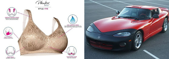
Playtex 18Hour (4745) wire-free bra (left) and 1996 Dodge Viper RT/10 fitted with car bra. Car bras are also wire-free.
Although
common, not all bras use an underwire, the “wire-free” design used for a number
of reasons. For those with small breasts
who require something merely decorative or desire only coverage rather than
support, the wire-free bras are a popular choice and the majority of sports
bras also use other methods of construction.
Like just about any form of engineering, there are trade-offs, the
advantages gained in not using an underwire needing to be assessed by wearers
considering whether they outweigh (sometimes literally) whatever limitations may be imposed. Sometimes, the wire-free devices are marketed
as a niche product such as maternity, nursing, post surgical or nightwear (ie a bra for sleeping in, it really does seem a thing).
However, modern materials and forms of reinforcing do make the wire-free
bra a viable choice for a wide range of wearers although the physical dimensions
of the fabric do tend to be greater (the frame, straps etc), the principle much
the same as when aluminium is used for an engine block rather than cast iron,
the volume of the lighter material needing to be greater to compensate for its
reduced strength. In a sign of the
times, although historically bras without an underwire often were advertised as
“wireless”, the ubiquity of the word to describe various forms of digital connectivity
(over WiFi, Bluetooth etc) means the industry has shifted mostly to calling
them “wire-free” which may seem unnecessary given few would confuse a bra with
a router but the internet-enabled bra can be only a matter of time so it’s good
manufacturers are thinking ahead. IT
nerds actually already have proved they can deal with linguistic overlap and
know about BRAS (broadband remote access server, known also as BBRAS or B-RAS),
a device which routes traffic to and from devices such as the ominous sounding DSLAMs (digital
subscriber line access multiplexer) in an ISP’s (Internet Service Provider) infrastructure.

2023 Dodge Challenger SRT Demon 170 Jailbreak in Panther Pink with two-piece "underwires". Some versions of the Dodge Challenger (2008-2023 and a revival of the style of the 1970-1974 range) were fitted with wheel-arch flares and whether a pair appeared only at the rear or at all four corners depended on specification, the former optimized for straight-line performance (ie drag-racing), the latter as all-purpose, high performance variants.
The “Panther Pink” Challenger was one of a small build in the "Demon 170 Jailbreak program" which included 40 exclusive paint colors, access to these by manufacturer’s invitation only (of the planned build of 40, it appears 28 (some claim 25) were sold). The option was documented as providing a “one of one” finish (a US$29,995 option) and the color range included a number of the “heritage shades” on the charts for the 1970 Challenger which in many ways was the season of "peak craziness". One was finished in Panther Pink (M3) and its unique “one-of-one” status saw it in February, 2025 realize US$450,000 when auctioned on Bring-a-Trailer, an impressive capital gain against the original invoiced cost of US$195,946, the option a good investment. The 1970 color chart is remembered not only for the lurid hues which grabbed the psychedelic moment of the era but also the imaginative names which included Plum Crazy, In-Violet, Tor Red, Sub Lime, Sassy Grass, Panther Pink, Moulin Rouge, Top Banana, Lemon Twist & Citron Yella. Although it may be an industry myth, the story told is that Plum Crazy & In-Violet (shades of purple) were late additions because the killjoy board refused to sign-off on Statutory Grape. That all this weirdness happened during the administration of Richard Nixon (1913-1994; US president 1969-1974) & Spiro Agnew (1918–1996; US vice president 1969-1973) is one of the footnotes in cultural history.

2023 Dodge Challenger SRT Super Stock (with single-piece "underwire") in White Knuckle with Satin Black accents over Black Laguna Leather.
Unexpectedly, during the 2010s, "underwire" entered the lexicon of automotive slang when it was used to describe a plastic part fitted temporarily as a protective piece. The yellow plastic fitting (pictured above on the leading edge of the Challenger's splitter) was called a "splitter guard" which was unimaginative but the factory didn't envisage them as consumer items and the term was merely explanatory for the information of those preparing cars for sale. Installed to prevent damage during shipping, it was part of dealer preparation instructions to remove the pieces but leaving them attached became a cult and some cars were even retro-fitted. An element in that was the "end of an era" vibe and large number of the vehicles in Dodge's "Last Call" runs (of which there were many) were purchased as investments to be stored away for the day when V8s are no longer produced and collectors will be anxious to pay much for the way things used to be done. How well that will work out remains to be seen but with the "Last Call" runs typically in batches of more than 3000, most of them weren't, in collectable terms, especially rare.

The text: "TO BE REMOVED BY DEALER" was molded into some of the splitter guards but after the things picked up their cult following, dealers began checking first with customers.
Dealers cautioned against the trend, noting the pieces weren't specifically molded to ensure a perfect fit so dirt and moisture were prone to being trapped in the gaps and this could scuff the paint. They were known also as "damage guards" and "scuff guards" but more imaginative souls dubbed them the "underwire" while serious students of such things suggested a better simile might have been "pastie", while acknowledging Chrysler followed the lead of the underwear manufacturers in having available both single and two-piece "underwires" although this was coincidental and deterministic, dictated by the splitter design. Women have been known to remove from bras especially intrusive underwires (a "comfort thing") but whether on splitters they were kept or discarded might have seemed an improbable subject for dispute but with cars, men always find a reason to argue about something. Although probably it would have preferred to discuss horsepower, superchargers and such, Chrysler noted the cultural phenomenon and, while obviously reluctant to upset either faction, did issue a statement to a magazine which had requested comment:
"The splitter guards on Dodge Charger and Challenger have taken on a life of their own. They originally made their debut in the 2015 model year to protect the performance fascias on SRT models during shipment from the manufacturing facility to the dealer, and, yes, they are designed to be removed before delivery. But today, they have their own Facebook page, and many of our performance enthusiasts have active debates on whether to keep or remove them. Some owners say they are even selling them in the aftermarket. Obviously, they weren't part of the original design, so we started with yellow guards and shifted to pink, but they are still so popular that we may shift them yet again to black. Wherever we land, this is another example of how our customers are passionate about every part of their Dodge muscle cars."
The Car Bra

1989
Porsche 911 Silver Anniversary with car bra and mirror bras (left) and the dashboard with bronze plaque attached (right).
The Silver Anniversary edition was released in
1989 to mark the 25th year of 911 production, a run of 500 (300
coupés & 200 cabriolets) made available for the US market. Available only in metallic paint (silver or satin
black), all were trimmed in silk grey leather with black accent piping &
silk grey velour carpeting. In the
usually way these things are done, the package included a bundle of options
including a stitched leather console with an outside temperature gauge and a CD
or cassette holder, a limited-slip differential, a short shifting gear lever
and the inevitable “25th Anniversary Special Edition” badge,
stamped in bronze and affixed to the glovebox lid.

A 1989 bronze plaque, presumably one of those intended for an "anniversary" 911 but, for whatever reason, never installed.
Inevitable the
“25th Anniversary Special Edition” bronze plaque may have been but some were
sold without one, the reason being they were fitted not at the factory but as part
of pre-sale “dealer prep”. The tales
explaining the omission included (1) E&O (errors & omissions), (2) dealers
not being supplied with the stock in time for delivery and (3) opportunistic
staff keeping them as souvenirs. Whatever
the truth, it seems clear the requisite number (500) would have been produced
and they do still appear for sale (usually between US$100-200) although on one
of the Porsche owners’ forums there was a discussion about having replicas made
which would suggest there might be quite a few of the “25th Anniversary Special
Edition” with bare glove box lids.

1975 bronze plaques in English (left) and German (right).
The “plaquegate” scandal may
have afflicted not only the 1989 run which was exclusive to the US market. In 1975, Porsche did a batch of 1063 (some
500 of which were exported to the US) of Silver Anniversary 911s, marking a
quarter-century of sports car production at the Stuttgart facility; they too
included a brass plaque. Actually,
calling the cars a “batch” is in a sense misleading because the model was
available in both body styles (coupé & Targa) and as a 911, 911S or Carrera
with the plaque reading (depending on the market in which delivered) either “25 Jahre Fahren inseiner schönsten Form”
or "25 Years Driving in its Purist Form” and on some there was also a
unique production number. Not all the 25th
anniversary now have a plaque and there may be many reasons for that including
some obsessional owner removing it as a weight-saving measure (something to
which Porsche has often devoted much attention, especially at the rear of
911s). The weight saved would of course
be so insignificant that (despite the “straw which broke the camel’s back”
principle) an improvement in performance couldn’t be measured but such things
have been done. For one of its models, McLaren
switched from raised to inlaid lettering in the carbon fibre, reducing mass by
a few grams; the company admitted it was just a symbolic gesture to emphasize their
commitment to such things.

Dodge
Challenger SRT Demon 170 Decanter Set.
In the collector-car market, where
originality is so important, the retention of all bits and pieces the factory fitted
(the most uncompromising of the breed not insisting the fuel in the tank or air
in the tyres be original but that’s about the extent of the deviation they’ll
tolerate) completeness can mean a premium of thousands or even millions, many
times the original value of the components.
The additional stuff can include items like fitted luggage or decanter
sets and while the practice goes back decades, of late the manufacturers have
worked out that such is the desirability on the aftermarket (ie resale value) there’s
been a proliferation of product at what appears to be a healthy profit
margin.

Ultimate Alfasud: The Giocattolo (left), the world's best Alfa Romeo Sprint which included the world’s best tool kit (right). Unrelated to either, Il giocattolo (the Toy, 1979) was an Italian film noir from the Anni di piombo (Years of Lead) era, directed by Giuliano Montaldo (1930-2023).
Between 1986-1989, an Australian company
solved the two problems afflicting the Alfa Romeo Sprint (1983-1989 and between
1976-1983 sold as the Alfasud Sprint (1976-1983)): it was FWD (front wheel
drive) and, never having been fitted with engines larger than 1.7 litres (104
cubic inch), it was underpowered. Thus
the Giocattolo (a play on the Italian word meaning “toy”), a batch of 15 built
on Queensland’s Sunshine Coast before the economic downturn ended the fun. The Giocattolo was fitted with a mid-mounted
304 cubic inch (5.0 litre) Holden V8, driving the rear wheels through a ZF
five-speed transaxle, the combination yielding a top speed of 160 mph (257
km/h), a useful increase of 40 mph (65 km/h) over the fastest of the factory
Sprints. As impressive as the mechanical
specification was, the Giocattolos are remembered also for the unusual standard
feature of a 375 ml bottle of Bundaberg Rum (the Sunshine Coast's most famous
product which began as a way to use a waste-product of sugar-cane processing)
and two shot glasses as part of the toolkit.
Many who have worked on Italian cars probably think they deserved a
drink so it was a good idea but these days, a company would be cancelled for
such a thoughtful inclusion.
The other
wire-free bras are “car bras” (hyphenated and not). Car bras are “protective garments”, vinyl
covers designed to fit snugly over the front of a vehicle, stopping stones or
other debris chipping the paint. Their
origin appears to lie in the “cover masks” used by car-manufacturers in the
1970s as a means of concealing the appearance of vehicles being tested (a “shake-down”
the preferred phrase) on closed tracks or public roads prior to their release
and the purpose was to stop photographers getting pictures of upcoming models
to sell to magazines, anxious to scoop the competition with news of what would
soon be in the showrooms. The practical
advantages however were obvious and in the 1980s when chrome plated bumpers began
rapidly to disappear (replaced by painted surfaces), stone chips became
more of an issue, the vulnerable frontal area in many cases more than tripled.
Wire-free: Covercraft's "
Lebra" car bra for 2010-2013 Chevrolet Camaro.
The early
implementations of the car bra were utilitarian but those who were (1)
obsessive about such things, (2) drove frequently on roads where stone damage
was more common or (3) owned a vehicle with a design which made such damage
more likely (the Porsche 911 a classic example) were soon able to buy vinyl
(nearly always black) covers which came to be called “car bras”. In the 1980s they were very popular and, like any bra, the
better ones were both easy to fit and fitted well but problems were soon
observed, notably the trapping of moisture which, in conjunction with dust or
tiny fragments of stone which tended to be caught around the edges, acted as a
kind of sandpaper as the vinyl moved slightly while the vehicle was in motion;
over time, this could damage the paint, the very thing the car bra was there to
prevent; as bra-wearing women well know, chafing can be a problem.
For that reason, car bras fell from favour, especially as paint
technology improved with finishes becoming more durable and less susceptible to
being chipped. Additionally, clear
protective coatings became available which offered “extra layers” undetectable by the naked eye and by the time adhesive “wraps” (opportunistically now also marketed as "clear bras") in just about
any color became a thing, the appeal of the car bra diminished although they remain available and the newer versions have been revised to reduce "chafing". However, unlike other symbols of the 1980s (leg-warmers,
shoulder pads etc), a revival of the fashion seems unlikely. Car bras don’t use an underwire but some of
the advertising does have something in common with the underwear business, one
manufacturer listing some of the features of their car bra as including (1) double
padding to prevent wear-thru, (2) a top double-stitch for better body-hugging
fit and (3) double-covered & reinforced hooks which won’t scratch. The available materials include both the basic
vinyl and “textured carbon fibre vinyl”.


