Rigger (pronounced rig-er)
(1) A
person who rigs.
(2) A person
whose occupation is the fitting of the rigging of ships.
(3) A person
who works with hoisting tackle, cranes, scaffolding (the protective or
supporting structures on or around construction sites) etc.
(4) A mechanic
skilled in the assembly, adjustment, and alignment of aircraft control
surfaces, wings, and the like (eg parachute rigger); a person skilled in the
use of pulleys, lifting gear, cranes etc.
In
rowing, a bracket on a racing shell or other boat to support a
projecting rowlock or other fixed fulcrum.
(6) In
digital animation, one whose occupation is to outfit a computer model with
controls for animation.
(7) One
who rigs or manipulates (an election, a market etc); a cheater. A rigger need hot however be doing something unlawful; the gerrymander is a form of rigging electoral outcomes by manipulating divisional (constituency, electorate etc) boundaries, a process usually within the law, even if scandalously so.
(8) A
plastic bottle of beer, typically between with a volume between 1.0-2.5 litres
(1-2.6 quarts) (New Zealand).
(9) In
(usually graphic) art, a long, slender, pointed sable paintbrush for making
fine lines etc; said to be so called from its use for drawing the lines of the
rigging of ships.
(10) In the BDSM (Bondage, Discipline (or Dominance) & Submission (or Sadomasochism)) community, a person who applies (a word in this context with a wide vista) functional or artistic rope or strap bondage to another person's body (technical competence required because some role-playing activities involve a participant "hanging by a strap"); within the community, the coordinate terms are "rope bunny" & "rope bitch".
(11) A
cylindrical pulley or drum in machinery.
(12)
One whose occupation is to lift and move large and heavy objects (such as
industrial machinery) with the help of cables, hoists and other equipment.
1490s:
The construct was rig + -er. Rig was
from the Early Modern English rygge,
probably of North Germanic origin and related to the Danish & Norwegian rigge (to bind up; wrap around; rig;
equip), the Swedish dialectal rigga
(to rig (harness) a horse) and the Faroese rigga
(to rig; to equip and fit; to make function”). The source was perhaps the Proto-Germanic rik- (to bind), from the primitive
Indo-European rign- reig-, & reyg- (to bind) or it was related to the
Old English wrīhan, wrīohan, wrēohan & wrēon (to bind; wrap up; cover) which are linked also to wry (to
cover; clothe; dress; hide). The late
fifteenth century verb rig was originally nautical in the sense of "to fit
(a ship) with necessary tackle; to make (a ship) ready for sea" and gained
the extended sense of "dress, fit out with, furnish with, provide (with
something) emerged in the 1590s; that of "to adjust, put in condition for
use, set in working order" is from circa 1625. Rigger is a noun; the noun plural is riggers.
The
slang meaning "pre-arrange or tamper with results" is attested from
1938, although the noun rig (a trick, swindle, scheme) had been used as early
as (1775) and, apparently unrelated was the meaning "sport, banter,
ridicule" dating from 1725. The
phrase “to rig the market” was used, firstly in stock exchange slang and
later more generally to convey the idea very familiar in modern times: "raise
or lower prices artificially to one's private advantage". One use as a verb which faded was that
meaning "ransack", from the 1560s.
It’s strange rig & rigger took that long apparently top evolve given
rigging was known as a verb meaning "action of fitting (a ship) with
ropes” circa 1400 and as a noun meaning "the ropes that work the sails of
a ship" from the 1590s but it may be
rig and rigger in this context existed in oral use. The use in nautical & naval architecture
to describe the "distinctive arrangement of sails, masts etc on a ship;
the characteristic manner of fitting the masts and rigging to the hull of any
vessel" (without regard to the hull) was documented from at least 1769 although a
number of sources insist the first use was in 1822, probably because that’s the
earliest known reference in the archives of the UK's Admiralty.

By 1843, use of "rigger" had extended to costumes and clothing outfits (especially if as a fanciful
description). In engineering, it
was widely used to describe just about any creation added for some purpose but
was by 1831 most associated with horse-drawn vehicles and this was later
adopted to refer to trucks, buses etc, a use still common today, especially for
large units. In oil extraction, the
apparatus used for well-sinking was known as a rig as early as 1875. Rig was 1570s slang for “a wanton girl or
woman" which, although long obsolete had had the odd idiosyncratic
revival; it was probably related to the also obsolete use from the same era
describing "to play the wanton; to romp about" (the use as a word with which to disparage women probably has never been revived because men coined or re-purposed so many others; they're spoiled for choice). As a noun, a rigger by 1610 was "one who
rigs ships", that sense later adopted to describe aircraft mechanics
(1912) and those employed on oil rigs (1949). The –er
suffix was from the Middle English –er
& -ere, from the Old English -ere, from the Proto-Germanic -ārijaz, thought
usually to have been borrowed from Latin –ārius and reinforced by the
synonymous but unrelated Old French –or & -eor (the Anglo-Norman variant
was -our), from the Latin -(ā)tor,
from the primitive Indo-European -tōr. The –er suffix was added to verbs to create a person or thing that
does an action indicated by the root verb; used to form an agent noun. If added to a noun it usually denoted an
occupation.

Flying Cloud (launched 1851) (1921)
drawing by George Robinson, National Maritime Museum, Greenwich, London.
“Square-rigged” ships are those with
(approximately) square sails rigged onto horizontal spars attached to
perpendicular masts, sitting therefore square to the keel. The spars are known also as yards and their
tips, beyond the last point of attachment (or stay) are called yardarms, the
part of a rig associated with the phrase “hung (ie hanged) from the yardarm”,
in folklore the Admiralty’s preferred means of executing death sentences though
practiced less frequently than the legend suggests. The square-rig formation evolved as the
standard ocean-going form because, when sailing downwind, it’s aerodynamically
the most efficient shape which survived into the steam age, many of the early
steam-ships (including naval vessels) constructed as hybrids which combined
powered propulsion with square-rigged sails.
To reduce running costs and carbon emissions, there’s now a
renewed interest in using sails (or sail-like structures) on commercial vessels
to augment the power from huge engines burning the notoriously dirty marine oil (which is essentially what's left over after refineries have extracted other products (gasoline (petrol), diesel, kerosene etc from crude oil)). Square was from the Middle English square, sqware & squyre, from
the Old French esquarre & esquerre, (which persists in modern
French as équerre), from the Vulgar
Latin exquadra, the construct being ex- (from Middle English, from words
borrowed from the Middle French, from the Latin ex (out of, from), from the primitive Indo-European eǵ-
& eǵs-
(out)). It was cognate with the Ancient
Greek ἐξ (ex) (out of, from), the
Transalpine Gaulish ex- (out), the
Old Irish ess- (out), the Old Church
Slavonic изъ (izŭ) (out) & the Russian
из (iz) (from, out of). The “x” in “ex-“, sometimes is elided before
certain constants, reduced to e- (eg ejaculate)) + quadro,
from quadrus (square), from quattuor (four).
The
square-rigger MGs
1949
Jaguar XK120 (1948-1954) OTS (open two seater, the company's term for a roadster) with
aluminum bodywork.
Jaguar went to the 1948 London Motor Show thinking their big announcement would be the new XK engine, the twin-cam straight-six which faithfully would serve the line for the next forty-four years. What instead stole the show was the test-bed, the roadster in which it was installed; it was a sensation, the reaction convincing Jaguar's management to put it into production as the XK120. However, tooling-up a production-line, even for a relatively low-volume sports car, takes time so the first 242 XK120s were hand-built with aluminum bodies affixed to an ash frame atop a steel chassis substantially shared with an existing model. The sensuous shape was a blending of the flowing lines of the company's pre-war SS-100 roadster with some touches of mid-century modernism but there was almost no stylistic debt to the old “square rigger” sports cars which evolved in the 1920s and 1930s, characterized by the
upright, angular lines of its many disparate parts, the point of comparison
being the classic big ships of the sail age.
The term came into use in the immediate post-war years to differentiate
these old-style sports cars from the new, modernist generation, typified by the
Jaguar XK120, which featured lower profiles and a curvaceousness which recalled the pre-war "streamliners". From this stark contrast came the use of "square rigger" casually to apply to any sports car of the old style, the modern Morgans the last descendants.

In the post-war years, the
term “square rigger” came most to be associated with the T-series MGs. Replacing the P series which in two models
had run between 1934-1936, the T series was, excluding the war years, in production between 1936 and 1955,
the year Citroën introduced the DS (1955-1975) which provides a comparison to the still contemporary square rigger MGs as amusing as
the XK120. Somewhere during those two
decades the cars descended into obsolescence but the attraction was in
their charm and the entertainment delivered; it was an intimate
and tactile experience which belied their miniscule power and performance which
was, at least in a straight line, modest when compared even to mundane family
cars of the era. The popularity of the T-series in the early post-war US was at least partly accounted for by many US military personnel having been stationed in England between 1941-1945, whetting US appetites for the diminutive sports cars.
MG PA
Midget (1934-1935, 1973 built)
1934 MG
PA Midget.
The P series Midget replaced the rather more exotic J series and although visually the relationship to previous models was obvious, the P was well-received and thought
much improved. The new OHC (overhead camshaft) 847 cm3 (52 cubic inch) in-line four cylinder engine attracted particular praise,
the revised lubrication and induction system delivering the willing and lively
character well suited to a sports car.
Knowing many customers would use them for competition, MG installed
a strengthened four-speed gearbox and heavy-duty clutch, drivers assisted in
their ability to harness the additional performance by brakes 50% larger. It featured also one of the
first safety innovations (a thing that would in decades to come become an
accelerating trend), a flat-fold windscreen made from toughened
non-discolorable “Triplex safety glass".
1935 MG
PA Midget Airline
coupé by H W Allingham of London.
The P series was offered in the colors
which would come to be associated with the marque (Ulster Green, Dublin Green,
Oxford Blue, Cambridge Blue, Carmine Red & Saratoga Red) but the most
popular choice remained gloss-black. The
standard factory bodies were the two-seater roadster and four-seat tourer but specialist
coachbuilders made available more elaborate DHCs (drophead coupés, best thought of as "cabriolets" with more emphasis on creature comforts than the pared-down roadsters) but the most memorable coachwork was that of Allingham’s Airline Coupé although, being as expensive as many
larger, more practical vehicles, few were ordered. At
the time of release, the factory listed the two-seater at Stg£220 with the four-seater
an additional Stg£20; the Airline cost Stg£290.

The
three 1935 MG PAs of the "Dancing
Daughters". This was a MG publicity shot taken at the Brooklands circuit, prior to the team's departure for France.
Unlike many
of its predecessors, the factory didn’t envisage a competition programme for
the P series but a three-car team was entered in the 1935 Le Mans 24 hour
endurance classic, driven by six young ladies; although it pre-dated
second-wave feminism by some decades, all-female driving teams at Le Mans were
not rare in the 1930s. Managed by
Captain George Eyston (1897–1979), an English engineer, and racing driver who
between 1937-1939 thrice set the world LSR (Land Speed Record), the team was
promoted as “Eyston's Dancing Daughters”, a reference to a popular BBC radio
programme of the time which featured a troupe of teenage tap-dancers which
sounds a challenging concept for radio although, in the studio, the girls were
costumed skimpily “to get the atmosphere” so that must have helped. That such outfits were tolerated in BBC House
under the regime of the supposedly puritanical Sir John Reith (later Lord Reith,
1889–1971; BBC Director-General 1927-1938) might have surprised some but years
after his death, his bisexuality was revealed so clearly the seemingly austere
Scot got more fun out of life than previously was thought. Those who knew Reith would never have suspected the secret of what had once gone on behind closed doors: In his controversial diary (published 1966), Lord Moran (1882-1977; personal physician to Winston
Churchill (1875-1965; UK prime-minister 1940-1945 & 1951-1955) wrote of
Reith as “…that gaunt old Covenanter…” The Covenanters were a most uncompromising Scottish religious and
political movement of the seventeenth century.
The Dancing Daughters and their PAs on the dock, awaiting shipment to France. As this staged shot suggests, MG attached much importance to the publicity possibilities afforded by their all-female entry.
The six attracted much attention from the press (although one of the even then nasty Fleet Street tabloids was casually dismissive of them as “bright young things” despite all having solid credentials in racing) and the three cars lasted the 24 hours which was far from typical (in 1935, 29 of the 58-strong field was classed DNF (did not finish)). It was certainly a testament to the toughness of the little machines, the only “mechanical” issue requiring the attention of the pit crew a blown taillight bulb suffered by car #55 and one thing which did work in the team's favor was the wet weather. Although driving in the rain, seated in an open cockpit protected only by a small “aero-screen” (the windscreens not fitted to gain aerodynamic advantage) was not ideal, the conditions did suit the the cars, the light, nimble PA Midgets less affected than heavier machines.

Car #55 during a refueling stop, Le Mans, 1935. For pit crews, fireproof suits and other safety gear was many years away. The results however were modest, the PAs under-powered
for a circuit with such long straights and the team completed 152 or 153 laps
compared with the 222 of the victorious Lagonda M45 Rapide. Competing in the 751-1100 cm3
class, car #56 (Joan Richmond (1905–1999) & Eva Gordon-Simpson (1901–1980))
finished 24th & 9th in class; car #55 (Doreen Evans
(1916–1982) & Barbara Skinner (1911–1942)) 25th & 10th
in class and car #57 (Margaret Allan (1909–1998) & Corinne Eaton
(1909-2005)) 26th & 11th in class. Given the arduous circuit and more powerful opposition
it was a reasonable achievement but corporate expectations may have been higher
for within weeks chairman Lord Nuffield (William Morris, 1877–1963)
closed the MG Competitions Department, racing activities not resumed until the
1950s.
MG PB
Midget (1935-1936, 525 built)
1936 MG
PB Midget.
The Le Mans experience in part prompted the more powerful PB which
was introduced in 1935, the engine enlarged to 939 cm3 (57 cubic
inch) and a close ratio gearbox was fitted. There were detail changes too, one
of which a consequence of an early example of environmental legislation. In 1935, fearing an ancient species was under
threat, the US government banned the export of Sequoia redwood timber so the
PB’s dashboard was instead finished in the walnut more familiar to UK customers. Very much a transitional model, the PB was available
only briefly but its debut depressed interest in the PA to the extent not
even a substantial discount was enough of an inducement to buyers so the factory
converted the two-dozen odd remaining PAs to PBs (a tactic Shelby American later would revisit to sell left-over 1969 Mustangs as 1970 models), both variants sold for the same Stg£222. Production of the PB ended in February
1936.
MG TA
Midget (1936-1939, 3,003 built)
1937 MG
TA Midget.
Corporate restructurings are nothing new and nor is the tyranny of
the cost-accountant. In 1935, the MG Car
Company was sold to Morris Motors and in the inevitable agonizing reappraisal
which ensued, MG lost its autonomy, reduced to a corporate brand and one
expected to deliver a better return on capital: profits had to be higher. The first sacrifice had been the competition
department, followed almost immediately by the MG design office and the
cancellation of the spirited little OHC engine which had given the PA & PB
so much of their sporting character. It
was a harbinger for the spirit of rationalization would over decades spread and eventually drive almost
all the UK’s motor industry to extinction or into foreign hands.
Under new management, the design imperatives were now profitability, simplicity
of production and uniformity in parts to maximize interchangeability between
ranges. All those things are now taken for granted but at the time of acquisition, in many aspects, MG was still something of a cottage industry and while charming, it was a method of operation not suited to the economy of the troubled 1930s.

1938 MG
TA DHC by Tickford.
The purists were thus not hopeful but the T series, released in
1936 was the first in a successful line which would be in production for a
dozen-odd years, the run till 1955 interrupted only by six war years during
which MG’s industrial capacity was given over to military needs. The T might not have had the OHC engine but
the OHV (overhead valve) unit which replaced it, although borrowed from
a pedestrian little saloon, was a larger 1292 cm3 (79 cubic inch)
and generated some 50 HP, a useful increase over the 36 & 43 the P
series engines had managed and delivered it in a more effortless manner than
its smaller predecessors which actually made it more suitable for both the road
and in competition. Longer and wider,
the T was much more spacious and hydraulic brakes were a welcome addition,
all for the same Stg£222 as the PB, something which reflected the improvements in manufacturing efficiency wrought by the corporate restructuring. There were of course a few purists who lamented no longer being able to use their skills to coax the maximum from the highly strung OHC engine but they were a dying breed belonging to the same crew that loved the challenge of straight-cut gears and thought synchromesh effete.

1936 MG
TA Midget Airline coupé by H W Allingham of London.
The T series made the Midget
suddenly quite civilized although, as part of the rationalization, the factory's offering was limited to a single two-seat roadster but separate chassis were
still supplied to coachbuilders, allowing Tickford (the brand of Salmons and Sons (1830)), to produce some 250 elegant DHCs with such luxuries as wind-down windows,
full carpeting and a clever "three-way" convertible top which could be closed, partially
opened or fully thrown back. The Airline
style was reprised by Allingham, Whittingham & Mitchel and Carbodies and although
much-admired, being still expensive, only a handful were built. Despite the misgivings, the T proved a great
success and was built until 1939 when it was replaced by the TB which included
a new engine which would become one of the most storied in MG’s history: the XPAG.
MG TB
Midget (1939, 379 built).
1939 MG
TB Midget.
By May 1939, war clouds were gathering over Europe and Finnegans Wake by James Joyce
(1882–1941) was published. Into this strange and uncertain environment, MG released the TB, visually apparently as little
changed from the TA as the PB had been from its predecessor but under the
louvered hood (bonnet) now sat the new XPAG engine which would until 1955 power just
about every MG made and provide numerous builders of race cars with a light,
robust and tuneable power-plant, one which would see some of the specials in which one was installed exceed 150 mph (240 km/h). Over the
years, with forced aspiration and other modifications, extraordinary power outputs were achieved, the tough little engine able
to withstand supercharging at pressures which broke many others. Totally new, although at 1250
cm3 (76 cubic inch) slightly smaller, there was now a bigger bore which allowed higher engine speeds and thus a "sportier" state of tune but, under the government's dopey calculation of the time (based on cylinder bore), attracted a
higher tax-rate. With the introduction
of the TB, the designation TA was applied to the earlier car which hitherto had been
known simply as the T series, the same act of retrospective re-christening which had turned P into PA. The TB was priced
at Stg£225 for the 2 seater and Stg£270 for Tickford’s DHC but there would be no more
of the exquisite Airlines.

1939 MG
TB Midget.
The XPAG restored some of the character of the old OHC engine, the
bigger bore and shorter stroke delivering the maximum 55 HP at 5,250
rpm against the 4,500 rpm of the TA, performance generally improved in all
aspects and made easier to exploit with the fitting of a new four-speed gearbox
which included synchromesh on all but the lowest ratio. The TB was in production for only a few
months before the declaration of war in September; the brochures for the 1940
model-year were actually ready for printing and the range had been
announced when production was abruptly halted after 379 had been
completed. Rapidly, the Abingdon factory
was cleared of all the machinery of car assembly and devoted for the
duration to parts for aircraft, machine guns and the servicing of tanks and
trucks. In hibernation for six years,
the TB would return in what would prove to be a new world and it would be
called the TC.
MG TC (1945-1949,
10,001 built).
1947 MG
TC.
On both sides of the Atlantic, the cars released in the early post-war years
were almost all barely revised versions of those last available before the
outbreak of hostilities. The MG TC, the
first of which left Abingdon in 1945 actually was structurally more different
from the TB than most of the cars of 1945-1946 were from their predecessors of 1939-1941 because the passenger compartment had been widened by four inches (100 mm),
creating additional interior space without the need otherwise much to alter the body or
chassis. Other than the up-scaling and some detail
mechanical and electrical upgrades, it was essentially a re-birth of the same
basic design as the TA of a decade earlier.
Despite that, just resuming production to the extent of the few dozen
examples completed before the end of 1945 was something of an achievement given
the chronic shortages of components, steel and other raw materials.
1948 MG
TC.
Immediately, the TC proved a success. Although the new Labour Party government (1945-1951) was as "socialist" as the UK ever got to enjoy, it was also "realist" and understood the parlous state of the nation’s
finances. For this reason it extorted the manufacturing sector with the simple mantra “export
or die” and MG responded, much early TC production allocated to the export
trade. The volume of sales to the Commonwealth’s
southern dominions (Australia, New Zealand & South Africa) had been expected
because these had been receptive markets in the pre-war years but what proved a pleasant surprise was demand from the United States and Canada, triggered it was
suspected by the number of returning servicemen who had so enjoyed or at least
yearned for the little sports cars during their wartime service stationed in the UK. Although only 2,000 of the 10,001 TCs made
went to the US, the interest was enough for the factory to do a run of
US-specific models and it was the TC which whetted
the American appetite for small sports cars. In the 1950s, MG and others would benefit
from what became something of a craze, one which the square-riggers and their
successors would for decades exploit, success enduring long after the what was being sold was obviously obsolescent.

1950 MG TC
EUX. Although none left the factory with
supplementary headlights, the Lucas Flamethrowers were a popular dealer-fitted
and after-market accessory.
The “US-specific” run of TCs was a batch of 494 (some sources claim 492 or 493) EXU models produced
in 1948-1949 (the EXU designation (which in the original factory documents
appears also as EX-U) simply a clipping of “Export-USA”). The variation in specification from the
standard TC was a response to feedback from customers and the US dealer
network, most notably in the high-density markets of Los Angeles and San Francisco, the changes making the relative small machines (and their passengers!) a little less vulnerable in urban use. Although the bumpers fitted to US cars had not yet been forced to adopt the "battering ram-like" dimensions which would be mandated in the 1970s, even then they were big, with the additional danger of potentially intrusive dagmars so every little bit of protection helped. The feature set included: (1) full-width chrome
bumper-bars with over-riders (similar in style to those which would appear on
the later TD) with MG’s octagonal medallion in the centre of the back
bar, the license plate mounts front & rear centrally mounted, (2) twin taillights,
(aligned with the top of the gas (petrol) tank)), flashing turn indicators
(activated by a switch in the centre of the dash), (3) slightly smaller
headlight housings fitted with the seven inch sealed-beam units mandated by a US law (an industry-protection mechanism (the bill reputedly written by the industry)) which for decades condemned US drivers to suffer inferior headlights) and (4) twin Lucas Windtone horns located under the hood on either
side of the battery box.

1950 MG TC
EXU, showing correct steering wheel and seven inch headlights.
Like all TCs, the EUXs were all RHD
(right hand drive) and although the last left the factory in 1949, some were
registered in the US as 1950 models. Calibrated to 105 mph (169 km/h), the speedometer was rather optimistic for a machine usually reported as having a top speed of 77 mph (124 km/h) but the robust XPAG engine was highly tuneable and, with the right gearing, a TC could go much faster. In Australia, one dubbed the "Red Cigar" was in 1954 fitted with a Marshall Nordec J 75 supercharger and magneto ignition, the top speed claimed to be 115 mph (185 km/h), a pace assisted by the usual weight reduction measures and some attention to aerodynamics. For
the driver, there was laminated windscreen glass, a steering wheel with a gold
pearl finish rather than the traditional black, the rear view mirror mounted
atop the dashboard, two map lights and the positions of the ammeter,
oil-pressure gauge, ignition and light switches were changed. Although in the collector market “special
models” are highly valued and attract a premium, the EXU accounted for almost a
quarter of the TCs sold in the US so they're really not "rare" but there is a following for the survivors which
have all the model-specific bits still in place, the headlights and bumper-bars often having
been removed because so many came to be used in competition; for those
seeking more speed, the weight reduction was a quicker and cheaper path than extracting more
power and didn’t risk sacrificing the famous reliability.
MG TD (1949-1953,
29,644 built)
1950 MG
TD.
The TD was the most popular of the T series and was the model which both
established the brand in the US and encouraged others to realize the sports car
craze was real and thus a market segment to explore. From what General Motors initially regarded
as the improbable success of the TC and TD would come first the tentative toe
in the water that was the Chevrolet Corvette show-car of 1953 and long line
of production cars which, over eight generations since 1953, continues to this day. The TC however was, even before being discontinued in 1949, a museum-piece, if an entertaining one, and it was clear
that for MG further to succeed in the US market a more modern
interpretation of the sports car would be required. The
budget was limited but the culture of simplicity of production and uniformity in
parts to maximize interchangeability between ranges now proved advantageous, a
small team allocated to develop a prototype using mostly what fell immediately
to hand. In what was a master-class in
improvisation, they shortened by five inches (127 mm) and then stiffened the
chassis of a MG YA saloon, grafted on an independent front suspension & rack
and pinion steering, made the changes necessary to ensure it could easily be
made with either left or right-hand drive and overlaid a (slightly) modernized rendering
of the TC’s body. The design team would
have preferred to create something more sophisticated and certainly something
which looked more contemporary but, given the constraints under which they
worked, the TD was a good result, both as a piece of engineering and, more
critically, one that made commercial sense.

1952 MG
TD.
If the look remained archaic, underneath, the changes were transformative and they needed to be. The TC’s platform was little changed from the
cars of the 1930s, that had been a mere refinement of a decade-old concept; while antiquated even compared to its stop-gap contemporaries of 1945-1949, it looked
prehistoric against the new generation of models which emerged early in the 1950s. The TD’s saloon-based chassis was hardly
innovative but was rigid and well-executed with a modern arrangement for the
independent front suspension and a rear-end which accommodated additional
travel by sweeping the frame up over the axle instead leaving it underslung while the XPAG engine differed in
being derived from that used in Y type so included its improvements to
lubrication and attached accessories.
The most obvious change was to the body (substantially revised for the
first time since 1936) and, while the stylistic legacy was apparent, it was was
considerably wider and thus more spacious.
Structurally, the engineering was carried-over, body panels still
mounted on the traditional wooden frame of English ash.

1953 MG
TD.
A mix then of old and new as many products are. Even though not one body-panel was unchanged
and the interior fascia was new, the aesthetic still was recognizably square-rigger with cutaway
doors, separate flowing front wings, running boards, stand-alone headlamps and
the characteristically upright MG radiator with vertical slats. As had been the motif since the 1920s, a centrally hinged hood, an exposed, slab-sided fuel tank and a rear-mounted spare wheel
carrier maintained the period-look.
Where modernity's intrusion was unobtrusive, such as the independent front
suspension, it was welcomed but some changes attracted criticism from a
few. The sturdy chromium plated bumper-bars
added weight which it had be MG’s practice to avoid but reflected the needs of
the US market where sales overwhelmingly were in urban areas, owners
sharing roads and parking spaces with domestic automobiles equipped increasingly with
substantial bumpers made from heavy gauge steel, rigidly mounted to the chassis or frame, the protruding dagmars then approaching their fullest expression. Also controversial were the smaller diameter,
pressed-steel disc wheels which replaced that sports car staple, the TC’s tall,
spindly spoked wire-wheels. It was again
the intrusion of the rationalists.
Because different wire-wheels would have had to be made to accommodate
the arms and links of the rack and pinion steering, the corporation refused to authorize the design, tooling and production for a part unique to one model. The disc wheels actually offered
advantages, being much easier to clean and not as prone to the damage and distortion
the wire wheels suffered when used on secondary roads. In the years since, some have been unable to resist the charm of spokes and many TDs have been retro-fitted with wire wheels.

1952 MG
TD (Eduardo Muñoz) following 1953 Porsche 1500 (Rezende Dos Santos), Vuelta de Aragua
Road Circuit, Aragua State, Venezuela, 14 June, 1953.
The TD was much improved
but as usual, there was a price to be paid.
Weighing some 200 lbs (90 KG) more than the TC while enjoying only the
same 54 HP, the TD was less lively than its predecessor, something a
change in gearing only partially disguised so for those who wished for more, in 1950 the factory made available a "competition" version with a higher compression ratio, 62 HP delivered, a useful increase of more than 10%. Officially, the "competition" TD was sold only in markets where high-octane gas could be purchased at the pump but dealers entered into arrangements with the factory so those with access to supplies of avgas (aviation fuel) could enjoy the experience. However, few bought TCs for their outright performance numbers
and the increasing gulf between them and the ever more
powerful vehicles increasingly surrounding them seems not to have much dampened demand, customers flocking to buy TDs upon its debut in
1949 and over a four-year run some thirty-thousand would be built, most
destined for the US market, sales encouraged greatly by Sterling in September 1949 being devalued to US$2.80, an adjustment of around a third, correcting the absurd post-war maintenance of the Stg£1=US$4.03 peg set in 1940. In period (and for years afterwards), a popular update in the US was a supercharger although, very much in the hot rod tradition, conversions to use cheap and numerous flathead Ford V8s were not unknown.
MG TF (1953-1955,
9600 built).
1953 MG
TF 1250.
The TF was the last of the square-riggers. It was also an accident of history, the
result of corporate intrigue within the BMC (British Motor Corporation) conglomerate
of which MG was one, small part and, even at the time, it was no secret the TF
was a stop-gap model there to fill the showrooms with something (sort of) new
before the arrival of the much anticipated MGA.
What had happened was corporate stablemate the Healey company reached the BMC boardroom
with a proposal for their new 100 before MG got there to make the case for the
MGA and the board, thinking it a bad idea to release at the same time two similar vehicles, put the MGA on hold. It was emblematic of the way business would be done at BMC and the many successor corporations; Healey had
pipped MG by several days, history for centuries recording how such luck
influences the way events get to unfold. Thus evolved the TF,
a just slightly less-square rigger launched into the age of the Citroën DS and
Porsche 356; even the Triumph TR2 of the time making cutaway doors look less
archaic. The TD obviously couldn’t be
made to look modern and the facelift it gained to bridge the gap between the
square riggers and the sleek MGA was a quick job, essentially grafting the
streamlining techniques of the 1930s to the once upright front, the headlamps
now fared-into the wings, the same expedient Morgan had that same year been
forced to adopt when Lucas advised there would no longer produce the separate
housings; without the demand from MG, the economics of scale to maintain the
product in the low volume Morgan would absorb, no longer existed. Mechanically, so little-changed was the TF that
it could have be thought the TD Mark II had the appearance not so differed. Visually refined with a sloping grill that for the first time concealed a separate radiator, the hood now
sloped forward, something achieved by lowering the radiator housing by 3½ inches (90 mm) in relation to the top of the scuttle (cowl), the view from the screen that of a Hawker Hurricane compared to the Supermarine Spitfire-like TD. The front wings with the now partially
integrated headlamps were themselves fared into the hood's sides in
conventional streamlining style while the rear end gained modifications to the
fuel tank and spare wheel mounting which resulted in a neater finish. In a nod to tradition, perhaps to distract
from other changes, the revised facia panel re-gained the octagonal
instrument pods of the pre-war years, a nostalgic touch very well received, as
was the return of the option of wire-wheels.

1955 MG
TF 1500.
The TF in 1953 was released using the faithful 1250 cm3 XPAG
engine which dated back to the TB Midget in 1939 and there were many who hoped
for and expected more. Whatever
aerodynamic improvement the streamlining had delivered, the TF was still barely
able to top 80 mph (130 km/h) while the Triumph TR2 tempted many with the lure
of the then rare “ton”: 100 mph (160 km/h).
It was still an appealing drive with fine road-holding and handling but was, by any standards, sluggish. Of this the factory were well aware and engineers discussed exotic solutions such
as aluminum components to improve the power to weight ratio but it didn’t take
much thought to work out the solution was that the Americans had taught: "there is no substitute to cubic inches". In mid
1954, the TF 1500 was released, using a 1466 cm3 (89 cubic inch),
big-bore version of the XPAG, now designated XPEG, power increased to a more
useful 63 HP. While it didn’t
permit the TF to match the pace of the TR2 or other competition, almost 90 mph
(145 km/h) was now possible and the XPEG did stimulate demand, almost all the 3,400
TF 1500s shipped to the US. Probably not many in the US would much have been impressed by the idea of an additional 13 cubic inches but these things are relative.
MGA (1955-1962,
101,970 built)
MG
Factory Competition Team with three MGAs (EX 182), Le Mans, 1955. No women drivers on the team this year.
The TF was the
end of MG’s square-rigger era, the introduction in 1955 of the MGA both long
awaited and much overdue. Neither
mechanically nor stylistically was it ground-breaking and even during its
lifetime would come to be thought old fashioned but at the time of release the sensuous,
flowing lines were much admired and in the decades since, appreciation has
increased, the MGA today a desirable and attainable classic.
It was powered by a 1489 cm3 (91 cubic inch) version of the
corporate 'B' series engine and as, a design exercise, had actually been finalized some two years before being introduced, slated to replace the TD before corporate politics prevailed. By 1955,
it had been intended to announce the MGA and use three pre-release cars (code-named
EX 182) to contest the Le Mans 24 hour race in June. That was thwarted by delays in the supply of
parts so the three were forced to compete as prototypes rather than in the
production class for which they'd been prepared. Against the more formidable competition of pure race cars, success was
unlikely but reliability was proved, one finishing an outright twelfth and the
team finished a creditable fifth and sixth in their class although everything
was overshadowed by the horrific crash that year at the sixth hour which killed 84 (the race allowed to continue, something which now astonishes), one
of the MGs involved in the aftermath of the disaster. Encouraged, three were entered in September’s
RAC Tourist Trophy in Ulster, the fifth round of the FIA (Fédération Internationale de l'Automobile (the International Automobile Federation) which in 1955 hadn't yet descended to being world sport's dopiest regulatory body) World Sports Car
Championship, two with experimental DOHC (double overhead camshaft) engines, a
configuration which later and unhappily would figure in MGA history.

1957
MGA 1500 Roadster.
First shown at the 1955 Frankfurt Motor Show, the MGA 1500 was
an immediate success; 58,750 (52,478 roadsters and 6,272 coupés) built between 1955-1959, the great bulk of
which were exported, the US again the most popular destination. In 1956, the roadster was augmented by a FHC (fixed head coupé) which, in a sign of the times, included many of the refinements
saloon buyers had come to expect including wind-up windows and lockable door
handles which, while appreciated luxuries, did make the FHC about 100 lb (45
KG) heavier so acceleration suffered slightly but, such were the vagaries of
aerodynamics that top speed increased a little, a well tuned FHC able to attain
the magic ton which just eluded the roadster, the owners of which turned to the
multitude of tuners if they wanted more.
1957
MGA 1500 FHC.
Having earlier boosted the 1500 from 68 to 72 HP, the
factory in 1959 again gave owners more, the engine enlarged to 1588 cm3
(97 cubic inch), the new model named MGA 1600, the additional 6 HP and
the more relevant 17% increase in torque meaning the “ton” was now topped by
all models and there was a dramatic improvement in braking, vastly superior
(and really overdue) discs fitted at front.
Revisions to the suspension were part of normal product development but
what was much appreciated on the roadster were the removable, sliding side windows in Perspex, which
now sounds primitive but were quite an improvement on the celluloid flaps used
on the 1500. Production of the MGA 1600 totalled 29,007 (28,730 roadsters and 277 coupés). In 1961, for the MGA’s
swansong, capacity was again enlarged, this time to 1622 cm3 (99
cubic inch), additional internal changes boosting power to 90 HP, top
speed now a heady 106 mph (170 km/h) and to
mark the change, the factory designated the 1622-equipped cars as MGA Mark II,
production of which ran to 8,719 (8,198 roadsters and 521 coupés).

The other MGA. Lindsay Lohan in bucket hat with optical disc at MGA Entertainment's (Micro-Games America (1979)) Bratz, 2003 Teen Choice Awards, Universal Amphitheatre, Universal City, California.
Actually, there was also another MGA, the IBM Monochrome Graphics Adapter (1981), the original PC graphics display which transformed the lives of the spreadsheet jockeys who were starting to live their lives inside the Lotus 1-2-3 environment. What MGA meant was these number-crunching nerds could now see their digits on one screen and their charts on another, something which in the 2020s sounds routine but in the early days of Ronald Reagan's (1911-2004; POTUS 1981-1989) administration, was a revolution in the accounting profession. The dual-monitor thing would go mainstream in the next century but MGA came first and the trend to two screens among accountants was paused only with the release in 1982 of the HGC (Hercules Graphics Card) which supported a simultaneous display of text and graphics. After MGA, IBM continued to define video standards with the release of EGA (Enhanced Graphics Array, 1984) and VGA (Video Graphics Array, 1987) but at that point things fragmented, third party suppliers developing their own specifications for SVGA (Super VGA) and IBM's subsequent releases such as XGA (eXtended Graphics Array, 1990) never became universal. VGA (640 x 480) remains the in-built default used as a LCD (lowest common denominator) by many manufacturers of laptops and desktops, systems able to display in this resolution even in the absence of a driver appropriate for a monitor or video card. MGA
Twin Cam (1958-1960, 2111 built).
1959
MGA Twin Cam Roadster.
In the English way of things, the most famous and
celebrated of the MGAs is the least successful and the one at the time damned a failure. The first MG since the OHC PB
in 1936 not to use an OHV power-plant, the DOHC Twin Cam used an engine not fitted
to any other car and in that sense of uniqueness ranks with the Triumph Stag in
the annals of British engineering failures although the MG's problems were at least
(sort of) excusable given the analytical tools of the time and, as ultimately
transpired, easily fixable, unlike Triumph’s tragically flawed V8. Although not used in the production MGA Twin
Cam until 1958, the DOHC engine had enjoyed a long development, the basic
design completed in 1954 and two prototype versions were in 1955 fielded for
the RAC Tourist Trophy in Ulster; while on that occasion not successful, the factory
wasn’t deterred, refining the concept and using them to set world speed records
in various classes in 1956 & 1957. Critically however, most development work was in high-speed competition rather than the conditions under which most motorists operate their cars on public roads. Using the 1588 cm3 block, the DOHC “B” series was in the then classic mold of small-displacement European high-performance engines: an aluminum cross-flow, DOHC cylinder head operating valves angled at 80o
in hemispherical combustion chambers with a high compression ratio. Twin 1¾ inch SU carburetors fed the
induction while, on the opposing side, an imposing exhaust manifold boasted
separate downpipes for each cylinder.
The impressive specification yielded a healthy 108 HP @ 6700 rpm and
top speed was rated at 113 mph (180 km/h), testers reporting sparkling
acceleration at all but the lowest speeds.
Cognizant of the pace, the factory fitted disc brakes on all four wheels
and this time, wire wheels weren’t even optional, the required Dunlop Road
Speed tyres suitable only for the ventilated Dunlop centre-lock disc wheels. Radically different though it was under the
skin, there were few visual differences to distinguish the Twin Cam from its
more mundane cousins, an approach Mercedes-Benz would later adopt for its
300 SEL 6.3 (W109, 1968-1972) and 450 SEL 6.9 (W116, 1975-1981) Q-ships. Only
the purposeful wheels, discreet Twin Cam badges and some details changes to the
interior (including a tachometer and speedometer that accommodated the higher
limits) provided the external visual clues.

1959 MG
Twin Cam FHC.
Like the Stag, the Twin Cam attracted praise upon release and,
like the Stag, the reliability issues soon surfaced. Reports emerged first of excessive oil
consumption which fouled spark plugs and the factory experimented with several
variations of piston rings before settling on the replacement of the top chrome
ring with one of cast iron and a scraper with an expansion ring; these changes resulted
in normal oil consumption. What was not
solved until the Twin Cam had been discontinued was what ruined its reputation
and doomed the engine: the propensity to burn holes in the top of pistons #3 or
#4. Applying conventional wisdom, the
factory first retarded the ignition timing, then, assuming owners were (contrary to operating instructions) using cheaper, lower octane petrol, lowered
the compression ratio from 9.9:1 to 8.3:1, both changes reducing power in the
quest for reliability, a trade-off well-known to engineers. The sacrifice however failed to solve the
problem and pistons continue to fail.
What baffled the engineers was they were unable to replicate the issue
in their tests, even under sustained and extreme loadings. Their tests however, while imposing demands
beyond what any road car would be subjected to, were performed usually in a
workshop, on a static test-bed. By mid
1959, the factory gave up and the Twin Cam was withdrawn from sale, the
engineers not discovering the cause until 1960 and those findings they chose not
to publicize. Later, amateurs would
trace the problem to resonant vibration which, under conditions encountered
when actually driving (as opposed to what happens under extreme load on a test-bed), at certain
engine speeds, the SU carburetors would suffer foaming of the fuel in the float
chamber which caused the fuel/air mixture to run lean, greatly increasing the
heat in the combustion chamber causing the aluminum pistons to begin to melt. The solution was no more
complex than the insertion of flexible, vibration isolating mounts between the
intake manifold and carburetors. It would have been a cheap and simple fix.

1959
MGA Twin Cam FHC. Whatever the flaws in implementation, the DOHC engine had a classic look.
In 1960, MG's engineers had reached the same conclusion. After disassembling several engines, they
noted the balance of the units was well below the levels of
precision they had specified as a result of testing the prototypes, the production
engines exhibiting two periods of natural vibration around 3200 and 5600 rpm. With the stock gearing (fitted to most Twin Cams), 3200 rpm coincided with what were then typical highway cruising speeds. So, they returned to the test bed and,
instead of pushing the engines beyond their limit, instead ran them to the
point of vibration and found the float on the rear carburetor would hang on its
spindle and not drop, inducing a lean mixture which burned holes in either #3
or #4 piston. In minutes they improvised
a flexible mounting using nothing more exotic than some thin sheet-rubber (fitted in conjunction with Thackery washers) but the
solution came too late, the discontinued Twin Cam’s reputation too sullied for
a revival. A decade on, a similar tale would be told of Norton’s lusty 750 Commando Combat.

1962
MGA 1600 Mark II “Deluxe” Roadster.
So only 2,111 Twin Cams were sold (1788 roadsters and 323 coupés). Making the best of
a bad situation, the factory used the residual stockpile of Twin Cam bits and
pieces (other than the engine) and created some up-graded models
often referred to as the “DeLuxe” and while MG never formerly applied the designation, shameless dealers advertised them as the “Deluxe”, "De Luxe” or
De-Luxe”. Production was limited by the
availability of parts and only 82 1600s were built (70 roadsters and 12 coupés), along with 313 of the upgraded Mk II 1622 (290 roadsters and 23 coupés). Except for the Dunlop wheels and four wheel disc
brakes, there was no universal specification, some using a genuine Twin
Cam chassis, some with the “hybrid” competition shell and a mix of other options while many were essentially standard MGAs differing only in the wheels and brakes.
Because of the rarity and upgraded specification, the “Deluxe”
models are now second only to the Twin Cam in desirability and, all else being equal, the more "gear" that's fitted, the more collectable the specimen.

1959 MG MGA
Twin Cam “Competition” Roadster (left) and the wood-rimmed steering wheel
supplied as part of the Competition package (right).
The factory
also built a reputed 50 MGA Twin Cams equipped with a “Competition”
package. Intended for privateer
entrants, the package included much of what had been used in factory-supported
racing such as the lower, more sloped windscreen, more supportive leather
seats, a close-ration gearbox linked to a differential with a 4.55:1 final
drive ration and a lovely, wood-rimmed steering wheel. As well as saving a little weight, the lower
windscreen was the most obvious way to improve aerodynamics, the reduced
frontal area said to increase top speed by 3 mph (5 km/h) although it did mean neither
a soft-top or hard-top could be fitted, the tonneau cover offering the only
protection from the elements (as well as some reduction in drag). Usually, vehicles used in racing have engines
assembled with unusual care and attention but because the MGA Twin Cam’s
critical flaw manifested only when cruising on freeways within a certain speed
range lower than would be experienced on race tracks, were that to be the
exclusive use, it was not essential for them to be augmented with flexible
mounts which prevented the vibrations and subsequent melting of the pistons.

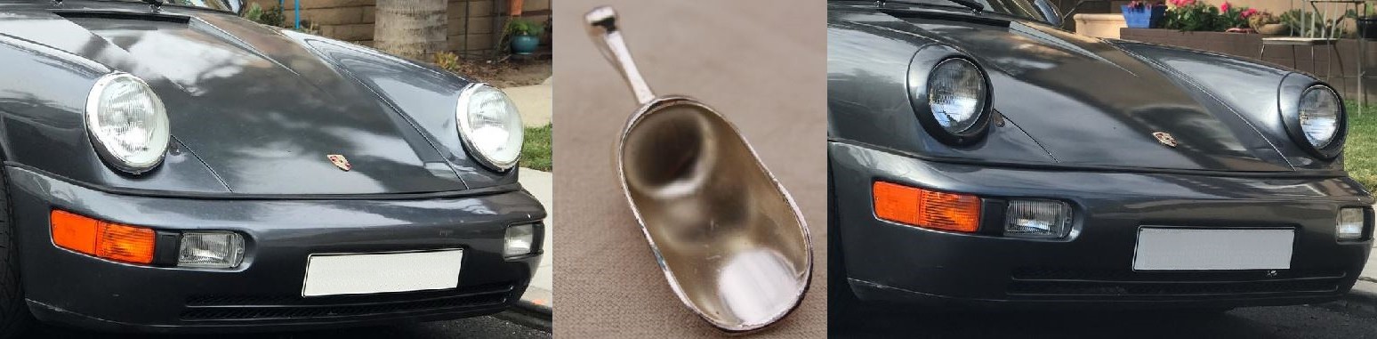
Thackery washer with wave.
A
Thackery washer is a specialized form of spring washer and in engineering
jargon, the “kink” in the centre section usually is described as a “wave” or “undulation”
although over the years there’s being a bit of “terminological inflation”, “notched”
and “wave bend”, “offset bend”, “spring convolution” and “waisted section” have
all been documented; the punchy “wave” seems the best choice. What the wave does is create the axial spring
compliance that lends a Thackery washer both its locking and preload characteristics. They were factory-fitted on several places on
MGAs and definitely one with a ⁵⁄₁₆ bore should be used in conjunction with the flex-mounts
for the carburettors, the specific compression achieved by tightening to leave 25-40
thousandths of an inch (0.635 mm) between the coils. Were non-waved spring washers to be used, the
requisite degree of flatness would not be achieved and the stresses induced
would thus be higher. This should also
been done on MGA Twin Cams used in competition (and is critical if they’re also
driven on the road). It’s an unusual
quirk of the engine that “extreme conditions” are encountered not on race tracks
at full throttle but while serenely cruising at 60-70 mph (95-110 km/h).

1962 MGA Deluxe Mark II roadster with "side screens" fitted (they were a considerable advance on the dreaded, flexible "side curtains"). What came
to be called the “MGA Deluxe” was first advertised as “MGA with Competition
Suspension option” (described in the factory parts books also as “All Round
Disc Brakes model” or “All Wheel Disk Brakes model”) and that was reasonable because
the configuration of those first built used the Twin Cam chassis but fitted
with an OHV engine. The platform did
however have to be modified so the combination of the Twin Cam type master
cylinders and the OHV style radiator and heater unit could both be fitted,
thus the variations in the shape of the heater shelf and the radiator mounting.
As a quirk, an uncertain number of the
very early–build “Deluxe” models included the removable vent panels in the
front inner wings, presumably only those produced before residual Twin Cam stock was absorbed. Production of the roadster & coupé
versions proceeded over two years, during which the 1600 Mark II was introduced
and many included some or all of an extensive range of equipment including the
Road Speed tyres, “competition seats”, close ratio gearbox, radio, badge bar
(then a big thing in England) and some of the roadsters had a bolt-on hard-top
(the desirable aluminium unit by Vanden Plas and, when stocks of those were
exhausted, the fibreglass version).

1962 MGA Deluxe Mark II roadster with the much admired aluminum hard-top by Vanden Plas.
All
the “Deluxe” run included the oil cooler and anti-sway bar so, considering the
higher level specification and price, “Deluxe” was as good a name as any and for those who prefer the rarest of anything, with only 35 of the build being coupés, that model
was the MGA with the lowest build number. The 395 "Deluxes" came at the end of MGA production, the last of both the standard and “Deluxe” editions leaving the line in June 1962 and that 395 were built was a product of the Twin
Cam venture prematurely being aborted.
According to the factory’s records, MG contracted with Dunlop for the
supply of at least 2,500 “kits” containing the wheels and disc brake
apparatuses so when the Twin Cam was dropped there were some 400
kits in the warehouse; the “Deluxe” model was concocted just to absorb these
parts and thus recoup the cost.
Presumably MG must have had more parts on hand because some would have
been retained as spares but definitely the “Deluxe” was a “model of necessity”
and other manufacturers later would use the same trick.