Button
(pronounced buht-n)
(1) A small disk, knob, or the like for sewing or
otherwise attaching to an article, as of clothing, serving as a fastening when
passed through a buttonhole or loop.
(2) Anything resembling a button, especially in
being small and round, as any of various candies, ornaments, tags,
identification badges, reflectors, markers, etc.
(3) A badge or emblem bearing a name, slogan,
identifying figure, etc., for wear on the lapel, dress, etc.
(4) Any small knob or disk pressed to activate an
electric circuit, release a spring, or otherwise operate or open a machine,
small door, toy, etc.
(5) In botany, a bud or other protuberant part of
a plant.
(6) In mycology, a young or undeveloped mushroom
or any protuberant part of a fungus.
(7) In zoological anatomy, any of various small
parts or structures resembling a button, as the rattle at the tip of the tail
in a very young rattlesnake.
(8) In boxing slang, the point of the chin.
(9) In architecture, a fastener for a door,
window, etc., having two arms and rotating on a pivot that is attached to the
frame (also called turn button).
(10) In metallurgy, when assaying, the small
globule or lump of metal at the bottom of a crucible after fusion.
(11) In fencing, the protective, blunting knob
fixed to the point of a foil.
(12) In horology, alternative name for the crown,
by which watch is wound.
(13) In the graphical user interface of computers
and related devices, a small, button-shaped or clearly defined area that the
user can click on or touch to choose an option.
(14) Slang term for the peyote cactus.
(15) A small gathering of people about two-thirds
of the drinks are spiked with LSD. Those
who drink the un-spiked are the buttons responsible for babysitting the
trippers (1960s west coast US use, now extinct).
(16) A series of nuts & bolts holding
together a three-piece wheel. Such
wheels are very expensive because of the forging process and the ability to
stagger offsets to create large lips.
(17) In boiler-making, the piece of a weld that
pulls out during the destructive testing of spot welds
(18) In rowing, a projection around the loom of
an oar that prevents it slipping through the rowlock.
(19) South African slang for methaqualone tablet.
(20) A unit of length equal to one twelfth of an inch
(British, archaic).
(21) Among luthiers, in the violin-family
instrument, the near semi-circular shape extending from the top of the back
plate of the instrument, meeting the heel of the neck.
(22) In the plural (as buttons), a popular nickname for young ladies, whose ability to
keep shirt buttons buttoned is in inverse proportion to the quantity of strong drink
taken.
1275-1325: From the Middle English boto(u)n (knob or ball attached to another body (especially as used to hold together different parts of a garment by being passed through a slit or loop)), from the Anglo-French, from the Old
& Middle French boton (button
(originally, a bud)), from bouter & boter (to
thrust, butt, strike, push) from the Proto-Germanic buttan,
from the primitive Indo-European root bhau-
(to strike); the button thus, etymologically, is something that pushes up,
or thrusts out. Records exist of the surname
Botouner (button-maker) as early as the mid-thirteenth century (and the Modern French noun bouton (button) actually dates from the twelfth century). It was cognate with the Spanish boton and the Italian bottone. The pugilistic slang (point of the chin) was first noted in 1921. First use of button as something pushed to
create an effect by opening or closing an electrical circuit is attested from
1840s and the use in metallurgy and welding is based by analogy on descriptions
of mushrooms. The verb button emerged in the late fourteenth century in the sense of "to furnish with buttons" which by the early 1600s had extended (when speaking of garments) to "to fasten with buttons". The button-down shirt collar was first advertised in 1916. In
fields in which there are structures or entities which in part or in whole are “buttonlike”
in appearance, there are many uses of “button” as a descriptor (button
mushroom, button seal, button willow, button quail etc), botany, zoology anatomy,
architecture, cooking and engineering all using the word thus. There are also a number of idiomatic forms
including “cute as a button” (very cute), “on the button” (correct) and “buttoned
down (or up)” (conservative to the point of being repressed.Button is a noun & verb, buttoning is a noun & verb, buttoned is a verb & adjective, buttonize is a verb, and buttonlike & buttonable are adjectives; the noun plural is buttons.

John Button (1987) (1933-2008; senator for Victoria (ALP (Australian Labor Party) 1974-1993), oil on canvas by Andrew Sibley (1933–2015),
National Portrait Gallery, Canberra, Australia.
New uses continue to emerge as technology evolves: The phrase button-pusher to describe someone "deliberately annoying or
provocative" was first recorded in the 1970s and hot-button issue appeared in political science journals as early as
1954, apparently a derivation of the brief use in the press of big red-button and hot-button to (somewhat erroneously) describe the mechanics of
launching a nuclear attack. Hot button issues can be useful for political parties to exploit but what the button triggers can shift with generational change: As late as the 1990s the Republican Party in the US used "gay marriage" as a hot button issue to mobilize their base but within 25 years the electoral universe had shifted and the issue no longer had the same traction; there had been generational change. In the 1980s, the now mostly extinct button-pusher had been co-opted as a somewhat condescending description of photographers both by journalists
and snobby art critics, the former suggesting some lack of affinity with words,
the latter, an absence of artistic skill.

How it came to be done:
2022 Mercedes-Benz EQS 56 inch (1.42 m) single-panel
screen. There are no physical buttons on the dashboard, something which provoked a reaction and, for certain critical features, there's been a welcome "button revival".
In cars, as in aircraft, the shifting of controls for core and ancillary
systems from individual buttons and switches to combined or multi-function
controllers began to accelerate during the 1960s, a reaction to the increasing
number of electrically activated functions being installed to the point where, if
left individualised, in some of the more electronic vehicles, space for all the
buttons would have been marginal and ergonomics worse even than it was. Some very clever designs of multi-function
controllers did appear but in the twenty-first century, by the time LED flat-screen
technology had become elsewhere ubiquitous, it became possible to integrate
entire system control environments into a single screen which, able to display
either one or a combination of several
sub-systems at a time, meant space became effectively unlimited, arrays of virtual buttons and switches available in layers. That didn't mean thing became easier or more convenient to use but production costs were lower. Of late, in response to consumer pressure, some manufacturers have admitted the approach went to far and what might be appropriate for someone sitting at their desk using a desktop PC (and the only way things can be done on a phone), might not be a good idea when driving a car at speed, in traffic. Thus, for core critical functions (ie those drivers most often perform) such as adjusting settings on entertainment and HVAC (heating, ventilation & air conditioning) systems, buttons are making a welcome comeback.

For those who can remember the ways things used to be done: 1965 Jaguar Mark X 4.2 with burl walnut & red leather. Jaguar's cockpits in the 1960s were among the most atmospheric of the era although, even at the time, the less than ideal ergonomics attracted criticism. Something has been lost with the decline of the sensual, tactile, analogue world of buttons, knobs & switches.
There were buttons and there were switches. Jaguar used toggle switches until US safety regulations in 1967 compelled a change to rocker switches with softer edges and less forward projection, similar concerns resulting in the top section of the dashboard gaining a padded vinyl covering. Indeed, at the time, there was in the UK and Europe a suspicion US regulators might ban the use of decorative timber in car interiors and the models Mercedes-Benz released in 1971 & 1972 had none but the austerity didn't last, the veneers soon restored. The functionality of the rocker switches was exactly the same as that of the toggles and they were certainly less prone to damage but for some the tactile experience was lacking, the ASMR less satisfying. ASMR (Autonomous Sensory Meridian Response) describes the physical & psychological pleasure derived from specific stimuli (usually a sound). A highly segmented market, among the aficionadi there are niches as varied as those who relish the clicking of an IBM Seletric typewriter or Model M keyboard, the sight & sound of South Korean girls on TikTok eating noodles, the mechanical precision of the fore-end slide of pump-action shotgun being operated or the flicking of toggle switches.
The accounting departments of car manufacturers liked
the change to touch-screens because it was cheaper to produce and install the things rather than an array of
individual buttons, switches, instruments and lights, behind each of which ran at least one and sometimes several wires or lines, requiring schematics that could be
baffling even to experts who needed sometimes to track (literally) miles of cabling.
While now using sometimes even more wiring, the new systems are capable although their long-term reliability remains uncertain and in many cases, a button or switch is both easier to use and falls more conveniently to hand; that makes sense because with buttons one's sense of touch (finger-tips most sensitive) effortlessly can distinguish whereas all of a touchscreen feel the same. It would be possible to make a a touchscreen "feedback" different vibrations or sounds depending on which icon is touched but that may create more problems than it solves and is anyway a complicated solution to a simple problem. It's better just to provide some switches.

1991 Mercedes-Benz 600 SE (W140).
Built on the SWB (short-wheelbase) platform, the 600 SE was offered only during the W140's first year, the V12 sedans subsequently available only as the LWB (long-wheelbase (V140)) 600 SEL (S 600 after 1993 when the corporate naming system changed). The duplication on the glovebox of the
trunk (boot) lid badging was also a single-year fitting and even if a buyer opted for the "badge delete option" the characters on the glovebox remained. The badge delete option had existed for a long time but enjoyed a spike in popularity beginning during the 1970s when it became obvious the more expensive models were more likely to attract the eye of terrorists, kidnappers and such. While outfits like the
Baader–Meinhof Gang (technically the RAF (Red Army Faction)) had some fondness for stealing smart cars (the
BMW
2002 tii and Porsche 911S apparently their favorites), they didn't approve of those driving (or being driven in) conspicuously expensive vehicles. On the 450 SEL 6.9 (V116, 1975-1980), the factory's delete option code was 261 and in the FRG (
Bundesrepublik Deutschland (Federal Republic of Germany; the old West Germany) 1949-1990) it was ticked by those who like to go fast on the Autobahn but not attract the attention of kidnappers or
assassins. One advantage the 6.9 did confer was, if pursued by kidnappers, one could outrun the BMWs and all but the fastest Porsches.
The noun buttonology
genuinely does exist. It was a calque of
the Swedish knappologi and
used to refer to the
fashion for pedantic and often pointless systematization. The construct followed the Swedish model (knapp (button) + -ologi,
coined by Swedish
author August Strindberg (1849–1912) and appearing in the short story De lycksaliges ö (The Isle of the
Blessed) which although written in 1884, wasn’t published until 1891 when it
appeared in the compilation Svenska öden
och äventyr (Swedish Destinies and Adventures). Buttonology is used most often as a generic
term to decry the exaggerated, obsessive or pointlessly pedantic
systematization, especially of trivial subjects but literally it can describe the
study or categorization of buttons (in the sense of clothing fasteners). In a light-hearted vein, in the training of software
engineers and designers, it’s the component of the course focusing on user
interfaces (where there can be many buttons).
In US military slang, buttonology is used of user interfaces generally.
Button porn: Centre console in 1991 Mercedes-Benz 600 SEL (V140).
Although a sight to delight button-nerds, "peak button" unfortunately coincided with the "biodegradable wiring incident" (1991-1995) in which the soy-based insulation for the cables deteriorated some decades before the supplier's projected end-of-life, the issue exacerbated by the taste of soy which would attract rodents and other creatures happy to chew on the stuff for a quick snack. The basic shape of the gear selector knob dates from one introduced in 1971, the design a product of analysing data from the Swedish government's
mandatory post mortems (autopsies) of road-accident fatalities (under Swedish law, such corpses were for 48 hours the property of the state). What the pathologists' findings revealed was lives could be saved if engineers could devise as a shift lever handle too large to penetrate the eye socket. While there's an element of the
macabre in such research and it wasn't something the factory choose widely to publicize, the design was a classic example of what's called "
passive safety".
A tanned young lady in a bikini with a piece of belly button jewellery (sold also as "navel jewellery").
The 140-series sedans (1991-1998) and companion coupé (C140, 1992-1999) were peak-button and it won't happen again, touch-screens now much cheaper to install and although buttons are making something of a comeback, they'll not again be seen on such a grand scale. The 140-series cars were end-of-era stuff in many ways and the last of the old-style exercises in pure engineering with which Mercedes-Benz re-built its reputation in the post-war years; what followed would increasingly show the influence of accountants and the dreaded "sales department". Most charismatic of the 140s were the early, 402 bhp (300 kw) 600s tuned for top end power; the 6.0 litre (365 cubic inch) V12 (M120; 1991-2001 (although it would appear in cars by other manufacturers until 2012)) would later be toned-down a little with a greater emphasis on mid-range torque and thoughts of the 8.0 litre V16 and W18 prototypes entering production were shelved as the economic climate of the early 1990s proved less buoyant than had been expected. Subsequent concerns about climate changed doomed any hope of resurrection but as something of a consolation, AMG for a while offered larger versions of the V12 (as big as 7.3 litres (445 cubic inch)). Diana, Princess of Wales (1961-1997) died in her hotel's hire-car (S 280 with a 2.8 litre straight-six (171 cubic inch)) version of the 140.
Coincidently, it was in the "peak button" era that Mercedes-Benz revised the convention of model nomenclature, inverting the alpha-numeric placement which had evolved since the 1920s. Until the 1980s, old nnn.xxx convention (mostly) made sense once the logic behind the sequence had been explained but even then there had long been inconsistencies with the letters doing "double duty" and the numerals not always aligning with displacement (as well as one off aberrations like "219") but by the 1990s the proliferation of ranges and models had made the old system more or less unmanageable. Every series of cars was changed but most affected were the various C140s and they were especially unusual in being the last of the “SECs” and the first of the “CLs” with a mid-life spent as an “S”, the confusing alpha-numeric trajectory of the C140 600 being:

1992 600 SEC (Not sold in North America)
1993 600 SEC (Global)
1994-1995 S 600 (Global)
1996-1997 S 600 (North America) & CL 600 (RoW (rest of the world))
1998 CL 600 (Global)
1999 CL 600 (North America only)
1993
Cadillac Allanté in standard form (left) and with “wood
grain kit” fitted (right).
Cadillac in
the peak-button era did its bit and for most owners the look either was “enough”
or “too much” but although the Allanté was then a very different sort of Cadillac targeting a demographic younger
than the marque’s usual buyer profile, third party suppliers (which for
generations had been selling all sorts of Cadillac accessories of dubious taste
such as Rolls-Royce style grills & badges in anodized gold or “neo-classical”
external spare tyre housings) saw possibilities and offered “wood grain kits”, pieces of plastic appliqué which could be added atop accommodating interior surfaces. Never fitted by the factory, the “plastic wood” must have had a certain appeal because Allantés so adorned are not uncommon and at least four different companies at times produced the kits which were offered in Dark Cherry, Medium Cherry, Burlwood, Oak and Teak. Some Cadillac dealers did carry the kits as “dealer-fitted accessories” and to gain a sale, the staff would sometimes bundle the supply and fitting with the purchase price. If sold subsequently, there the usual “fitting fee” but being self-adhesive, it wasn't a difficult or time-consuming task. The impressive
Delco-GM/Bose Symphony Sound System (a US$905 option in any other Cadillac) was
fitted to the Allanté for its first six seasons (a 100 watt unit used 1987-1990,
upgraded to 200 for 1991-1992) while the models built in 1993 received the
cheaper Delco-GM/Bose Premium Symphony Sound System; for audiophiles, the
difference was obvious. Despite that and
other examples of cost-cutting “de-contenting” such as the loss of the genuine
Recaro seats, the 1993 Allantés are preferred by some because of the use of the
4.6 litre (281 cubic inch) Northstar V8 which was (mostly) a good design
except for a design flaw which meant head gaskets often failed. The fix was simple but time-consuming (and
thus expensive) and there was also the quirk of the starter-motor being located under the induction; that demanded
removing the fuel-injection apparatus were a replacement needed.
1991 Cadillac Allanté: Although the lines were neither adventurous or innovative, it was an accomplished design.
The
Cadillac Allanté (1987-1993) was an ambitious project, a two-door, two-seater roadster
produced in an expensive, travel & labor-intensive process which required
trans-Atlantic transport (in modified Boeing 747 freighters) for the bodies
from Pininfarina’s Italian factory to Cadillac’s assembly line in Detroit where
final assembly was undertaken. The US
industry had in the 1950s & 1960s dabbled with this approach and even then
it made little financial sense but it was a time when indulgences could be
tolerated as a part of “image building”.
The economics of the late 1980s were very different but Cadillac early
in the decade had, with a mix of jealousy and lust, been pondering the numbers
achieved by the Mercedes-Benz R107 SL roadster (1971-1989), then quite ancient
in automotive terms yet still habitually selling in numbers which belied its
high price and vintage design. Sharing
mechanical components with higher-volume models and with the tooling for the
structure long since amortized, Cadillac knew the thing was absurdly profitable
despite being visually almost unchanged since its debut.
1988 Cadillac Allanté: One tangible advantage was the Allanté's removable hard-top was of
aluminum and thus a relatively
svelte 58 Lbs (26 kg) compared with the R107's steel unit which weighed in at a hefty 96 (44). Roof-mounted hoists were popular with R107 owners.
T
hus the
Allanté, the company’s first two-seat roadster since the 1930s and one with the
exclusivity of being built by an Italian coach-builder famous for having
designed some of the most admired Ferraris.
Mechanically, the Allanté was unchallenging in that it was built on a
shortened version of an existing platform which meant the use of FWD (front
wheel drive) and the 4.1 litre (250 cubic inch) HT-4100 V8, both factors which
meant there was no need to build new assembly lines or make expensive changes
to existing facilities. While the notion
of an expensive “FWD roadster” may now seem strange, dynamically it made less
difference than might be imagined because the Mercedes-Benz R107 was no sports
car and for the Allanté’s intended market, the advantage of more interior space
was thought more important than behaviour on a skid-pan. The HT engine however proved more troublesome
although that was a product of design flaws, not its placement in the Allanté.
Buttons come in many shapes, shades and sizes although most still are circular. A button with four "sew holes" is called a "four-eye button".
The critical response was
unexpectedly favorable. In a comparison test published in the in February 1989 edition of C&D (Car and Driver
magazine, not noted for being lavish in its praise of the US industry’s output), the writers declared it a
better car than the Mercedes-Benz 560 SL (which may seem a slight achievement given the R107 was then some 18 years old and on a platform which had been designed in the late 1960s) and didn’t much dwell on either the Cadillac being some 15%
cheaper nor it delivering slightly better fuel economy; their judgement was all about the driving experience likely to be typical of buyers (many of whom probably wouldn't notice the difference between FWD and RWD) although perhaps the sight of the “Pininfarina” script on the flanks lent some rose-tinting to their spectacles. The testers noted
the US-Italian hybrid was better suited to the urban conditions where most people
would be operating most of the time, finding the Allanté more nimble and decidedly more
modern although what was left unstated was it was remarkable the trans-continental
effort managed to be only slightly better in some aspects than what was a design two decades old and in its final months.
Last
days of the baroque: 1989 Mercedes-Benz 560 SL in Light Ivory over Brasil Dark
Brown leather.
The RoW (rest of the
world) R107s & C107s didn't suffer the disfiguring modifications
(headlights for the whole model life, bumper bars after 1973) fitted to the NA
(North America) market cars to ensure compliance with various US regulations. In the US, there's now a minor industry importing the RoW headlights and bumper bars to restore cars to the appearance the designers intended. Although the R107 lacked the delicate elegance of its predecessor (the W113 “Pagoda”; 230/250/280 SL, 1963-1971) the design has aged well and despite the large volume made, retain a following, the most sought being the rare 350 SLs with a four-speed manual transmission, the 500 SLs (the most powerful) and the 560 SLs (the most refined). As a quirk of use, although the R107 also has a removable hardtop which uses the pagoda motif, it's only the W113 which is referred to thus.
In
one area though, the 560 SL proved its mettle, the 5.5 litre (338 cubic
inch) V8 out-running the Cadillac by 10 mph (16 km/h) in top speed and
effortlessly out-accelerating it in any range about 25 mph (40 km/h), the
advantage increasing as speeds rose.
Despite all the effort and expense, in some seven years, fewer than 21,500 Allantés
were built while Mercedes-Benz shipped 237,287 R107s plus 62,888 LWB coupés (C107, 1971-1981) on the same platform, an average annual
build rate over 18 years of some 17,000, two-thirds of which were exported to
North America where, in places like Los Angeles, they were for decades the preferred (one suspects almost obligatory) transport for types such as interior decorators, successful hairdressers, the wives of cosmetic surgeons and bare-shouldered Hollywood starlets. Had Lindsay Lohan in 1989 been of age, she'd have been at the wheel of a 560 SL. Cadillac has had its failures (infamously the Cimarron) but it's believed never to have booked more of a loss on a single model than was the accountants' final reckoning of the (by then virtual) red-ink in which the Allanté's numbers were written. By comparison, the write-down suffered with the cancellation of the division's remarkable Blackwing V8 (2018-2020) was relatively modest.

1933
Cadillac 355C Coupe Convertible. In 1933, Cadillacs had
buttons but not many because there was then not so much stuff to activate although a
valve-radio was on the options list. As
a nice touch (and a hint Cadillac understood their target market), a “golf bag compartment” was
fitted behind the passenger’s door. The external trunk and folding luggage rack were optional extras.
Introduced for
1931 as a lower cost range because the effects of the Great Depression drastically had reduced demand for Cadillac’s V12 & V16 lines, the V8-powered 355s (1931-1935)
were, until the Allanté in 1987, the last Cadillac to be offered as a two-seat
convertible although La Salle (its lower-cost stable mate) would offer the
style as late as 1940, the year the brand was retired after a seven year stay
of execution. Cadillac called the
coachwork a “Convertible Coupe” because “roadster” was associated with smaller,
lighter machines; had it been built in England this would be dubbed a DHC (drop
head coupé) while continental manufacturers would have preferred “cabriolet”. In the elaborate Mercedes-Benz naming system it would be a “Cabriolet A”
which designated “a two, door, two seat cabriolet with no rear quarter glass
panes”. The existence of supplemental passenger accommodation in the rumble seat does not affect the use of “Cabriolet A” because (1) Daimler-Benz never created a designation to describe the configuration (although “Cabriolet E” seems not to have been allocated if the factory is in the mood for retrospection) and (2) “Cabriolet A” anyway included certain models with provision for a third occupant in the rear of the passenger compartment.

1933 Cadillac 355C Coupe Convertible.
Somewhat
unusually for the industry, Cadillac’s alpha-numerics were from day one locked
in (355A (1931), 355B (1932), 355C (1933), 355D (1934) & 355E (1935)) so
the “A” was not a retrospective appendage, unlike the Chrysler 300A which (informally)
became the description of the 1955 C-300 only after, impressed by the sales of
what had been intended as a one-off model to homologate parts for use in competition,
the company for 1956 released the 300B. Retiring the 355 range after 1935 meant Cadillac in 1939 never had to
face the problem which afflicted not only Chrysler (when updating the 300H) but
also bra manufacturers (what to slot-in between a 32H & 32J?) and the USAF
(US Air Force) (when updating the Boeing B-52H).
The issue always was the desire to avoid an “I” being confused with a
numeric “1”. Chrysler and Boeing solved
the problem by skipping the letter “I” and going straight to “J” while in the
bra business there are very few “I cups”, the usual convention being to offer an
“HH” (“double-H” in retail slang) or a “J”.
Although nominally a two-seater, three (snugly) could be accommodated and
two more could fit in the rumble seat, the so-called “mother-in-law seat”, an
appellation which makes most sense if she’s put there while the soft-top is in
the raised position. Unlike the Allanté,
the 355 Coupe Convertibles were bodied in the US by Fisher, a GM (General Motors) coach-building
division which was shuttered in 1984.
Reset button on early (clone) PC.
The
stability of the PC (personal computer) has improved since August 1981 when the
first IBM PC-1 appeared, triggering several waves of transformative changes
which profoundly have altered the world; the AI (artificial intelligence) cycle
is merely the latest of these “revolutions” and is unlikely to be the last. One feature common on PCs during their first
two decades of existence was the “reset button”, an oft-resorted to device
because of the propensity of the things to “freeze” or lock-up, rendering the keyboard
(until the late 1980s, mice were rare, expensive and used mostly by a lunatic
fringe) useless. While it might seem a redundant
feature given each machine came with an on/off switch or button, the two
performed distinct functions related to the limitations of the hardware and
operation systems of the era. The on/off
switch performed a “cold start”, cutting and then restoring power to all
components, an inherently slow and potentially stress-inducing process. By contrast, the reset button triggered a “warm
reset” which electrically asserted the CPU’s (central processing unit) RESET
line (which, as implemented by many manufacturers, also often often reset the
system bus) without cutting power; what it did was immediately restart
execution at the firmware’s entry point (BIOS (basic input output (I/O) system) on genuine IBM PCs) while leaving
the power-flow to the system uninterrupted.
The most obvious practical advantage of using the reset button was a
faster restart and a reduction in mechanical wear on hard & and floppy
drives by not subjecting them to spin-down & spin-up cycles.
Front panel on early (clone) PC.
The key (to the right, below the on/off power switch) enabled users to "lock" the keyboard, preventing use of the machine. This mechanical security layer was required because the early operating systems had no accounts requiring a login and no password protection, meaning anyone who turned the thing on had unfettered access (very few programs offered application-level security). The "Turbo" button was there to permit users to "throttle-back" to CPU to the 4.77 MHz speed used by the 8086 & 8088 CPUs in the original PCs. That was needed to ensure some older software (especially games) would still run on newer hardware, running at a dazzling 7.16 or 9.54 MHz.
Because
almost all the early operating systems (PC/MS-DOS, CP/M-86 and the various UNIX
ports) had no memory protection and only primitive fault recovery, a single
misbehaving program could (1) disable the interrupts upon which hardware
depended, (2) corrupt the system state and (3) make the keyboard wholly unresponsive. Not only did all these things happen, they
happened with some frequency so the advantages of the reset button offered were a
real benefit to users. The hardware also
enjoyed a protection layer because the power switches on early PCs were "hard
mechanical mains" switches, often directly switching line voltage which meant rapid
power cycling could stress the power supply, cause voltage transients harmful
to expansion cards and risk data corruption or loss because robust “parking”
mechanisms were rare on the early hard drives.
As operating systems gained protected mode, multitasking, and graceful
reboot mechanisms, the need for reset buttons diminished and gradually they
disappeared from the standard specification.
Wall of 1000 buttons (actually 1,048) at Shimada Electric Manufacturing Company's OSEBA button theme park.
It’s not
known how many theme parks currently operate around the planet but it’s
estimated there are at least hundreds and there may be more than a thousand. What can however be said with certainty is
(1) all theme parks will have some buttons and (2) the world has only one “button-themed
park”. Opened in 2024 (presumably with
the “press of a button”) OSEBA is operated by the Shimada Electric
Manufacturing Company, a company founded in 1933 and specializing in elevator
buttons which has for decades maintained an enviable reputation for producing high-quality
equipment for elevators, both standard items and customized, decorative
fittings. The theme park’s appeal is
essentially twofold: (1) the remarkable variation in appearance of buttons and
(2) the tactile joy of pushing buttons. Shimada
was encouraged to enter the theme park business after noting the tours of its
factory had for some time massively been over-subscribed with the company having
the capacity to satisfy less than 1% of demand for places. OSEBA is located in the city of Hachiōji and
sits next to Shimada’s factory, the advertising noting it is a convenient 15-minute
walk from the Keio-Hachioji Train Station.
Inside the OSEBA button theme park.
Thoughtfully
designed in the Japanese manner, the theme of the experience is (predictably) “pressing
buttons” but as well as being interactive, things are done in a way which
builds anticipation because although the standard instruction is: “Push the
button, and something will begin”, one can never predict quite what. Sometimes it’s as simple as various pairs of
choices (food, anime characters and such) with cumulative totals appearing, allowing
visitors to understand how their preferences align with those of others. It sounds simple but it’s popular although apparently
not as addictive as the “wall of a thousand buttons” (there are actually 1,048
because symmetry is important in Japan) where one “races the clock” to press as
many buttons as possible within 30 seconds ; in a country renowned for serious
weird hobbies, it’s almost conventional.
More visually intriguing is the immersive “Infinite Elevator Box” which
uses dynamic, colorful visuals to create a feeling of movement, even while
remaining static. Apart from the “Play” stuff,
OSEBA also has a “Learn” area which focuses on the company’s history and craftsmanship.

Reset button: Sergey Lavrov (left) and crooked Hillary Clinton, Geneva, 2009. The delicious irony is that one of crooked Hillary's few diplomatic successes came from a mistake in translation.
Having
failed in 2008 to secure the Democratic Party’s nomination to contest that year’s
presidential election, crooked Hillary Clinton (b 1947) between 2009-2013 to
the consolation prize of becoming US secretary of state, the job she decided was
a prelude to her becoming POTUS in 2016, a position to which she believed she
was entitled. Things didn’t quite work
out as she’d hoped and her tenure at Foggy Bottom was marked by scandal
(related, predictably, to her chronic untruthfulness) but one potential “diplomatic
incident” was allowed to pass without adverse comment on the basis “she meant well”. Following a not untypically troubled recent past, Barack Obama (b 1961; POTUS 2009-2017) decided to
try to improve Washington’s relations with the Kremlin.
As a gesture in this vein, in 2009, crooked Hillary presented Sergey
Lavrov (b 1950; Russian Minister of Foreign Affairs since 2004) with a red button (of the type often
used in heavy machinery as an “emergency stop”) on which was printed “Reset”
and a Roman alphabet transliteration of the Russian Cyrillic перегрузка (peregruzka). The idea was, with the arrival in Washington
of a new administration, the two states should “re-start” their relationship
and try to pretend to forget as much as possible of the past. Unfortunately, the department got the
translation wrong and used the Russian word for “overload”; it should have read перезагрузка
(perezagruzka). Mr Lavrov however was
also at the time anxious to improve things and accepted the gift in the spirit
in which it was intended, he and crooked Hillary pushing the button
simultaneously for several photo opportunities.
Lindsay
Lohan’s belly button adorned with belly button jewellery, Los Angeles, 2009.
The noun buttonology genuinely does exist. It was a calque of the Swedish knappologi and used to refer to the fashion for pedantic
and often pointless systematization. The
construct followed the Swedish model (knapp (button) + -ologi,
coined by Swedish
author August Strindberg (1849–1912) and appearing in the short story De lycksaliges ö (The Isle of the
Blessed) which although written in 1884, wasn’t published until 1891 when it
appeared in the compilation Svenska öden
och äventyr (Swedish Destinies and Adventures). Buttonology is used most often as a generic
term to decry the exaggerated, obsessive or pointlessly pedantic
systematization, especially of trivial subjects but literally it can describe the
study or categorization of buttons (in the sense of clothing fasteners). Obviously, practitioners of buttonology are buttonologists. In a light-hearted vein, in the training of software
engineers and designers, it’s the component of the course focusing on user
interfaces (where there can be many buttons).
In US military slang, buttonology is used of user interfaces generally.
Childless
cat lady Taylor Swift (b 1989) with Ragdoll Benjamin Button, named after the eponymous
character in the movie The Curious Case
of Benjamin Button (2008), Time Magazine cover for “Person of the Year” edition, 25 December, 2023. Ragdoll cats make good stoles because
(attributed to a genetic mutation), they tend to “go limp” when picked
up.
An owner of three most
contented felines, gleefully, Ms Swift in 2024 embraced the appellation “childless
cat lady” after wide publicity of its earlier use as a slur by James David (J.D.)
Vance (b 1984; VPOTUS since 2025), something prompted by Mr Vance being
named as Donald Trump’s (b 1946; POTUS 2017-2021 and since 2025)
running-mate in the 2024 US presidential election. The now famous phrase had been used in a 2021
interview with then Fox News host Tucker Carlson (b 1969) when he lamented the decline in the state of the nation: “…we are effectively run in this country via the Democrats,
via our corporate oligarchs, by a bunch of childless cat ladies who are
miserable at their own lives and the choices that they've made and so they want
to make the rest of the country miserable too.” Mr Vance may have struck an electoral chord because
while Kamala Harris (b 1964; US vice president 2021-2025) presumably gained the
childless cat lady vote, the Trump-Vance ticket won the election: 77,302,580 (49.8%) to 75,017,613 (48.3%) in the popular vote and 312 to 226 in the Electoral College on a turnout of 64.1%.

Pressed or pushed, many buttons needed.
The literal (physical) button-hole was noted in
tailoring first during the 1560s, the figurative sense "to detain
(someone) unwillingly in conversation” dating from 1862, a variation of the
earlier button-hold (1834) and button-holder (1806), all based on the image is
of holding someone by the coat-button so as to detain them. The adjectival push-button (characterized
by pressing a button used to activate something) emerged in 1945 as a consequence of the increasing public appreciation of the extent to which military weapons systems had become electronically controlled. The earlier form “push-buttons" was from
1903, a modification of the noun push-button (button pressed with the finger to
effect some operation) from 1865, then applied to mechanical devices. The earlier adjectival form was “press-button”
(1892) derived from the noun (1879). For
no apparent reason, it was the earlier “press of a button” which tended in the
1950s & 1960s to be preferred to “push of a button” to express the concern
felt at the ease with which the US and USSR could trigger global thermo-nuclear
war although “flick of a switch” also achieved much currency. None were exactly usefully descriptive of a
complex chain of events but it’s true that in a launch of nuclear weapons, many buttons and
switches still are involved.
Highly qualified content provider Busty Buffy (b 1996) during “button-theory” test session. Button theory involves trying on “button-up” tops of various sizes and subjecting each to normal human movement, the test “passed” when no buttons “pop open”.
In fashion, the number of a top’s buttons “left undone” is a signifier of various things and the range extends from “all done up” to “all undone”, the latter usually restricted to catwalks and red carpets when stability of fabric sometimes is achieved with the use of adhesive, double-sided tape. While not culturally specific, the meanings signified by the number left undone (usually from top-to-bottom) can differ depending on certain circumstantial variables (time, place, temperature, wearer, presence of paparazzi etc). 
No fear of button theory: Button
theory suggests buttons can be done-up or undone. Noted empiricist Lindsay Lohan has for some
years been undertaking a longitudinal study to test theory.
The fear
of buttons is koumpounophobia, the construct being the Modern Greek κουμπί
(koumpí) + -phobia and
the word, like many describing phobias is a neologism. Koumpi was from the Ancient Greek κομβίον
(kombíon) translates as button in its two literal senses (a fastener for
clothing or a device for instrument or remote mechanical control). A button in Greek is thus κουμπί (koumpí) (the
plural κουμπιά) and the verb is κουμπώνω (koumpóno). In the Ancient Greek the lexemic unit koump- didn’t
exist although it did have κομβίον (kombíon (which exists in Modern Greek as komvíon))
which meant buckle. It may seem as strange
omission because Ancient Greek had κουμπούνω, (koumpouno) which meant “to
button” but the root was κύαμος (komos or koumos) meaning “broad
bean” and, because there were no buttons in the Greece of Antiquity, they used
appropriately sized & shaped beans as clothes fasteners. The construct of koumpouno (to button) koum(os)
+ + πονέω (poneo) (to work; to exert), the
idea of a bean which is used again and again.
The suffix -phobia (fear of a specific thing; hate, dislike, or
repression of a specific thing) was from the New Latin, from the Classical
Latin, from the Ancient Greek -φοβία (-phobía)
and was used to form nouns meaning fear of a specific thing (the idea of a
hatred came later). In medicine, the absence of the belly button is a rare congenital defect, the medical term for which is omphalocele, usually something ultimately of no physiological significance but because it can cause psychological distress, plastic surgeons can re-construct one, a relatively simple procedure. The alternative for an omphalocelic is to shun omphalophiliacs and hook up with someone who suffers omphalophobia (fear of the belly button); they should live happily ever after. The phobia koumpounophobia is unrelated and references only the manufactured objects.

Lindsay Lohan in
trench coat buttons up. As fashionistas know, with a trench the
belt is tied, only the military buckling up.
So,
in the narrow technical sense, an etymologist might insist koumpounophobia is
the fear of clothing fasteners rather than buttons of all types but that seems not
helpful and it’s regarded as a generalised aversion and one said sometimes
associated with kyklophobia (the fear of circles or other round objects) and
especially the surprisingly common trypophobia (fear of holes (particularly if
clustered or in some way arranged in a pattern)). Estimates of the prevalence
of the condition have been given by some but these are unverified and it’s not
clear if those who for whatever reason prefer zips, Velcro or some other
fastener are included and with phobias, numbers really should include only
those where the aversion has some significant impact on life. The symptoms suffered can include (1) an
inability to tolerate the sight, sound, or texture of buttons, (2) feelings of
panic, dread, or terror when seeing or thinking about buttons, (3) an acknowledgment
that the fear is either wholly irrational or disproportionate to the potential danger. Koumpounophobia reactions are usually
automatic & uncontrollable and the source may be unknown or experiential
(exposure to some disturbing imagery or description of buttons or an actual
event involving buttons such as swallowing one when a child). Like many phobias, the physical reactions can
include a rapid heartbeat, shortness of breath, trembling, excessive sweating,
nausea, dry mouth, inability to speak or think clearly, tightening of stomach
muscles, and an overwhelming desire to escape from button-related situations. All are likely to involve an anxiety attack to
some extent and the recommended treatment is the staggered exposure therapy used
for many phobias; the patient slowly learning to wear, use and live with
buttons; antidepressants, tranquillisers & beta-blockers are now considered
medications of last resort.

Buttons are hard to avoid.
What
is sometimes treated as koumpounophobia can be a manifestation of a different
phobia. In the literature there are
examples of buttons triggering anxiety when touched or viewed but the reaction was
actually to texture, color or a resemblance to something (typically a face,
mouth or teeth as in many instances of pareidolia). The button is thus incidental
to the reaction in the same way that those with mysophobia (in popular use the
germophobic) may react to buttons because of the association with uncleanliness. One documented aspect of obsessive compulsive
disorder (OCD) is that many sufferers immediately wash their hands after
touching a button; the increased prevalence of this behaviour during the COVID-19
pandemic in relation to buttons touched by other (keyboards, elevators etc) is
not thought indicative of a phobia but would be if it manifests as life-long behaviour.
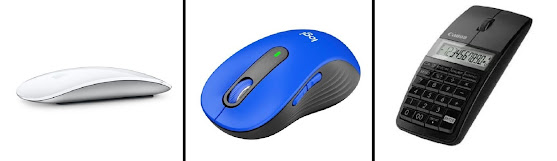
Apple Magic Mouse, Multi-Touch Surface in white @ US$99.00 (left), Logitech Signature M650 L, full-size wireless two-button Scroll Mouse with Silent Clicks in blue @ US$37.99 (centre) and Steve Jobs' vision of hell: Canon 5565B001 X Mark I Slim 3-in-1 wireless mouse with keypad calculator @ US$49.95.
Steve
Jobs (1955-2011; co-founder, and sometime chairman & CEO of Apple) was said to
have an aversion to buttons, something linked to his fondness for button-free
turtleneck clothing but given he spent decades using keyboards without apparent
ill-effect, it’s doubtful a clinician would diagnose koumpounophobia and it's more likely he was just convinced of the technological advantages of going
button-less. Without buttons,
manufacturing processes would be cheaper, water-proofing devices like iPhones would become (at least
theoretically) possible and upgrades would no longer be constrained by static buttons,
the user interface wholly virtualized on one flat panel, able to be changed (the industry's term for "change" is "upgrade" although users don't always agree there has been an improvement) purely in software. It apparently started with the button-less
Apple mouse, the industry legend being Mr Jobs saw a prototype (which the
designers regarded as nothing more than speculative) and insisted it become
Apple’s standard device.
Whether or not
it happened that way, the story is illustrative of the way business was done at
Apple and it’s notable his veto on offering a stylus with which to interact
with apps or the operating system didn’t survive his death. His response to the idea of a stylus was
reportedly “yuk” and he seems to have decided all his users would think the
same way and probably he was right, Apple’s users tending usually to do what Apple
tells them to do. Indeed, one of reasons Apple has found the Chinese market so receptive to the iPhone is that the company's approach accords with "the Chinese way": First, their parents tell them what to do, then their teachers tell them what to do, then the CCP (Chinese Communist Party) tells them what to do; Apple found it most agreeable they also did what it told them to do. However, for those who
find the sleek Apple mouse better to behold than use, third-party products with
buttons and scroll wheels are available, sometimes for half the cost of the
genuine article. Since the death of Mr Jobs, Apple has relented on the "stylus question".
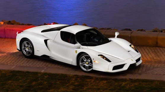
Shiny on the outside: Finished in Bianco Avus over black leather with Rosso Corsa (racing red) instruments, of the 400 Ferrai Enzos (2002-2004) chassis 133023 (2003) was the only one the factory painted white. Some Ferraris really suit white, notably the elegant 365 GT4 2+2 and the successor 400 and 412 models (1972-1989).
The
dreaded “Ferrari sticky buttons” is a well-known phenomenon, the stickiness coming
from the rubberized material preferred by the factory because of the superior
feel offered. However, under just about any
climatic conditions, continuous use will induce a deterioration which
resembles melting, "mushiness" the final outcome. The internet is awash with suggestions, the simplest
of which involves products like rubbing alcohol (the use of which can cause its own destructiveness) and the consensus seems to be that in many cases only replacement
buttons will produce a satisfactory result.
The choice is between obtaining the real Ferrari part-number (if
available) with the knowledge the problem will re-occur or use third-part replacements
which are made of a more durable material, the disadvantage being the feel won’t
be quite the same and there’s a reluctance among some to use non-factory parts, an attitude enforced by the "originality police".
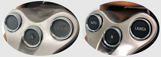
Sticky on the inside: Ferrari 485 California F1 gearbox buttons, sticky (left) and not (right).
Ferrari
does use the suspect material for a reason and it’s applied to interior
components such as trim, bezels, buttons & switches, and heating, ventilation
& air-conditioning panels. The
coatings are usually referred to as “soft-touch” and designers like them for
the soft, velvet-like feel imparted. Used
also on computer mice and electronic remote controls, the low gloss sheen is in cars helpful because being absorptive, glare is reduced and Ferrari
uses both a clear and black finish.
It’s an issue not exclusive to Ferraris although owners of
those do seem most concerned and while using rubbing alcohol might sound a
tempting Q&D (quick & dirty) fix, for those with sticky buttons this is
probably a job best left to experts of which there are now a few and they're finding business good.


