Showing posts sorted by date for query Dazzle. Sort by relevance Show all posts

Sunday, January 26, 2025

Neon

Neon (pronounced nee-on)

(1) In chemistry, a rare, colorless, odorless gaseous element; an inert gas (the second in the noble group) occurring in trace amounts in the atmosphere.  It glows reddish orange when electricity passes through it, as in a tube in an electric neon light, hence the industrial use in illuminated signs & lights although it’s used also in refrigeration because of the helpfully low melting & boiling points.

(2) A neon lamp, tube or device, in the singular or collectively; made of or formed by a neon lamp or lamps.

(3) A sign or advertising display formed from (or emulating) neon lamps.

(4) Of, relating to, or characteristic of an urban area brightly lit during hours of darkness and often associated with popular forms of entertainment.

(5) As in the phrase “in neon”, or “in neon lights”, adding emphasis to something (sometimes used derisively).

(6) Any of a range of bright, lurid colors, used particularly in fashion (lipsticks, nail polish etc) and as hair color products.

(7) As neon tetra (Paracheirodon innesi), a freshwater fish of the characin family (family Characidae) of order Characiformes, native to the Amazon basin in South America.  Because of its vivid coloring and robustness, the neon tetra is one of the most popular tropical fish in home aquariums.

1898: From the Ancient Greek νέον (néon), neuter of νέος (néos) (new; young), from the earlier νέϝος (néwos), from the Proto-Hellenic newos, from the primitive Indo-European néwos.  From the same source, English (and other languages gained the prefix –neo which was often used to form clade or taxonomic names indicating more recent branching than a morphologically or otherwise similar group.  The prefix neo- was from the Ancient Greek prefix νεο- (neo-), from νέος (néos) (new, young).  In organic chemistry it (1) had the specific technical meaning “having a structure, similar to that of neopentane, in which each hydrogen atom of a methyl group has been replaced by an alkyl group” and (2) a newly-discovered or synthesized variant of an existing compound.  The synonyms (in the sense of something new) were ceno- & nov-, the less used antonym paleo-.  Many words have been prefixed with neo- and not exclusively to indicate something wholly novel but increasingly to describe a revival or new variation of something including (1) in architecture: neo-classical, neo-gothic etc, (2) in economics: neo-liberal, neo-Keynesian etc, (3) in politics: neo-Nazi, neo-conservative, neo-fascist etc and (4) in religion: neo-evangelicalism, neo-Hasidism etc.  In chemistry, the meaning is quite specific but in general use the synonyms include blazing, brilliant, glowing, lambent, luminous, radiant, shining, vivid, flashing, glitzy, glossy, razzle-dazzle, effulgent & gleaming.  Neon is a noun & adjective; the noun plural is neons.

Sohio “Neon Patrol” in action, Cleveland, Ohio, July 1938.  Technicians from the Neon Patrol would travel between the company’s retail outlets, servicing the neon signage and effecting repairs when required.  The truck is an International D-15 with a special body.  The D Series (1937-1939) was a range of light, medium & heavy-duty trucks, easily distinguished from the more rectilinear C Series (1934-1936) by the curvilinear lines and the two-piece V-shaped windshield.  The line was replaced by the K (1940-1946) & KB Series (1947-1950).

The Standard Oil Company (Ohio) was a US petroleum company which operated between 1870-1987 and Sohio was one of a number of separate entities created in 1911 after the Standard Oil corporate trust (1882-1911) was broken up.  Standard Oil and British Petroleum (BP) in the 1960s entered into an intriguing (and tax-friendly) arrangement whereby BP gradually would increase its stake in Standard Oil, culminating eventually in acquisition.  Sohio as a corporate identity ceased operations in 1987 but BP continued to sell gas (petrol) under the brand until 1991, the name formally retired when the branding on the last Sohio gas station was replaced with BP signage.

Neon

Symbol: Ne.
Atomic number: 10.
Atomic weight: 20.1797.
Valency: 0.
Density: 0.899 90 kg/m³ / 0.9002 gm/liter at 0°C & 760 mm pressure.
Melting point: –248.59°C.
Boiling point: –246.08°C.

Neon nail-polish in 5-pack by Casey's Toys (part-number 52123) @ Aus$9.99.

Although in the United States it’s possible for citizens (in some cases children) lawfully to possess military-grade firearms and some truly impressive ordinance, in other fields the government is punctilious in providing people protection.  In 2012, Douglas Schoon (b 1954), Creative Nail Design's (CND) chief scientific advisor, explained that in the US, the manufacture of neon nail-polish was unlawful, although, in what seemed a quirk of the law, the products remain lawful to wear.  However, that apparent anomaly isn’t actually strange or unique to neon nail-polish and reflects a regulatory environment where the need is to certify the safety of both the components and the processes used in the manufacturing process.  There are no concerns about the safety of the finished product, skin and nails anyway a most effective barrier and the nature and volume of fumes breathed in by consumers “doing their nails” would substantively be identical to that of other nail-polishes.

Coffin-shaped nails in neon-green.  These are actually "press-on nails".

Neon polishes are prohibited simply because the colorants have never been officially registered with the US Food & Drug Administration (FDA).  Mr Schoon explained that “what determines whether a color is neon is the chemical composition, just as it is with blues and greens”, adding that that any manufacturer could submit neon shades to the FDA, but it’s a costly and time-consuming process which is why many of the lurid shades available in the US, technically, are not neons.  Registration is only the first step in securing FDA approval and few small-scale manufacturers have the resources to go through a process from which others would gain equal benefit.  Imported neon polishes appear on many shelves but it’s not known if unlawful, small-scale manufacturing is being undertaken somewhere in the US.

Lindsay Lohan (b 1986, left) in neon outfits and singer-songwriter Billie Eilish (b 2001, right) with neon highlights.  Ms Eilish also went blonde, the result thought most pleasing.

As an adjective used of colors, neon refers to the quality of brightness rather than the red-orange colour which is the particular property of neon gas under electrical stimulation.  Thus, a “neon color” (or simply “neon”) is anything bright, lurid and used in clothing, accessories & enhancements (lipsticks, nail polish etc) or hair color products.

"Neon" advertising displays, Piccadilly Square, London, 1967.

Neon was discovered in 1898 by British chemists Sir William Ramsay (1852–1916) and Morris Travers (1872–1961) while working in their London laboratory during a series of experiments which also uncovered krypton & xenon, the other two residual rare inert elements remaining in dry air after nitrogen, oxygen, argon and carbon dioxide are removed.  In normal conditions a colorless, odorless & inert monatomic gas, it has about two-thirds the density of air and is noted for its emission in the spectrum of bright red when exposed to electrical current.  Although one of the known universe’s most common elements (fifth behind hydrogen, helium, oxygen and carbon), it’s rare on Earth, existing only in trace amounts in the atmosphere, attributable to it being highly volatile and thus never forming compounds which assume any solidity.

It needs thus to be extracted from air by an industrial process so is relatively expensive, its industrial uses limited to some specialized applications in refrigeration (by virtue of its low melting & boiling points) and the famous “neon lights” most associated with advertising and signage, the first of which was released in 1913, the term “neon sign” dating from 1927.  The distinctive bright red (tending to orange) light distinguished the first neon signs (created with curved neon-tubes) and in the narrow technical sense these are the only true “neon-lights” because tubes which generate other colors are made using either other noble gases or are instances of fluorescent lighting.  In hidden use, neon is also a component of various electrical devices including vacuum & wave tubes, current indicators and lightning arresters.

Late twentieth (left) and early twenty-first (right) century Tokyo after dark: now less pink, more blue.

For decades, pink was the dominant color in the night-time Tokyo streetscape but in the twenty-first century observers began noting a shift to something darker.  The change is attributed not to the nation’s post 1989 slump in economic growth (the so-called “lost decade” of the 1990s apparently never having ended) but the development in 1993 by Japanese-American engineer Shuji Nakamura (b 1954) of a high-efficiency blue LED (light emitting diode) using gallium nitride (GaN) as the semiconductor material.  While green and red LEDs had for decades been in use, blue had proved elusive because the industry lacked a material suitable (and sufficiently cheap) to use at scale.  Nakamura san’s work built on earlier research by Japanese physicists Isamu Akasaki (1929–2021) and Japanese physicist Hiroshi Amano (b 1960) and what the three did was make possible both blue and white LEDs, the latter enabled by combining the blue with phosphors.  In 2014, the three were awarded the Nobel Prize in Physics.

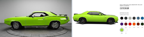
1970 Plymouth Hemi 'Cuda in Limelight (left) and 2023 Dodge Challenger SRT Hellcat Redeye Jailbreak in Sublime (right). 

Lurid neon hues began to fade from the roads after being banished from the automotive color charts in the mid 1970s and while it can be debated if that was an aesthetic loss, it certainly made the option lists less linguistically interesting.  Like other manufacturers, Chrysler had some history in the coining of fanciful names for colors dating from the psychedelic era of the late 1960s when the choices included Plum Crazy, In-Violet, Tor Red, Limelight, Sub Lime, Sassy Grass, Panther Pink, Moulin Rouge, Top Banana, Lemon Twist & Citron Yella.  Although it may be an industry myth, the story told is that Plum Crazy & In-Violet (lurid shades of purple) were late additions because the killjoy board refused to sign-off on Statutory Grape.  Plymouth called their lime green Limelight while Dodge used Sub Lime.  That the colors vanished during the 1970s was not because of changing tastes but in response to environmental & public health legislation which banned the use of lead in automotive paints; without the additive, production of the bright colours was prohibitively expensive.  Advances in chemistry meant that by the twenty-first century brightness could be achieved without the addition of lead so Dodge revived psychedelia for a new generation although Sub Lime became Sublime.  There was still a price to be paid however, Sublime, Red Octane, Sinamon Stick and Go Mango all costing an additional US$395 while the less vivid shades listed at US$95.  The resurrected "neon look" proved popular although only within the high-performance niche, most of the market preferring more "dignified" tones such as black, white, silver and many variations of gray although there's still the odd malcontent who orders blue or red.  On the street, Chrysler's bright colors were all the more noticeable because the mainstream-market preference now tends to white, silver, black and grey.  

2015 Dodge Challenger SRT in Sublime (code FB).  Literalists should note this is NOT what Greta Thunberg (b 2003) meant when she spoke of "green vehicles".

There was of course once a time when the term “green vehicle” had a simple, unambiguous meaning but were a driver to contest a parking ticket, the outcome might depend on how a court would apply the “Vagliano rule”, established by the House of Lords in Bank of England v Vagliano Bros (1891) AC 107.  The Vagliano rule is a principle of statutory interpretation and holds that when interpreting a statute, courts should start by considering the natural meaning of the words in the statute itself, without referring to previous case law or historical background, unless the language is ambiguous.  The rule is of such significance because it prioritizes the literal and ordinary meaning of words over any interpretation which could be derived if other factors are allowed to intrude.

In his judgment, Lord Herschell (Farrer Herschell, 1837–1899; Lord High Chancellor of Great Britain 1886 & 1892-1895) wrote: “I think the proper course is, in the first instance, to examine the language of the statute and to ask what is its natural meaning, uninfluenced by any considerations derived from the previous state of the law, and not to start with inquiring how the law previously stood, and then, having ascertained that, to see whether the statute will bear an interpretation which is in accordance with it. If the statute is clear, its provisions must prevail, whatever the previous law may have been. If the statute is ambiguous, then, and only then, may the history of the law be referred to.  Whether in the 2020s a judge would be persuaded “Green Vehicle” should for this purpose be read-down to permit gas-guzzling V8s (simply on the basis of being painted a certain color), to occupy parking spots allocated exclusively to the machines of which Ms Thunberg would approve may be doubtful but any driver will always be able to find a lawyer willing to run the case and, if heard by a judge fond of a "black letter law" interpretation of things, may enjoy success, at least at first instance.  Presumably, the solution would be for the signs to read: "GREEN" VEHICLES, the semiotics of the inverted commas conveying the new (non-literal) meaning.

Tuesday, July 9, 2024

Vorticism

Vorticism (pronounced vawr-tuh-siz-uhm)

A short-lived movement in the British avant-garde, nurtured by Wyndham Lewis, which climaxed in a London exhibition in 1915 before being absorbed.

1914: The construct was vortic + -ism.  The Latin vortic was the stem of vortex, (genitive vorticis), an archaic from of vertex (an eddy of water, wind, or flame; whirlpool; whirlwind whirl, top, crown, peak, summit), from vertō (to turn around, turn about) from vertere (to turn), from the primitive Indo-European wer (to turn; bend).  The –ism suffix is from the Ancient Greek ισμός (ismós) & -isma noun suffixes, often directly, sometimes through the Latin –ismus & isma (from where English picked up ize) and sometimes through the French –isme or the German –ismus, all ultimately from the Ancient Greek (where it tended more specifically to express a finished act or thing done).  It appeared in loanwords from Greek, where it was used to form abstract nouns of action, state, condition or doctrine from verbs and on this model, was used as a productive suffix in the formation of nouns denoting action or practice, state or condition, principles, doctrines, a usage or characteristic, devotion or adherence (criticism; barbarism; Darwinism; despotism; plagiarism; realism; witticism etc).  Vorticism is a noun, vorticist is a noun & adjective and vorticistic is an adjective; the noun plural was vorticists,  The forms vorticistically & vortical seem never to have come into use.

Hieratic head of Ezra Pound (1914), by Henri Gaudier-Brzeska (1891-1915).

The name Vorticism was said to have been coined in 1914 by the poet Ezra Pound (1885–1972) years before fascism and madness possessed his soul.  Pound had already used the word "vortex" to describe the effect modernist poetry was having on intellectual thought in Europe and he used the word not in the somewhat vague sense it often assumed when used figuratively to suggest swirling turbulence but rather as a mathematician or meteorologist might: an energy which gathers from the surrounding chaos what’s around, imparts to it a geometrical form which, intensifying as it goes, arrives at a single point.  Pound’s coining of the name is generally accepted but some historians claim the name was chosen by the Italian futurist Umberto Boccioni (1882-1916) who claimed all creative art could emanate only from a vortex of emotions.

Blast Magazine, July 1915.

Vorticism flourished only briefly between 1912-1915 as an overly aggressive reaction to what was held to be an excessive attachment to and veneration for delicacy and beauty in art and literature, preferring to celebrate the tools of modernity, the violence and energy of machines.  In painting and sculpture the angles were sharp and the lines bold, colors displayed in juxtaposition to emphasize the starkness of their difference and there was a reverence for geometric form and repetition.  The movement in 1914 published its own magazine: Blast: the Review of the Great English Vortex which was more manifesto than critique, a London-based attempt to gather together the artists and writers of the avant‐garde in one coherent movement.  It wanted the shock of the new.

Composition (1913), by Wyndham Lewis (1882-1957).

The idea was an art which reflected the strains of the vortices of a modern life in what was increasingly a machine age.  Thus, although it remains a footnote in the history of modern art, the label Vorticism refers to a political and sociological point rather than a distinct style such as contemporaries like Cubism or Futurism.  The timing was of course unfortunate and the outbreak of World War I (1914-1918) robbed Vorticism of much of its initial energy; the exhibition eventually staged in London’s Doré Gallery in 1915 remained a one-off and, like much of the pre-1914 world, Vorticism didn’t survive the World War.

Dance Hall Scene (circa 1913), by CRW Nevinson (1889-1946).

Being unappreciated at the time, most of the paintings of the vorticists were lost but retrospectives have been assembled from what remains and the still extant photographic record and there’s now a better understanding of the legacy and the influence on art deco, dada, surrealism, pop art, indeed, just about any abstract form.  Graphic art too benefited from the techniques, the sense of line and color identifiable in agitprop, twentieth century advertising and, most practically, the “dazzle” camouflage used by admiralties in both world wars as a form of disguise for ships.

Juan Garrido, a graphic designer based in Caracas, Venezuela, created the display typeface Vorticism in 2013.  Reflecting the cultural and linguistic influences, while there are a number of typefaces called futurism (or some variation) and some based on the word "vortex", Mr Garrido's "Vorticism" is uniquely named.

Lindsay Lohan in the Vorticism typeface.

Ezra Pound (1919), by Wyndham Lewis.

Even in 1912, Vorticism’s use of bold, abstract, and geometric forms (often depicting movement and mechanical apparatuses) wasn’t new but the movement had an energy which attracted those wanting to create imagery which marked a dramatic break from the representational forms which then were still dominant early in the ear which would come to be known as the dawn of modernity.  In that sense, Vorticism is understood as one of a number of movements embracing a new aesthetic reflecting the dynamism and energy of the modern world.  That as a distinct entity Vorticism didn’t endure was in a way an indication of success rather than failure because its motifs and techniques were co-opted to serve as foundational aspects of many movements in modern art, the abstract and geometric forms underpinning Futurism and Constructivism as well as becoming a staple of commercial graphic art and advertising.  Perhaps the most obvious influence was the artistic legitimization of the integration of text into images, a practice borrowed from commerce and a notable signature of Dada and Surrealism.  The use of text as a visual element challenged traditional boundaries between different art forms, a tension which enabled Pop art to create was in some ways a novel ecosystem.  However, those same motifs have been used also as something illustrative of the destructive tendencies of the speed and spread of mechanical and industrial reality which the vorticists championed and Precisionism & Bauhaus celebrated, at least in a sanitized and idealized way which hid the essential ugliness below.

Thursday, November 9, 2023

Dazzle

Dazzle (pronounced daz-uhl)

(1) To overpower or dim the vision of by intense light.

(2) Deeply to impress, to astonish with delight

(3) To awe, overwhelm, overpower, stupefy.

(4) To shine or brilliantly reflect.

(5) To excite admiration by a display of brilliance.

(6)To be overpowered by light.

(7) Something that dazzles.

(8) A form of camouflage used on early-mid twentieth century warships.

(9) The collective noun to describe zebras.

1475-1485: A frequentative of daze, the construct being daze + le, from the Middle English dasen, from the Old Norse dasa (as in dasask (to become weary)) and related to the Danish dase (to doze, mope).  1475-1485: Daze was a Middle English, back-formation from the Middle English dazed, from the Old Norse dasaðr (weary) & dasask (to become weary), from the Proto-Germanic dasōjan-, from the adjective daza-, which may have been a variant of the primitive Indo-European der- (to hold, support) and related to the Armenian դադարել (dadarel) (to settle, stop, end).  The -le suffix was a frequentative form from the Middle English -elen, -len & -lien, from the Old English -lian (the frequentative verbal suffix), from the Proto-Germanic -lōną (the frequentative verbal suffix) and was cognate with the West Frisian -elje, the Dutch -elen, the German -eln, the Danish -le, the Swedish -la and the Icelandic -la.  It was used as a frequentative suffix of verbs, indicating repetition or continuousness.

The original, fifteenth century, meaning was “be stupefied, be confused” which many dictionaries list as obsolete but there are certainly at least echoes of that sense in the modern use.  Originally intransitive; the transitive sense of “overpower with strong or excessive light” dates from the 1530s while the figurative sense of “overpower or excite admiration by brilliancy or showy display” is from the 1560s.  As a noun in the sense of “brightness, splendour”, it’s been known since the 1650s.  The verb bedazzle (to blind by excess of light) emerged in the 1590s but is now far more common in figurative use.  The late nineteenth century coining of “razzle-dazzle” originally suggested “bewilderment or confusion, rapid stir and bustle, riotous jollity or intoxication etc but came soon to be used of “deception, fraud; extravagant or misleading claims”.  At the turn of the twentieth century it was used also to mean “a state of confusion” but the modern trend is to use “razzle-dazzle” to mean anything flashy, especially unstructured, inventive performances on the sporting field.  Forms such as overdazzle, outdazzle, outdazzling, overdazzle, overdazzled, overdazzling, redazzle & undazzled have been coined as required.  The adjective antidazzle is commonly used in commerce (often as anti-dazzle).  Dazzle is a noun & verb, endazzlement, dazzlement & dazzler are nouns, bedazzle & (the archaic) endazzle are verbs, adazzle is an adjective, dazzling & dazzled are verbs & adjectives and dazzlingly is an adverb; the noun plural is dazzles.

Dazzling: Lindsay Lohan in zebra-print dress from Balmain's autumn-winter 2013 collection, GQ Men Of The Year Awards, London, September 2014.  Cohort, crossing, harem, herd and zeal have all been cited as the collective noun for zebras but most zoologists seem to prefer dazzle.

Developed first by the Royal Navy during World War I (1914-1918) to counter the German U-Boat (submarine) threat, dazzle camouflage for ships was a counterintuitive adaptation of techniques known to have been used during antiquity, the fleets of both the Greeks and Romans having been painted in shades of green and blue to blend with the surface and horizon.  The modern approach however was rather than concealment, the vessel would be exposed to the enemy.

View through periscope, with and without dazzle.

The British Admiralty adopted the scheme as an experiment.  It had been suggested in 1917 by a Royal Navy Volunteer Reserve (RNVR) lieutenant commander with a pre-war background in painting, his argument being that while it wasn’t possible actually to conceal a ship, a suitable paint scheme should make difficult the task of a submarine captain trying to estimate a vessel’s speed and direction while viewing through a periscope for a limited time and that was no easy task in 1917.  A U-Boat captain, while maintaining a distance from his target between around a quarter mile (400m) and a mile (1600m), had to predict the speed and direction of the target’s travel while factoring in ocean currents which could affect a torpedo’s travel, all within the short time he could risk his periscope being visible above the surface.  The dazzle concept of camouflage differed from traditional methods of concealment in that it sometimes made the target easier to see; the object was to make it harder to sink; it's thus better thought of as "subterfuge" rather than "camouflage".  A U-Boat carried very few torpedoes and they couldn't be wasted.  The captain had to hit a moving target, often in a rolling sea and to maximize the chance of success, needed the torpedo to hit the ship in her most vulnerable spots and this was done by aiming not at where the target was, but where the target would be more than half a minute later.  The idea of the dazzle was not to hide the ship but to make it even harder for a U-Boat commander to estimate variables like direction and speed of travel.    

After encouraging findings in small-scale tests, the admiralty authorised trials and artists experimented with both colours and shapes, intending usually to distort the perception of the shape of the bow and stern, disrupting perspective and falsely suggesting a ship’s smokestacks or superstructure pointed in a different direction than truly it sat on the water.  Many of the ideas were shamelessly borrowed from modernist art, especially the concepts of cubism, a theft so blatant that Pablo Picasso (1881–1973), in conversation with the American poet and novelist Gertrude Stein (1874–1946), observed the Cubist movement deserved some credit from the Admiralty.

French light cruiser Gloire (laid down 1933, launched 1935, commissioned 1937, scrapped 1958) in dazzle camoflage, off the North African coast, 1944.

The programme spread to merchant vessels and then across the Atlantic.  Soon thousands of ships were painted in lurid colour schemes but unfortunately, the extensive archive of photographs from this era are mostly monochrome which not only fail fully to capture the vivid variety of the artists’ work but also don’t convey the contrasts created by the blues, reds, greens, purples and greys light & dark which created the optical illusions.  Both navies undertook analysis of the losses in shipping to evaluate the effectiveness of dazzle but the results, so impressive in laboratory conditions, were inconclusive, it being statistically impossible to account for external factors but U-Boat captains interviewed after the war attested to the problems dazzle created for them.

RMS Olympic (RMS Titanic's sister ship) in in dazzle, Pier 2 in Halifax, Nova Scotia, Canada, 1918, oil on canvas by Arthur Lismer (1885–1969).

Despite there being no consensus about the advantage of dazzle, allied naval authorities continued to employ it on both some warships and merchant fleets in World War II (1939-1945).  The Imperial German Navy had shown little interest in camouflaging ships during the Great War but did adopt a variation of dazzle early in World War II although OKM’s ((Oberkommando der Marine, high command of the Kriegsmarine (Navy)) designs were intended to disguise the identity of a ship from surface and air observation rather than raise doubts about speed or direction.  It’s not documented why this was abandoned by OKM (which is surprising given most of the navy's records survived the war) but, after 1941, all naval assets were repainted in regulation shades of grey.

Although never as widely used as in 1917-1918, allied navies retained faith in the subterfuge throughout the war although this time it was the Americans who were much more systematic and it wasn’t until late in 1942 the Admiralty released their Intermediate Disruptive Pattern and not until 1944 was a Standard Scheme promulgated.  Wartime developments in radar were already reducing the effectiveness of dazzle and this was accelerated by post-war advances in range-finding which rendered dazzle wholly obsolete.  For decades after 1946, no dazzle schemes were commissioned but (much toned-down) aspects of the idea have in recent years been interpolated into modern "stealth" naval architecture.

Sunday, December 25, 2022

Outlandish

Outlandish (pronounced out-lan-dish)

(1) Freakishly or grotesquely strange or odd, as appearance, dress, objects, ideas, or practices; bizarre.

(2) Having a foreign appearance (archaic).

(3) Remote from civilized areas; out-of-the-way (archaic).

(4) Being actually foreign; alien (archaic).

Pre 1000: From the Middle English outlandisch, from the Old English ūtlendisc (of a foreign country, not native) from the Proto-Germanic ūtlandiskaz and related to ūtland (foreign land, literally "out-land").  The meaning in the sense of unfamiliar, strange, odd, bizarre (such as the customs of foreigners may seem to natives) dates from the 1590s and may be compared with the German ausländisch and the Danish udenlandsk.  The Old English utland could also mean "land lying beyond the limits of occupation or cultivation," a sense that survived into Modern English.  The noun outlander (a foreigner, a person who is not a native) came into parallel use in the 1590s as a direct back-construction from outland (foreign land), almost certainly on the model of the Dutch uitlander and the German ausländer.  In South African English, by 1892 it acquired the specific sense of "not of Boer birth" which was a loan-translation of South African Dutch uitlander.  In Old English utlanda meant "an exile", a status which was known in many Medieval legal systems (or at least common practice).  In the Middle English, outland was simply a descriptor for "foreigners" and was a verbal shorthand of straungeres outlondes.  Outlandish is an adjective, outlandishly is an adverb and outlandishness is a noun.

Glass-blowing, the Royal Navy and coal

Many trees required: The architecture of the seventeenth century English ship-of-the-line (the battleships of their day).

In English common law, outlandish retained its original, literal, meaning in as late as the 1690s.  The often persecuted Huguenots, an ethno-religious group of French Protestants had lived in an uneasy relationship with the French state for many years until their rebellions in the 1620s prompted the abolishment of most of their political and privileges and persecution increased, culminating in the Edict of Fontainebleau (1685), effectively outlawing them and forcing them to flee France.  Many ended up in England, including a large number of artisans involved in glass and steel production, both of which demanded much energy.  Within a decade, it became apparent the forests of England were rapidly being depleted to provide fuel for furnaces, a matter of concern to a small island dependent for its trade and security on the Royal Navy and merchant marine, both with fleets of ships made from wood; each big warship (known as ship of the line or man-O-War) required the felling of several-thousand trees during its construction.  The government acted and banned the outlandish (foreigners) from leasing, owning or harvesting forests.  Designed to avoid a threat to the supply of timber, the law had the far reaching effect of accelerating the shift of Britain’s source of energy for industrial production from wood to coal, something that would endure almost three-hundred years and it wouldn't be until the early twentieth century that the the Royal Navy's big ships began to switch from coal to oil-fired power.

An outlandish combination which recalls the dazzle camouflage schemes used by several admiralties in the world wars: Lindsay Lohan dressed for ABC network television, Good Morning America, New York City, November 2022.

The interesting ensemble included an Akris color-blocked suit by Law Roach (b 1978) and shoes in gloss burgundy by Giuseppe Zanotti (b 1957).  The flared cut of the trousers hid the shoes' 2-inch (50 mm) soles and 6-inch (150 mm) heels which was a neat stylist's trick but they certainly deserved to be seen.

Sunday, May 9, 2021

Knave

 Knave (pronounced neyv)

(1) An unprincipled, untrustworthy, or dishonest person.  A rogue (archaic).

(2) A card (1 x hearts, diamonds, clubs, spades) in the standard fifty-two card pack of playing cards.  Also known as the Jack, the choice of word being sometimes used as an indicator either of class or geographical origin.

(3) A male servant of the lower ranks (archaic).

(4) A man of humble position (archaic).

Pre 1000: From the late Old English cnafa (boy, male child; male servant) from the Proto-Germanic knabon- (source also of the Old High German knabo (boy, youth, servant) and the German knabe (boy, lad)) and thought likely related to the Old English cnapa (boy, youth, servant), the Old Norse knapi (servant boy), the Dutch knaap (a youth, servant), the Middle High German knappe (a young squire) and the German Knappe (squire, shield-bearer).  The ultimate origin is a mystery, the most popular speculation being "stick, piece of wood".  Knave, knavess & knavery are nouns, knavish is an adjective and and knavishly is an adverb; the noun plural is knaves.

Cards and class

The sense of a "rogue or rascal" emerged circa 1200, thought probably reflective of a the (ever-present) societal tendency to equate the poor and “those of low birth" with poor character and propensity to crime, English poet & satirist Alexander Pope (1688-1744) in Essay on Man (1732-1734), capturing the feeling: “From the next row to that whence you took the knave, take the seven; from the next row take the five; from the next the queen.  To show mercy towards such a knave is an outrage to society!”  Despite that however, in Middle English didn’t lose the non-pejorative meaning, a knave-child (from the Scottish knave-bairn) being a male child.  The use in playing cards began in the 1560s, a knave being always the lowest scoring of the court cards.

Lindsay Lohan's Royal Routine (Ace down to the 10 in one suit) in The Parent Trap (1998).  The most desirable of the 40 different straight flush possibilities, under standard poker rules, the odds against holding a Royal Routine are 649,739:1 whereas those of any straight flush are a more accessible 72,192:1.  The difference in the math is there are fewer cards available for a Royal Routine to be assembled.

The use of Jack in cards came from the influence of French.  What the French called a valet, the English knew as a knave (in the sense of a young, male servant).  During the seventeenth century the French started to call such staff “Jack” apparently on the basis of it being a common name among the serving class; it was also the name used for the Knave of trumps at the game All Fours.  Although it appears widely to have been played by all classes, All Fours suffered, perhaps because it was a quick, trick-taking game, the reputation of being something enjoyed only by the lower classes and the choice of “knave” or “jack” came to be treated as a class-signifier, Charles Dickens (1812-1870) in Great Expectations (1860-1861) having Estella express scorn for Pip’s use of the latter.  The class-consciousness in English extends to the adoption of the German Bauer (farmer or peasant), as Bower, collectively to describe (usually when a pair of trumps (by color)) the Jacks in some games.  Knave survived in widespread use well into the twentieth century but US cultural influence has rendered it now mostly obsolete except for a few games where it persists and possibly among those who prefer a dish of tea to a cup.

In packs of cards, Knave (marked Kn) was used until Jack (J) became entrenched after 1864 when, US card-maker Samuel Hart published a deck using J instead of Kn to designate the knave to avoid confusion with the visually similar King (marked K).  Historically, in some southern Italian, Spanish and Portuguese decks, there were androgynous knaves sometimes referred to as maids.  This tradition survives only in the Sicilian Tarot deck where the knaves are unambiguously female and always known as maids.

In Tarot

The Jack of Spades card indicates a young man of dark complexion, cunning and devious.  Intelligent, brilliant even, but cynical and exploitative, he will use you and walk away.  The Jack of Spades is a sign you will face adversity from a ruthless person; he cannot be trusted.  The central problem in dealing with Jack of Spades types is they're inherently transactional so a relationship can seem wondrously fulfilling and probably is until it outlives its usefulness at which point one will be cast adrift... or worse.  Exemplary Jack of Spades: Donald Trump (b 1946; US president 2017-2021; president elect 2024).  

The Jack of Clubs means a good friend.  Although flirtatious, he is a sincere, skilful and brave young man.  For a woman, this card represents her fiancé but for a man, it means a more successful and richer rival. This card also signifies education and intelligence.  There's a fine nuance in Tarot between the Jacks of Clubs and Hearts in that for men it means a rival and for women a fiancé and the latter hopes he may also be represented by Hearts.  Exemplary Jack of Clubs: Elon Musk FRS (b 1971).

The Jack of Hearts signifies an honest young man in love. He is attractive, kind and generous, the card often announcing a new and intimate friendship. As a lover, the Jack of Hearts is trustworthy, even when absent he will be faithful.  Committed and sincere, he's a most eligible bachelor and thus a "good catch".  Tarot readers though cast a wide vista and drawing the Jack of Hearts is as likely to be indicative of the  arrival of a good, dependable friend as it is of impending romance.  Exemplary Jack of Hearts: Sir Tony Blair (b 1953; UK prime-minister 1997-2007).

The Jack of Diamonds represents the Messenger, symbolising also an unfaithful assistant or dishonest merchant or employee. The Jack of diamonds is a young man who comes and goes, taking more than is permitted and although quick-witted and cunning, is not trustworthy although like Jack of Diamonds Bernie Madoff (1938–2021), they can dazzle to deceive.  Exemplary Jack of Spades: Michael Cohen (b 1966; personal counsel to Donald Trump 2006-2018).


Of kings, axes and swords.

While suits are great significance to tarot card readers, in poker the rules the rules recognize only numbers and the odds the combination of cards create: a full house (3 of one card, 2 of another) with odds of 693.1667:1 beats a flush (5 cards of the same suit), a hand with odds of 507.8019:1.  The royal routine's odds are a less than encouraging 649,739:1.  The face cards are assigned a nominal number (Jack=11, Queen=12, King=13) and the Ace is a special case, able to assume a value of “1” or “14” and thus able to be used to create an “A-2-3-4-5” or a “10-J-Q-K-A” straight.  Because, in hands of equal numerical count, the suits do not affect the math used to calculate the odds, in the unlikely (though not impossible) event four players at a table each have a royal routine, the pot is split four ways.  However, except in competitions conducted under defined rules, there is no reason why a house can’t create a “tie-breaker” rule which assigns a hierarchy to the suits.  Provided the rule is clear, unambiguous and adequately communicated to all players, it should be uncontroversial and would define the winner if more than one straight flush of the same numeric.