Saturday, December 31, 2022

Album

Album (pronounced al-buhm)

(1) A bound or loose-leaf book consisting of blank pages, pockets, envelopes etc, for storing or displaying photographs, stamps, or the like, or for collecting autographs.

(2) A digital collection of photographs, stored on a computer or mobile device for viewing, displaying, or sharing.

(3) A record or set of records containing several musical selections, a complete play or opera etc.

(4) The package or container for such a record or records:

(5) A collection of audio recordings released together as a collected work:

(6) A printed book containing an anthology of writings, reproductions of photographs or artwork, musical compositions etc.

(7) In Ancient Rome, a white tablet or register on which the praetor's edicts and other public notices were recorded.

1645–1655: From the late Middle English albo (souvenir book), from the Classical Latin album (a board calked or painted white, onto which was inscribed in black, certain public notices, most notably the Annales Maximi, compiled by the Pontifex Maximus, high priest of the Collegium Pontificum (College of Pontiffs) which listed the year’s most significant events and appointments).  In Latin, the literal meaning of album was "white in color; whiteness", a noun use of the neuter of the adjective albus (white).

Album of Frederick Handel's (1685-1759) Messiah (1741) on 18 x 78 rpm shellac records; Royal Philharmonic Orchestra, under Sir Thomas Beecham (1879-1961), RCA Victor, 1947. 

The word was revived in Prussia circa 1645 by German scholars whose custom was to keep an album (amicorum) of colleagues' signatures, the meaning later expanded to include "book with blank leaves meant to collect signatures and other souvenirs" and according the entry in Samuel Johnson’s (1709-1784) A Dictionary of the English Language (1755), the album was "…a book in which foreigners have long been accustomed to insert autographs of celebrated people."  Photographic albums (in which people mounted photographs) were first advertised in 1859 and in 1882, the publisher Stanley Gibbons added to their catalogue the “stamp album” to meet the demand from the increasingly popular (and sometime profitable) hobby of philately.  The word became the popular descriptor of the (twelve-inch (300 mm)) 33⅓ rpm LP (long-playing) record in the 1950s although the term had earlier been used of (what would later be known as “boxed sets”) the bundled collections of 78 rpm records which, for certain recordings, demanded dozens of disks.  The use of “album” was an allusion to the resemblance of the paper sleeves, in which the shellac (and later polyvinyl chloride (PVC and usually called “vinyl”)) disks were stored, to the pages of autograph or stamp albums.

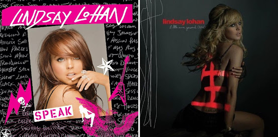
Lindsay Lohan's discography: Speak (Casablanca, 2005) & A Little More Personal (Raw) (Casablanca, 2005).

The Grateful Dead, Anthem of the Sun (1968).

The twelve-inch vinyl LP was an ideal format for commercial music distributors because it allowed 40-50 minutes of product to be packaged on the one disk, thereby permitting even long opera performances to be released as an album which required usually no more than 3-4 disks.  In popular music, the 50 minute limit (which technology did later permit to be extended to about an hour) was perfect and there many releases which barely troubled the lower end of the limit, format allowing acts to release several albums a year, each with perhaps a dozen songs (“tracks” as they came to be called).  This corresponded well with both creative output and the occasional release of a live performance and when required, double albums could be recorded and by the 1970s, there were even some triple and quadruple-disk albums.

The Incredible String Band, The 5000 Spirits or the Layers of the Onion (1967).

The eight-track cartridge and the much more successful cassette tape proved handy as portable media but operated less as a competitor than an adjunct to the vinyl product and it wasn’t until the compact disc (CD) gained critical mass in the mid-1980s that the 12 inch format came to be supplanted.  The CD was another format which proved ideal for the industry, particularly during the first decade-odd of its existence when the duplication hardware was for most (unlike cassette decks which were bundled with mainstream (3-in-1) stereo systems), prohibitively expensive.  The CD didn’t add greatly to the duration available for recording but the sound quality was superior (some vinyl audiophiles still dispute that), unit production and distribution costs were lower and windfall profits were raked in as the early CDs were sold at high prices and many consumers actually duplicated at least some of their vinyl collection as well as buying new releases.  Thus the “album age” lasted until displaced by the digital era which made possible the consumer’s (probably long-standing) preference to purchase the individual tracks they prefer.

Iron Butterfly, In-A-Gadda-Da-Vida (1968).

Until largely displaced by the smaller CD, the twelve inch album sleeve existed as a form of pop-art which attracted its own school of criticism.  Between the mid-1960s and late 1980s, small industries arose to create the artwork and there was even a niche in specialist publishing which produced compilations, the more psychedelic efforts especially popular and the “gatefold covers” used for the double and triple albums even permitted a wider vista; the results sometimes good, sometimes not.  The so-called “concept album” appeared to have had little effect on the album cover artwork which is surprising given it was such an obvious way to encapsulate a “concept”.  However, the definition of the “concept album” was always vague and while there were plenty with some discernible theme, it could with others be difficult to work out just what the “concept” was supposed to be.  Still, it was a word which suggested ambitions beyond a collection of three-minute singles and in the 1960s there was a growing industry of earnest critics, anxious to find meanings and ready to fill in the gap if none was immediately obvious.  Sometimes they would write as if influenced by TS Elliot, sometimes they'd just gush and if the idea had been delayed a generation, they would probably have called them "paradigm albums".     

There were great moments in album covers but, unfortunately, the memorable cover for Svetlana Gruebbersolvik's My Lips are for Blowing was a fake.  Beginning in the 1960s, the album cover with its standardized 12 x 12 inch (300 x 300 mm) format became a sub-genre of pop-art, the movement lasting until the smaller media of the CD rendered the packaging obsolete.  The twelve inch format has enjoyed something of a twenty-first century revival but the volumes are too low to support the scale of graphic-art industry which once flourished. 

Friday, December 30, 2022

Neon

Neon (pronounced nee-on)

In chemistry, a rare, colorless, odorless gaseous element; an inert gas (the second in the noble group) occurring in trace amounts in the atmosphere.  It glows reddish orange when electricity passes through it, as in a tube in an electric neon light, hence the industrial use in illuminated signs & lights although it’s used also in refrigeration because of the helpfully low melting & boiling points.

(2) A neon lamp, tube or device, in the singular or collectively; made of or formed by a neon lamp or lamps.

(3) A sign or advertising display formed from (or emulating) neon lamps.

(4) Of, relating to, or characteristic of an urban area brightly lit during hours of darkness and often associated with popular forms of entertainment.

(5) As in the phrase “in neon”, or “in neon lights”, adding emphasis to something (sometimes used derisively).

(6) Any of a range of bright, lurid colors, used particularly in fashion (lipsticks, nail polish etc) and as hair color products.

(7) As neon tetra (Paracheirodon innesi), a freshwater fish of the characin family (family Characidae) of order Characiformes, native to the Amazon basin in South America.  Because of its vivid coloring and robustness, the neon tetra is one of the most popular tropical fish in home aquariums.

1898: From the Ancient Greek νέον (néon), neuter of νέος (néos) (new; young), from the earlier νέϝος (néwos), from the Proto-Hellenic newos, from the primitive Indo-European néwos.  From the same source, English (and other languages gained the prefix –neo which was often used to form clade or taxonomic names indicating more recent branching than a morphologically or otherwise similar group.  The prefix neo- was from the Ancient Greek prefix νεο- (neo-), from νέος (néos) (new, young).  In organic chemistry it (1) had the specific technical meaning “having a structure, similar to that of neopentane, in which each hydrogen atom of a methyl group has been replaced by an alkyl group” and (2) a newly-discovered or synthesized variant of an existing compound.  The synonyms (in the sense of something new) were ceno- & nov-, the less used antonym paleo-.  Many words have been prefixed with neo- and not exclusively to indicate something wholly novel but increasingly to describe a revival or new variation of something including (1) in architecture: neo-classical, neo-gothic etc, (2) in economics: neo-liberal, neo-Keynesian etc, (3) in politics: neo-Nazi, neo-conservative, neo-fascist etc and (4) in religion: neo-evangelicalism, neo-Hasidism etc.  In chemistry, the meaning is quite specific but in general use the synonyms include blazing, brilliant, glowing, lambent, luminous, radiant, shining, vivid, flashing, glitzy, glossy, razzle-dazzle, effulgent & gleaming.  Neon is a noun & adjective; the noun plural is neons.

Neon

Symbol: Ne.
Atomic number: 10.
Atomic weight: 20.1797.
Valency: 0.
Density: 0.899 90 kg/m³ / 0.9002 gm/liter at 0°C & 760 mm pressure.
Melting point: –248.59°C.
Boiling point: –246.08°C.

Neon nail-polish in 5-pack by Casey's Toys (part-number 52123) @ Aus$9.99.

Although in the United States it’s possible for citizens (in some cases children) lawfully to purchase military-grade firearms and some truly impressive ordinance, in other fields the government is punctilious in providing people protection.  In 2012, Douglas Schoon (b 1954), Creative Nail Design (CND)’s chief scientific advisor, explained that in the US, the manufacture of neon nail-polish was unlawful, although, in what seemed a quirk of the law, the products remain lawful to wear.  However, that apparent anomaly isn’t actually strange or unique to neon nail-polish and reflects a regulatory environment where the need is to certify the safety of both the components and the processes used in the manufacturing process.  There are no concerns about the safety of the finished product, the skin and nails anyway a most effective barrier and the nature and volume of fumes breathed in by consumers “doing their nails” substantively identical to that of other nail-polishes.

Coffin-shaped nails in neon-green.  These are actually "press-on nails".

Neon polishes are prohibited simply because the colorants have never been officially registered with the US Food & Drug Administration (FDA).  Mr Schoon explained that “…what determines whether a color is neon is the chemical composition, just as it is with blues and greens”, adding that that any manufacturer could submit neon shades to the FDA, but it’s a costly and time-consuming process which is why many of the lurid shades available in the US, technically, are not neons.  Registration is only the first step in securing FDA approval and few small-scale manufacturers have the resources to go through a process from which others would gain equal benefit.  Imported neon polishes appear on many shelves but it’s not known if unlawful, small-scale manufacturing is being undertaken somewhere in the US.

Actor Lindsay Lohan (b 1986, left) in neon clothing and singer-songwriter Billie Eilish (b 2001, right) with neon highlights.  Ms Eilish has since gone blonde, the result thought most pleasing.

As an adjective used of colors, neon refers to the quality of brightness rather than the red-orange colour which is the particular property of neon gas under electrical stimulation.  Thus, a “neon color” (or simply “neon”) is anything bright, lurid and used in clothing, accessories & enhancements (lipsticks, nail polish etc) or hair color products.

"Neon" displays in Piccadilly Square, London, 1967.

Neon was discovered in 1898 by British chemists Sir William Ramsay (1852–1916) and Morris Travers (1872–1961) while working in their London laboratory during a series of experiments which also uncovered krypton & xenon, the other two residual rare inert elements remaining in dry air after nitrogen, oxygen, argon and carbon dioxide are removed.  A gas colorless, odorless and inert monatomic gas in normal circumstances, it has about two-thirds the density of air and is noted for its emission in the spectrum of bright red when exposed to electrical current.  Although one of the known universe’s most common elements (fifth behind hydrogen, helium, oxygen and carbon), it’s rare on Earth, existing only in trace amounts in the atmosphere, attributable to it being highly volatile and thus never forming compounds which assume any solidity.

"Neon" displays in Tokyo, 2021.  The discovery (rewarded with a Nobel Prize) of the material which made possible the long-elusive blue liquid crystal displays (LEDs), coupled perhaps with changes in public taste may account for the some of the Tokyo "neonscape" darkening in the twenty-first century.

It needs thus to be extracted from air by an industrial process so is relatively expensive, its industrial uses limited to some specialized applications in refrigeration (by virtue of its low melting & boiling points) and the famous “neon lights” most associated with advertising and signage, the first of which was released in 1913, the term “neon sign” dating from 1927.  The distinctive bright red (tending to orange) light distinguished the first neon signs (created with curved neon-tubes) and in the narrow technical sense these are the only true “neon-lights” because tubes which generate other colors are made using either other noble gases or are instances of fluorescent lighting.  In hidden use, neon is also a component of various electrical devices including vacuum & wave tubes, current indicators and lightning arresters.

2015 Dodge Challenger SRT.  Literalists should note this is not what Greta Thunberg means when she speaks of "green vehicles".

Miosótis

Miosótis (pronounced mahy-uh-soh-tis)

Any plant belonging to the boraginaceous (of the borage family) genus Myosotis, having basal leaves and pink or white flowers; known generally as the forget-me-not.

1700–1710: From the New Latin & Latin myosōtis from the Ancient Greek μυοσωτίς (myosōtís or muosōtis) (mouse's ear (in the context of botany)), the construct being myós (genitive of mŷs or muos (mouse)) + -ōt- (stem of oûs (ear)) + -is (the noun suffix).  The mouse-ear (Myosotis Arvensis (type species Myosotis scorpioides)) is also called mouse-lug and the original Hellenic name was based on the idea of the foliage have some resemblance to the rodent's ears.  In Portuguese, the plant is also known as the não-te-esqueças-de-mim (literally "do not forget about me" and thus akin to "forget me not") & orelha-de-rato (mouse ear).  Miosótis is a noun; the noun plural is miosótis.  The alternative spelling myosótis is obsolete.

The miosótis is a perennial flowering plant, the flowers having five sepals and petals, typically flat and less than a half-inch (1.25 mm) in diameter, the color range including pink, white, yellow & blue with yellow centres, sprouting in a scorpioid cluster.  Flowering happens almost in spring, coinciding with the melting of snow in alpine regions.  The genus was originally described by Swedish botanist, zoologist, taxonomist, and physician Carl Linnaeus (1707–1778), famous for having systematized binomial nomenclature, the modern system of naming organisms and thus known as the "father of modern taxonomy".  The colloquial names in the northern hemisphere are "forget-me-not" and (less commonly "scorpion grass" (based on the spiraled clustering of the flowers) and Myosotis alpestris is the official flower of both Alaska and Dalsland, Sweden.  In other places, the common names vary and because of the vivid colors they are popular among amateur horticulturists, having spread to many of the Earth’s temperate regions where, outside of curated artificial environments, they prefer moist locations such as wetlands and riverbanks.


The “mouse’s ear” explained by Karen Smith (Amanda Seyfried (b 1985)) in Mean Girls (2004).  Note the resemblance to the petals of the miosótis flower

Thursday, December 29, 2022

Rubricate

Rubricate (pronounced roo-bri-keyt)

(1) To mark or color with red; to adorn with red; to redden.

(2) To furnish with or regulate by rubrics.

(3) To write in the form of a rubric.

(4) In publishing, to print (a book or manuscript) with red titles, headings etc; to illuminate a manuscript with red letters.

1560–1570: Either from the perfect passive participle of the Latin verb rūbrīcō (to paint red) or from the Late Latin rūbrīcātus, past participle of rūbrīcāre (to color red), the construct being rūbrīc(a) (red ocher; red earth) + -ātus.  The Latin suffix -ātus was from the Proto-Italic -ātos, from the primitive Indo-European -ehtos.  It’s regarded as a "pseudo-participle" and perhaps related to –tus although though similar formations in other Indo-European languages indicate it was distinct from it already in early Indo-European times.  It was cognate with the Proto-Slavic –atъ and the Proto-Germanic -ōdaz (the English form being -ed (having).  The feminine form was –āta, the neuter –ātum and it was used to form adjectives from nouns indicating the possession of a thing or a quality.  Rubricate & rubricating are verbs, rubricated is a verb & adjective and rubrication & rubricator are nouns.

Rubic (rubrick the obsolete spelling) was from the Middle English rubriche & rubrike, from the Old French rubrique, from Latin rūbrīca (red ochre; red earth), the substance used to make red letters, from ruber (red), from the primitive Indo-European hrewdh.  Rubic came widely to be used, derived mostly from the sense of “giving emphasis or illumination to the text”.  In ecclesiastical printing, a “church text with rubrics” was one with the directions for a religious service printed in red.  This extended to secular publishing when used of a heading in a book or something highlighted in red which led to the general use as (1) a title of a category or a class, (2) an established rule or custom; a guideline.  By extension it came to describe (3) in education, a set of scoring criteria for evaluating a pupil’s work and the associated comments and (4) the flourish appearing after a signature.

The comparative is more rubricate and the superlative most rubricate.  Lindsay Lohan illustrates the nuances:

(1) Naturally rubricated.
(2) De-rubricated.
(3) Re-rubricated.
(4) Highly rubricated.

The popularity of red among Ferrari buyers has declined from the highs of the 1990s (and it was in this decade the phrase “resale red” was popularized) when fewer than two in ten were ordered in any other color but even today some 40% of Ferraris leave the factor finished in some shade of red.  Sliver, black, bright yellow and darker blues now attract buyers and noting this, the factory has in recent years launched new models in a variety of colors, the debut of the 488 Pista Spider at the 2018 Pebble Beach Concours d'Elegance using a white car trimmed in black in Alcantara and leather, an unfortunately neglected combination.

Ferrari 488 Pista Spider, 2018 Pebble Beach Concours d'Elegance.

Recent trends notwithstanding, red probably still is lodged in the public imagination as the color of a Ferrari and the origins of that long pre-date the brand, the motor-car and perhaps even the Italian state.  Quite how red became the Italian national color is contested among historians but the tale most Italians prefer is that of Giuseppe Garibaldi (1807-1882), an Italian nationalist general and politician.  Already famous for his exploits in Brazil, Uruguay and elsewhere in Europe, the legend of Garibaldi was created by his personal command of many of the military campaigns which led eventually to Italian unification in 1871 and his reputation as a romantic revolutionary has flourished because historians have seemed always anxious to present his military adventures as noble causes; unlike many pragmatic politicians of his time, Garibaldi longed for a united country and believed in miracles.

Portrait of Giuseppe Garibaldi (wearing garibaldino) during the landing of Thousand at Marsala (1860), oil on canvas by Induno, Gerolamo (1827-1890), Museo del Risorgimento, Turin.

Garibaldi’s part in the movement for Italian unification (known as il Risorgimento (Rising Again)) also added to the lexicon of paramilitary fashion.  His followers were known as the Garibaldini and in lieu of a uniform, they wore the red shirts he favored, the popular legend being it was to ensure they weren’t distracted from fighting were their blood to be spilled although it’s said that during his time in Uruguay, he wore the red shirts used by the butchers from a nearby slaughterhouse.  It was also an indication the campaign was a popular insurrection, not one fought by conventional military maneuvers or with traditional formations because, as the red-coated British soldiers had discovered, red wasn’t a good color to wear on a battlefield.  The word Garibaldino (plural Garibaldini) is used to refer to any volunteer soldier who served in the cause and the red shirts (which were never standardized in shade, style or cut) are often called garibaldino shirts or just garibaldinos.  From that point onwards, red began to be adopted as a symbol of many things Italian.

Le Mans 24-hour winning 1956 Jaguar D-Type in Ecurie Ecosse livery (known informally as Scottish Racing Blue)  In 2016 it sold at auction for US$22 million.

Il Risorgimento however can’t much in 1900 have occupied the minds of the members of the AIACR (the Association Internationale des Automobile Clubs Reconnus (International Association of Recognized Automobile Clubs), predecessor of the FIA (the Fédération Internationale de l'Automobile (International Automobile Federation)) because, displaying an ineptitude the FIA has of late turned into a mission statement, the color red was allocated to the United States as the official shade to be used on their racing cars.  The Belgiums were granted yellow, the French blue, the Germans white and the British Green and it wasn’t until 1907 the Italians were able to claim the right to red and these colors would sometimes be an issue in the years to come.  In 1934, Mercedes-Benz cars appeared in raw aluminum and the myth developed that the mechanics had to work overnight scraping off the thick layers of white paint so the machines would comply with the formula’s weight limit but the truth is less romantic. The factory simply didn’t wish to apply paint and the cars appeared at the track unpainted well before the weight limit was imposed, the company successfully arguing that in heraldry, silver and white are the same tincture (color), known as Argent.  The Nazis having taken power, the attitude “don’t argue with the Germans” was settling over Europe and the authorities relented.  Thus was born the era of the “silver arrows”, the all-conquering, aluminum-skinned grand-prix cars which would dominate the circuits in the 1930s and return for two winning seasons two decades later and the idea that white could be silver may have inspired the Nazis who for years argued (with gradually diminishing returns) that black was white.  The FIA also didn’t push the point in the 1950s when the Edinburgh-based Ecurie Ecosse (Scotland Stable) requested to race in the blue and white livery of the flag of Scotland, noting the pre World War I precedent of a Scottish outfit which had competed under a blue tartan.  Notably darker than French Racing Blue, Ecurie Ecosse argued the color really was a variation of green (although the real reason was they thought British Racing Green (BRG) was too identifiably “English”) and the request was approved, proving that if white can be silver, blue can be green.  In 1968, the system began to be abandoned under pressure from teams which wanted to use the corporate colors of their sponsors and that proved the thin end of the wedge, almost unrestricted advertising appearing within years.

But even when adorned with the logos of sponsors, Ferrari stuck to red.  Ferrari has sold road-cars (initially without great enthusiasm) to customers since 1947 and it’s impossible to compile a definitive list of all of the shades of red used over the decades given (1) the changes in the composition of paint which subtlety have altered the exact tincture, even of colors which retained the same designation (2) the sketchiness of the factory’s early records of such things and (3) the number of vehicles painted to special order, some of which used one-off shades.  However, Rossoautomobili compiled an illustrated guide to a dozen-odd which are said to be representative of the variations in rosso (red), all being rubricated although some are more rubricated than others; their indicative list including:

Rosso Barchetta (Little Boat Red): A darker shade of red.  Barchetta is Italian for “little boat”, an allusion to the shape Ferrari’s early (late 1940s) race cars.

Rosso Berlinetta (Coupé Red): A recent addition which takes advantage of newer techniques, permitting a triple-layer finish which sparkles in direct sunlight.  On the options sheet it lists at €20.000 (US$21,200).  In translation, berlinetta is literally “a small saloon” but in the Italian way of things is to applied to coupés.

1965 Ferrari 275 GTB (short-nose) in Rosso Cina.

Rosso Cina (China Red): Another of the darker hues which many would think of as a burgundy or maroon.  Non-metallic, it was introduced during the 1960s, the era of the 275 and 330 series cars and was reputedly a tribute to the red used on some fine Chinese porcelain held in Italian museums.

Rosso Dino: Another artifact from the 1960s, this one was discontinued in the 1970s before being re-introduced early in the twenty-first century and it remains part of Ferrari’s historical colour palette.  It straddles that area between red and orange, the name a tribute to Alfredo Ferrari (nicknamed Alfredino or Dino) 1932-1956; son of il Commendatore, Enzo Ferrari (1898-1987).

Rosso Fiorano (Fiorano Red): A darker shade named after Ferrari’s test track Pista di Fiorano.

Rosso Magma (Lava Red): A very metallic shade which was originally a Maserati part-number, added through the factory’s "Tailor Made" programme for selected models.  The name summons the image of the red-hot lava which flows from the earth’s magma chambers during volcanic eruptions.

2014 Ferrari LaFerrari in Rossa Vinaccia.

Rosso Vinaccia (Red Wine): The factory insists this must be thought a red although most might at first sight think it a purple.  The link lies in the literal translation as “red wine” but rather than the drops, the inspiration came from the detritus, the remains of the grapes after the juice is extracted.

Rosso Maranello Opaco (Matte Maranello Red): Reflecting the fad in recent decades for matte-finish paints (which seems to date from the idea that the military’s stealth technology could be used to absorb rather than reflect the radar waves police use in speed-limit enforcement), this is based on the metallic triple-layer Rosso Maranello. 

Rosso Metallizzato (Metallic Red): Dark almost to the point of suggesting a hint of purple, it’s one of the darkest shades of red on the option sheet.

Rosso Mugello (Mugello Red): Named after the Autodromo Internazionale del Mugello, this is both darker and a little more subdued than most reds.

Rosso Portofino (Portofino Red): Introduced as the signature shade of the Ferrari Portofino in 2017, it’s in the traditional vein and probably only experts can pick the difference.

1972 Dino 246 GT by Ferrari in Rosso Corsa.

Rosso Corsa (Racing Red): The classic Italian Racing Red, the original, and to many the definitive Ferrari color.

Rosso Scuderia (Factory Team Red): The especially bright Rosso Scuderia will be familiar to many as the exact color used by the Scuderia Ferrari (the factory racing team) for the Formula 1 cars.  In certain light conditions, it tend to orange.

Rosso Singapore (Singapore Red): Reflecting the increasing importance of the markets in the Far East, Rosso Singapore first appeared on a "Tailor Made" Ferrari commissioned by a dealer to celebrate the 50th anniversary of Singapore.

Rubino Micalizzato (Micalised Ruby): A dark and most subdued red (which is described as a “ruby”), it’s available only on request and doesn’t appear on the factory’s color charts.

Italian Racing Red: 1950 Ferrari 375 FI (left) & 1960 Ferrari 246 F1 (right).

The 375 was built to contest Formula One during the immediate post-war era when the rules permitted engines to be either 4.5 liters (275 cubic inch, naturally aspirated) or 1.5 litres (92 cubic inch, supercharged).  Although down on power compared with the supercharged BRM V16, the 4.5 litre V12 Ferrari proved more reliable and was the first in a series of classic front-engined roadsters which endured until 1960.  In 1960, a 246 F1 using a 2.4 litre (147 cubic inch) V6 was the last front-engined machine to win a Formula 1 grand prix, taking the checkered flag at the Italian Grand Prix (most of the mid-engined competition having withdrawn over safety concerns about the fast Monza circuit).

Empire

Empire (pronounced em-pahyuhr (sometimes om-peer if affecting to speak of things historically French)).

(1) A group of nations or peoples ruled over by an emperor, empress, or other powerful sovereign or government: usually a territory of greater extent than a kingdom, as the former British Empire, French Empire, Russian Empire, Byzantine Empire, or Roman Empire.

(2) As First Empire, the period of imperial rule in France under Napoleon Bonaparte, 1804-1815; as Second Empire, the period of Imperial rule under Napoleon III, 1852-1870 (a decadent period).

(3) A government under an emperor or empress.

(4) The historical period during which a nation is under such a government (often initial capital letter).

(5) Supreme power in governing; imperial power; sovereignty.

(6) Supreme control; absolute sway.

(7) A powerful and important enterprise or holding of large scope, especially one controlled by a single person, family, or group of associates.

(8) In horticulture, a variety of apple somewhat resembling the McIntosh.

(9) In fashion, of the style that prevailed during the first French Empire, in clothing being characterized especially by décolletage and a high waistline, coming just below the bust, from which the skirt hangs straight and loose (usually initial capital letter).

(10) As Empire State, a term for New York since 1834.

(11) In architecture and design, noting or pertaining to the style of architecture, furnishings, and decoration prevailing in France, emulated variously in various other places circa 1800-1830; characterized by the use of delicate but elaborate ornamentation imitated from Greek and Roman examples or containing classical allusions, as animal forms for the legs of furniture, bas-reliefs of classical figures, motifs of wreaths, torches, caryatids, lyres, and urns and by the occasional use of military and Egyptian motifs and, under the Napoleonic Empire itself, of symbols alluding to Napoleon I, as bees or the letter N (often initial capital letter).

1250–1300: From the Middle English empire (territory subject to an emperor's rule (and, in general "realm, dominion"), from the Anglo-French & Old French empire & empere (rule, authority, kingdom, imperial rule; authority of an emperor, supreme power in governing; imperial power), from the Latin imperium & inperium (a rule, a command; authority, control, power; supreme power, sole dominion; military authority; a dominion, realm) from inperare & imperāre (to command) from parāre (to prepare; to make ready; order).  The construct of the Latin imperare was in- (in) (from the primitive Indo-European root en (in)) + parare (to order, prepare) (from the primitive Indo-European root pere- (to produce, procure).  A doublet of empery and imperium.

In English, the early understanding of the word was defined substantially by the knowledge (however imperfect) of the Persian and Roman (especially the latter) empires of Antiquity and though never etymologically restricted to "territory ruled by an emperor", for entirely logical reasons it did tend to be used that way.  The phrase "the Empire" (which in the UK and the British empire almost exclusively implied "the British Empire" (dating from 1772)) previously would have been supposed to be a reference to the Holy Roman Empire.  Officially, the British Empire devolved into "The Commonwealth" in 1931 because of the constitutional implications of the Statute of Westminster (and the changing world view) but opinion is divided on when it really ended, most dating it from Indian independence in 1947 (when George VI ceased to be George RI (Rex Imperator (king-emperor)) and became George R) while others claim (less plausibly) that in a sense it endured until Hong Kong was handed back to China in 1997.  Nobody claims that still holding the Falkland Islands an empire makes.

Always a civilizing project, the Roman Empire stopped short of Ireland and Scotland.  One has to draw the line somewhere.

Despite the modern habit, etymologically, empire was never restricted to "territory ruled by an emperor" but has been used that way for so long a meaning-shift may have happened.  In political theory, an empire is an aggregate of conquered, colonized, or confederated states, each with its own government subordinate or tributary to that of the empire as a whole but history is replete with accidents and anomalies.  Japan’s head of state is an emperor although no empire exists and the most often quoted remark about the Holy Roman Empire has long been Voltaire’s bon mot that it was "...not holy, nor Roman, nor an empire".

Long pre-dating the era, the empire-line (sometimes called empire-silhouette) dress is most associated with the French First Empire (which lasted from 1804 when Napoleon Bonaparte crowned himself Emperor, to his final defeat at the Battle of Waterloo in 1815) and although the look endured longer than the political construct, beginning in the 1820s, skirts widened and waistlines lowered to an extent most were no longer identifiable as the style.  The look became linked to the First Empire because it was Napoleon's first Empress, Joséphine de Beauharnais (1763–1814) who popularized it in Europe and there are fashionistas who when speaking of the style, will pronounce it as a quasi-French om-pire.  In England, Emma, Lady Hamilton's ((1765–1815); mistress of Lord Nelson (1758-1805) and muse of the artist George Romney (1734-1802)) adoption of the style was much imitated, the cross-channel exchanges of fashion continuing uninterrupted even when a state of war existed between London and Paris.  The English or American fashions of this time tend respectively to be termed "Regency" (referring to the Regency of the Prince of Wales, 1811-1820) and "Federal" (referring to the decades immediately following the American Revolution).

Gisele Bündchen in Dior empire-line dress, Academy Awards Ceremony, Los Angeles, February 2005.


Empire-line dresses featured a waistline considerably raised above the natural level with skirts which vary from the slim and columnar to the swishy and conical.
  In its pure form it was characterized by (1) a columnar silhouette without gathers in front, (2) some fullness over the hips, (3) a concentration of gathers aligned with a wide centre-back bodice panel and (4), a raised waistline which reached usually to just below the bust but (occasionally) as high as the armpits.  Mass-production of the design was possible only because the industrial revolution made available new fabrics and other materials at volume and an attainable cost.  Empire- line proved appealing to women without an ideal figure because, by adjusting the parameters of the various components, a seamstress could flatter a wide variety of body types, disguising and emphasizing as required, able to create also the illusion of greater height. 

The empire-line inherently needs a lot of fabric which offers designers the possibility of using bold patterns, especially florals, which can't be displayed to the same effect in styles with less surface area.

Traditionally, most clothing had relied on the shape of the human body but new forms of corsetry, including strong yet delicate shoulder straps to provide the necessary structural integrity, combined with materials such as mull, a  soft, sheer Indian white muslin, allowed designers to create wearable outfits in which the neoclassical influence was obvious, the silhouette imitating the Classical statutes of Antiquity.  Such constructions had before existed for the rich but they were heavy, hot, rigid, uncomfortable and very expensive.  Sadly, the relative freedom women enjoyed proved short lived, evolving by the 1820s into something less simple and notably more restrictive, the hourglass Victorian styles much more prevalent in high-fashion by the mid-nineteenth century, a trend which lasted until the First World War.  The ideas of empire-line were revived for the less-constricting clothing popular in the 1920s and, although coming and going, it’s never gone away and, being somewhat hippie in its look, gained a new following in the 1960s.

Empire-line wedding dresses (left to right) by Dana Harel, Savannah Miller, Two Birds & LoveShackFancy.  Although the design and structural details differ between these, all four can be reduced to the same mathematics.  The wedding dress business seems to be one part of the industry where blonde models seem not to enjoy their usual natural advantage, photographers preferring dark hair, better to contrast and define the edges of all that white fabric.  

Lindsay Lohan in empire-line dress, Paris, 2011.

Today, empire-line dresses are still often worn and the style gained a new audience from their used in the Mad Men television series, set in upper-middle class US society during the 1960s.  One place where they've long inhabited a stable niche has been the Western wedding dress where the technical aspects of the design, the fitted bodice, high waist, and loose-fitting skirt allow the creation of silhouette that’s flattering and forgiving for a wide range of body shapes, once a genuine selling feature for brides with child who, in less accepting times, wished to conceal the bump.  However, even though the empire- line is almost uniquely  ideal at shifting focus from the waistline, it can be cut in a way to complement the slender, delivering a cinched waist.  In either case, the same mathematics are at work, the goal being to elongate and define and by creating the visual effect of the narrowest point appearing just under the bust, it can either (1) trick viewers into seeing a longer torso, diverting attention from the midriff and hips or (2) emphasise the waistline of the truly slender, making it perfect also for the petite or short.