Ovoid (pronounced oh-void)
(1) Egg-shaped (an oval, but more tapered at one end).
(2) In botany (of a fruit or similar part), egg-shaped with the broader end at the base.
1817: From the French ovoïde, from the New Latin ōvoīdēs, the construct being the Classical Latin ōvum (egg) + the Ancient Greek -oeidēs (like) (akin to -oid). The Latin ōvum (egg) is thought derived from the primitive Indo-European awi (bird) which may be the source of wyo & yyo, the primitive Indo-European words for "egg" although this is speculative. The hypothetical “evidence” for its existence is provided by the Sanskrit vih, the Avestan vish, the Latin avis (bird), the Ancient Greek aietos (eagle), the Old Church Slavonic aja, the Russian jajco, the Breton ui, the Welsh wy, the Old Norse egg, the Old High German ei and the Gothic ada, all meaning "egg." The –oid suffix was from the Ancient Greek -ειδής (-eidḗs) & -οειδής (-oeidḗs) (the ο being the last vowel of the stem to which the suffix is attached) from εἶδος (eîdos) (form; like; likeness) and was added to indicate the meanings “tending towards”, “similar to” or “like”). Ovoid is a noun & adjective and ovoidal is an adjective; the noun plural is ovoids. The adjective ovoidish doesn't exist and never should because something "ovoidish" is actually an ovoid. Subovoid (apparently never as sub-ovoid) is a technical word used in mathematics and some disciplines of engineering.

Lindsay Lohan in sunglasses with lens in an irregular ovoid. The irregular ovoid is a popular shape for the lens of spectacles of all kinds, simply because it conforms so well to the lacuna defined by the nose and eye socket.
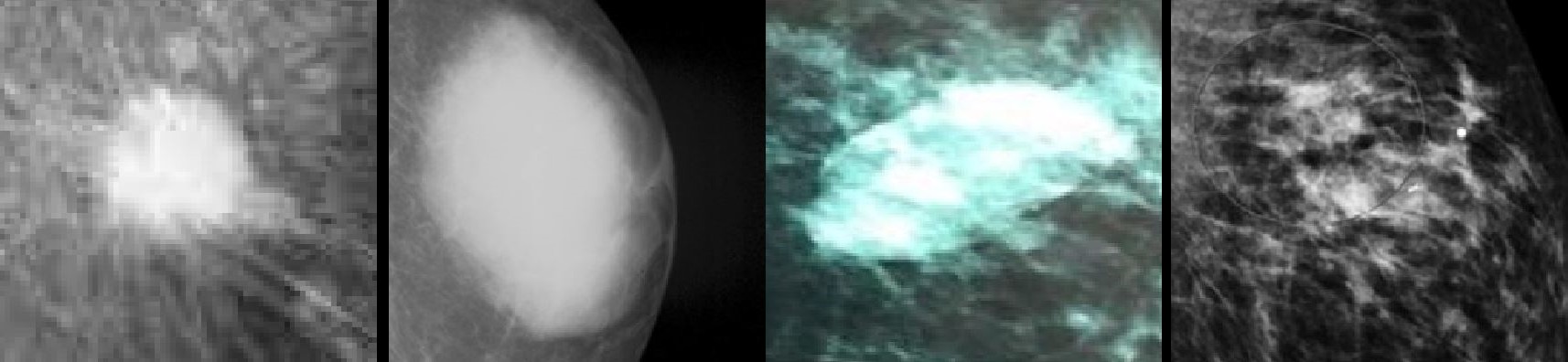
The four common descriptors in diagnostic imaging (left to right), the round, the oval the ovoidesque irregular oval and the irregular.
Reflecting the frequency with which they occur, in radiology and other forms of diagnostic imaging, the three classic shapes of “masses of interest” are round, oval and irregular but a frequent descriptor of those which often resemble ovoids is the “irregular oval” used (a little misleadingly for non-clinicians) to describe everything which tends towards being an oval but is outside the defined tolerance. The rationale in adding an adjectival “irregular” to “oval” seems to be to reflect the wide variation in the shapes, the only common characteristic being that to fit the description it must be vaguely ovoid in shape, distinguishing it not only from a round or oval but also from an irregular (ie everything else).
Headlights and Lobbyists

Mercedes-Benz 300 SL (W198, 1957-1963) roadster with composite headlights built for RoW (rest of the world (ie non US)) sale (left) and one with the less elegant assembly (right) used in the US market to accommodate the sealed-beam lights.

That is how politics in the US operates: it’s in the congresses, state and federal, where things are hammered out and deals done. Most of the world fixates on presidential politics because of the drama and the cults of personality but domestically, it’s in the legislatures that lobbyists do their work and that’s where they make "campaign contributions" in exchange for getting the legislation which most benefits the corporations employing them. “The business of America is business” is how former president Calvin Coolidge (1872–1933; US president 1923-1929) summed it up. It’s not wholly dissimilar to the development of the English constitution; it took centuries to evolve but essentially, in exchange for getting the money he needed to fight his wars, the king of England approved the laws the politicians wished to pass. In the US, the dynamic relationship is between politicians & corporations, mediated by the lobbyists and between the two sides, there's much interchanging of personnel which is why the system is sometimes described by political scientists as "incestuous". The dynamic of the system does of course shift; sometimes the congress has dominated the president and sometimes he has dominated them so in that sense the second administration of Donald Trump (b 1946; US president 2017-2021 and since 2025) is just a phase the system is going through.

1957 Imperial Crown Convertible in single headlight configuration (left) and 1957 Imperial Crown Sedan with the quad layout (right).
One quirk of the introduction of the quad headlight look for the 1957 season was the languid legislators in South Dakota and Tennessee lingered so long over the bills that it was clear it would be the next year before four headlights would be lawful in those two states. What that meant was new cars could be registered if so equipped so the manufactures were, for a few months, forced to make available models with two headlights instead of four. Some restricted these to the two recalcitrant states while others extended availability but very few were ordered in other states. What the late creation of the variations with only two headlights required was the creation of different chrome bezels and fittings around each lamp as well as a wider grill. So while it wasn’t complex engineering, for the industry it was an unwelcome resource allocation, all because of bureaucratic lag or politicians missing their legislative window (the blame attributed variously).

1957 Imperial (left) and Mercury (right) advertising.
As well as the tiresome matter of having to tool up to produce a small number of cars with single headlights grafted, sometimes a little unhappily, onto designs only ever intended to accommodate a matching pair, the advertising copy also had to be revised. Mercury called the new look “Quadri-Beam headlamps” and their brochures (in the small print) noted they were “Standard equipment except in South Dakota and Tennessee.” The use of “quadri” was a pleasing linguistic flourish and presumably everyone got the point there were now four where there once had been two, the borrowing most directly from the Classical Latin quadri where it meant “make four-cornered, square, make square” and was from quadrus (square), from quattuor (four). In French, the noun quadri (the plural quadris) was an (informal clipping of quadrimestre (a term of four months) while in Italian it was the plural of quadro (square).

Unfortunately, US regulations proved disfiguring as well as dimming because the simple solution of integrating the turn-signal indicators ("flashers" to many) and side-marker lamps into the assembly didn’t comply. As explained by automotive lighting expert Daniel Stern, the lit area was probably compliant (the rules specified a minimum 3½ square inches (22.5 cm2) but the intensity and inboard visibility angles would have been inadequate. A turn signal with its centre 4 inches (100 mm) or closer to the low-beam lamp had to provide at least 500 candela on-axis, which, with the technology then available, would be close to impossible for a lamp with this construction; turn signals more than 4 inches from the low-beam needed only to provide a minimum 200 candela. The RoW cars (left) were supplied with the original elegant design while for the US market some rather ugly after-market lamps were crudely added to the gaps next to the grill (centre). Late in the 1960s, the aesthetics were improved somewhat by using a larger unit (right) which emulated the look of a fog-lamp, the US cars by then also suffering the addition of "stuck-on" side-marker lights front & rear.

A variation on the ovoid theme was revealed with the debut of the 600 Grosser (W100, 1963-1981, left). The solution to comply with US legislation (right) was more unhappy even that that used on the 300 SL and called to mind a high-school project which deservedly would have been graded "F".
The design created for the US market W111s adopted a vertically stacked arrangement with four 5¾ inch sealed beams which, ironically, was much to influence US designers in the decade to come. When the 300 SEL 6.3 was introduced in 1967, Europeans were offered the choice of either style, four of the newer quartz-halogen bulbs generating even more light than the ovoid system. Europeans, who nicknamed the stacked lights “Californian” (California apparently the most American thing imaginable), came to admire the style, prompting Mercedes-Benz to offer buyers the option world-wide. Unfortunately, this was the factory's only ascetically successful adaption for the US market, most of the others being ghastly. In the mid-1960s, the factory again used “California” when the W113 (the 230/250/280 SL "pagoda" (1963-1971)) was for some years offered with just a hard-top, presumably because, viewed from often gloomy Stuttgart, California must have seemed permanently sunny. The W111’s stacked headlamps later spread to other models (W112, W108 & W109) but the W113 hard-top only configuration remained a one-off. It was one of only three occasions a production SL would be offered without a folding top and one of two with only a fixed roof.

The score? 1 out of 8. Top row: W198 Roadster (1957-1963, left) and W111 & W112 Coupé & Cabriolet (1961-1971, right). Second row: W100 (1963-1981, left) and W113 (1963-1971, right). Third row: W114 & W115 (1968-1976, left) and R107 & C107 (1971-1989, right). Fourth row: W116 (1972-1980) and W123 (1975-1986).
One genuine aesthetic success in eight attempts was not encouraging and one might be tempted to wonder if the Germans decided to punish the Americans for coming up with silly rules. The battering-ram styled bumpers bolted on in the era also attracted derision but in fairness, some others were worse. Interestingly, as well as admiring the US market implementation on the W111 & W112, there is in Europe a small but noticeable cult following for the headlight fittings used on the US market R107 & C107, possibly because the factory competition department fitted them to the 450 SLC 5.0s (1977-1980) used in rallies. The heavy cruiser was one of the more improbable rally cars but it enjoyed some success in its brief career, victorious in long distance events in Africa and it was both the first V8 and the first car with an automatic transmission to win a European rally. However, whatever the attraction of the headlights, the Europeans have shown no interest in the bumpers.