Protuberant (pronounced proh-too-ber-uhnt, proh-tyoo-ber-uhnt, or pruh-too-ber-uhnt)
Bulging out beyond the surrounding surface; protruding;
projecting; swelling from the surrounding surface; bulging.
1640–1650: From the sixteenth century French protubérant (prominent beyond the
surrounding surface), from the Late Latin protuberantem
(nominative protuberans), present
participle of prōtūberāre (to swell,
bulge, grow forth), the construct being pro-
(forward) + tuber (lump, swelling)
from the primitive Indo-European root teue- (to swell). The most common form in the Late Latin was prōtūberāre (to swell). The verb protuberate (bulge out, swell beyond
the adjacent surface) dates from the 1570s, from Late Latin protuberatus, past participle of prōtūberāre. Protuberant is an adjective, protuberate is a
verb, protuberance & protuberancy are nouns and protuberantly is an adverb.

In Australia, the Department of
Prime-Minister & Cabinet (PM&C) recently released a new logo for the “Women’s
Network”. To the left of the construct
was a cursive "W", the right stroke (the vertical diagonal line in a letter)
adorned with a swash (a fancy or decorative replacement for a terminal or serif
in an upper-case capital letter (although if the w is lower case (it’s hard to
tell) this would be a flourish). To the
right was a capsular (technically a geometric stadium) protuberance which had
been bitten into by the stylized W. The
logo’s graphical elements were rendered in a darkish purple which lightened to
the right, the text below in two different sans serif fonts, one line in black,
the other grey. The design and placement
of the text, though not obviously thoughtful, did at least add meaning to the graphic
which might otherwise have been thought something to do with aubergines
(eggplant).

The logo proved to have a short life, withdrawn from circulation in response to complaints it resembled male genitalia; on Twitter, #logonono quickly trended. Almost immediately the furor erupted, PM&C issued a statement saying the logo had been “removed” from its website “pending consultation with staff”. Noting the phallic creation was part of a rebrand of staff diversity networks “to establish a consistent look and feel” between the logos used for various groups, PM&C added “the Women’s Network logo retained a ‘W’ icon which staff had been using for a number of years” which seemed an unnecessary clarification given nobody had objected to the W. Anxious to assure the country that whatever controversy might have been induced by the purple protuberance, PM&C announced the “…rebrand was completed internally, using existing resources, and designs were consulted on widely. No external providers were engaged for this work… (and that) the prime minister and the prime minister’s office were not part of this logo design.”

Graphic designers do seem sometimes unaware of the levels of anatomical comparison their work offers.

The attitude of critics was exemplified by the National
Older Women’s Network, which issued a statement describing the logo as “either thoughtless or an insult”
although as a re-branding exercise, the project had to be labeled a success,
most of the country now aware of the existence of the Women’s Network, a
mysterious body previously familiar probably only to a few dozen. A discussion of what it does or whether it
fulfils any useful purpose wasn’t stimulated by the outcry over the offending logo so whatever the Women’s Network was doing before, it presumably
continues to do. One thing it achieved
was to flush out the competition; it seems there are in the country a number of
organizations with "Women's Network" in their title.

Perhaps the men involved in the “Women’s Network” design didn’t notice the shape of the protuberance because they were focused on the color, anxious to avoid what might once have been the obvious choice: pink. That would of course have been condescending and gender-stereotyping so PM&C deserve some praise for this mater in which they weren’t involved. Pink stuff for products aimed at the female market may be less of a thing than once it was but pink stuff aimed at men wanting a gift with a difference for women seems more of a thing than ever, pink tool kits popular gifts with sales spiking reliably in the run up to Valentine’s Day. It works for novelties like hammers and screwdrivers but doesn’t have a good record as a marketing device writ large, failure exemplified by the Dodge La Femme.

Chrysler show cars, 1954. Chrysler Le Comte (his, top) & Chrysler La Comtesse (hers, bottom).
Chrysler offered the La Femme package in 1955 and 1956 on
certain Dodge models, a creation that was not a stylistic whim but a response
to sociological changes in an unexpectedly affluent post-war US society in
which women were found to be exerting a greater influence on the allocation of
their family’s rising disposable income and of most interest to Chrysler was
that those increasingly suburban families were buying second cars, women
getting their own. Adventurous color
schemes were nothing new to Detroit, the cars of the art deco era noted for
their combinations but things had been more subdued in the years immediately
after the Second World War. That changed
with the exuberance of 1950s experimentation, reflected in the colors of the La
Femme concept which had been previewed in two of the cars Chrysler displayed
during the 1954 show season. The Le
Comte & La Comtesse attracted most attention for their clear Perspex roofs
(a craze at the time which didn’t last long as buyers found themselves slowly being
cooked) but, following the grammatical conventions of their French definite
articles, they were very much a “his & hers” brace, the darker (black & bronze) Le Comte with
a “masculine” image and the La Comtesse, painted in "Dusty Rose" & "Pigeon Grey", a softer and more “feminine”
look.
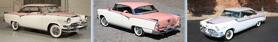
Dodge La Femme (1955-1956).
The public and critical response was sufficiently positive to encourage production and for the 1955 model year, the La Femme option was offered on the Dodge Custom Royal Lancer two-door hardtop, finished in a two-tone combination of "Heather Rose".(a shade of pink) & "Sapphire White", highlighted with gold-colored "La Femme" badges in a display script. If the exterior was (almost) subdued, the interior, a sea of pink, was femininity laid on with a trowel. Trimmed in a tapestry fabric unique to the La Femme which wove pink rosebuds on a silver-pink background with pastel-pink vinyl, confronting those who sat there was a dashboard painted in a bright-pink lacquer.

Dodge La Femme (1955-1956).
In a marketing ploy which turned out to be years ahead of
its time, the La Femme also came with coordinated accessories, the centrepiece
a pink calfskin handbag that fitted neatly into a storage compartment built
into the back of the passenger’s seat, the shape of which included a scallop
which meant the handbag’s escutcheon plate was visible, Dodge’s press-kits
noting the brushed-metal was designed to permit the owner’s name to be
engraved. The handbag contained a compact,
lipstick case, cigarette case, comb, cigarette lighter, and change purse, all
made variously with faux-tortoiseshell or pink calfskin, both combined with anodized
gold-tone metal. In a matching compartment
on the back of the driver’s seat was a matching compartment holding rain coat, rain-cap
and an umbrella, all made with a vinyl patterned to match the rosebud interior
fabric. The design and production was by
Evans of Chicago, a furrier and maker of fine accessories, famous for the
display of "Black Diamond" mink coats in their flagship store at 36 South
State Street. Evans would later fall
victim to the anti-fur movement which would lay waste to the industry.

Accessories by Evans of Chicago.
In toned-down form, the La Femme option re-appeared in 1956. The external color combination was changed to a "Misty Orchid" & "Regal Orchid" scheme and the interior finish was simplified, the previous year’s tapestry fabric proving difficult to produce in volume. The upholstery used a heavy white cloth with random patterns of short lavender and purple loops, matching the loop-pile carpeting and the accessories were fewer, restricted in 1956 to just the rain coat, rain cap and umbrella. Over the two season, fewer than 2500 buyers chose the US$143 option and it didn’t re-appear in 1957. Interestingly, (unverified) sources suggest at least three La Femme buyers chose the most powerful engine on the option list, Dodge’s D-500 (a 315 cubic inch (5.2 litre) V8 with hemi heads and a four-barrel carburetor); perhaps not all clung to 1950s gender stereotyping.


Other manufacturers did offer feminine-themed cars in a similar vein including the pink Pontiac Parisienne, Chevrolet Impala Martinique, and Cadillac Eldorado Seville Baroness but none enjoyed much more success than the La Femme. What in the US did prove a success with the female demographic was the new generation of more compact cars introduced in the early 1960s, women sensibly drawn to something smaller than the standard-size US automobile which after 1957 grew to an absurdly inefficient size. Much later, there would be innovations in car design which women found genuinely helpful such as a hook on which a handbag could hang while remaining conveniently accessible and headrests which comfortably accommodate ponytails.

Detecting the protuberance of pregnancy: Ali Lohan (b 1993, left) photographed with her pregnant sister (right) wearing Sandal-Malvina Fringe Tank Dress in (unattributed) Dodge Yorange (left). The shoes are Alexandre Birmen Clarita Platforms.


