Pontoon (pronounced pon-toon)
(1) In military use, a boat, boat-like device or some
other floating structure used as one of the supports for a temporary bridge (often
styled as “pontoon bridge) placed over a river, canal or similar waterway.
(2) A float for a derrick, landing stage etc.
(3) In nautical use, a float (often inflatable) for
raising a sunken or deeply laden vessel in the water; a camel or caisson.
(4) In aviation, a seaplane’s floats.
(5) In some places (1) an alternative name for the card
game blackjack (also as 21 or twenty-one, an alteration of the French ving-un (an obsolete variant of vingt-et-un (twenty-one)) and (2) in the
game, the combination of an ace with a ten or court card when dealt to a player
as his first two cards.
(6) In nautical freight & passenger handling, a lighter
or barge used for loading or unloading ships.
(7) In automotive design, a style in which the coachwork features
smooth, flowing curves extending from the front to the rear without
interruption.
1585–1595: From the Middle French ponton, from the fourteenth century Old French ponton (bridge, drawbridge, boat-bridge; flat-bottomed boat), from
the Latin pontōn-, from pontō (flat-bottomed boat, punt), from pōns (bridge); a pontōnem was a “ferryboat”. The use in some places to describe the card
game (an alteration of the French ving-un
(an obsolete variant of vingt-et-un (twenty-one)
dates from 1916 and entered English when French & British troops played the
game on the Western Front during World War I (1914-1918). In engineering, the pontoon bridge (a roadway
supported on pontoons) was described as early as 1778. Pontoon, pontooning & pontooneer are nouns
and pontooned is an adjective & verb; the noun plural is pontoons.

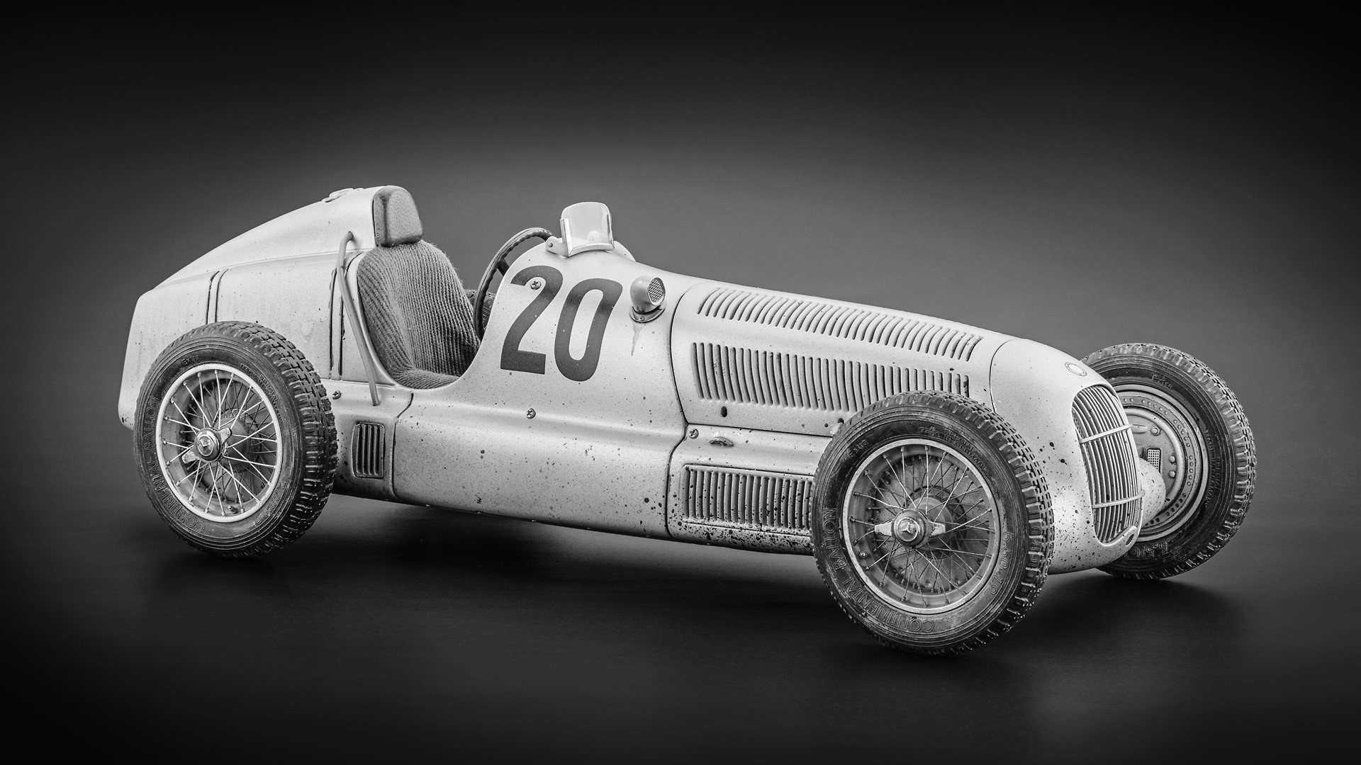
Bugatti T32s at the French Grand Prix, Tours, 1923.
Attracted by gains to be realized in aerodynamic efficiency,
in 1923 Bugatti fabricated four T32 race cars to compete in that year’s French Grand
Prix using the pontoon principle. Bodied
in aluminum, the stubby little machines were nicknamed “the Tanks” and there’s
certainly a resemblance to the lines of the World War I tanks but, designed
without the use of a wind-tunnel, the aviation influenced airfoil shape chosen
to increase top speed also possessed that other quality need by aircraft: lift. The combination of speed and lift was of
course a recipe for instability and the T32s showed a marked inclination to
leave the track. Despite this discouraging
start, the pontoon approach would ultimately prevail but for decades, instances
of aerodynamically-induced instability would plague the tracks, the death toll
not small.

Small & large: 1926 Hanomag 2/10 PS Coupé (Kommissbrot) (left) & 1933 Volvo Venus Bilo (right). The larger the pontoon, the more slab-sided the tendency.
In automotive design, term "pontoon" was used
to a style in which the coachwork features smooth, flowing curves extending
from the front to the rear without interruption. The use of the word alluded to the nautical
term used to describe a floatation device attached to the sides of a boat or
ship to provide stability. The
objectives of the early adopters of the motif included (1) aerodynamic
efficiency, (2) a reduction in the number of components needed to form a body,
(3) enhanced efficiency through the allocation of more usable internal space and
(4) a sleek and streamlined appearance.
It took decades of experimentation and there were a number of notable
failures in just about every aspect of the pursuit of those objectives but,
beginning in the 1920s, literally dozens of recognizably pontoon-like forms entered
production, some sold by the thousand but it’s notable the most successful
ventures were those which involved smaller (sometimes on the scale which would
later be called micro-cars) vehicles. On
those, the styling tended to be less jarring to the aesthetic sensibilities of
those who would actually pay for the things; on the larger machines, the most
commonly applied epithet was “slab-sided”.

The pontoon would prevail but in one little corner of England, the 1930s lasted until 1968. Remarkably, when the NSU Ro80 (left) was released in 1967, the Vanden Plas Limousine (right, complete with a divided windscreen made of two flat panes) was on-sale in a showroom in the same street.
Still, as the 1930s unfolded, the trend was certainly
gaining strength and had it not been for the blast of war, things might have
evolved much as they did although like many of the aspects of science and engineering
which benefited from the extraordinary progress realized during those years, the
evolution at the very least would probably have taken much longer. As it happened, in the late 1940s as the
first generation of post-war vehicles was released in the US, the pontoon motif
was almost universal, only some vestigial traces of the old, separated ways
remaining to reassure. In Europe, some
clung longer to the old ways and in the UK, even by the late 1960s there were
still traditionalists finding a tiny market still existed for the old ways bit
but mostly, during the previous decade the pontoon had taken its place as one
of the symbols of mid century modernism.

Bridge on the road to the pontoon: 1948 Mercedes-Benz 170 (left) & 1951 Mercedes-Benz 220 (right).
One range was so definitively pontoonish that it even
picked up the nickname “pontoon”. Daimler-Benz
emerged from World War II not so much diminished as almost destroyed and in
1945 the board of directors felt compelled to issue a statement declaring “Daimler-Benz
had ceased to exist in 1945” although that proved pessimistic, a modest
programme of repair and maintenance soon established and the next year, small
scale production resumed of the pre-war 170V although circumstances were
challenging and in two years barely 600 left the improvised assembly line. However, the currency reform and economic
stabilization of 1948 transformed things and marked the birth of the post-war Wirtschaftswunder
(economic miracle) and the 170 range, so appropriate to the austere times was
soon augmented and then replaced by more advanced models but the pre-war
styling was carried over substantially unchanged.

The Mercedes-Benz Pontoons: 1953 180 (left), 1956 219 (centre) and 1959 220 SE cabriolet (right).

It was however
obvious that the approach was antiquated and in 1951 work was begun on a new
range of mass-produced four-door sedans which abandoned the old separate
chassis for a unibody. This was the car
which came to be called the pontoon and the first version was released in 1953
as the 180, fitted with 1.8 litre (110 cubic inch) four-cylinder engine in both
petrol & diesel forms. Stylistically,
it was among the simplest, least adorned interpretations of the pontoon idea
and has been compared both to “three boxes” and “on loaf of bread atop another”
and among mainstream vehicles, probably only the contemporary British Fords
(the Mark Consul, Zephyr & Zodiac (the so called “three graces”)) enjoyed
the same austerity of line. The pontoon
though looked undeniably modern compared with its predecessors and it was a
success, soon augmented by the longer 220 fitted with the 2.2 litre (134 cubic
inch) straight-six with which more than any other the company rebuilt its
reputation. As the Wirtschaftswunder gathered
pace, demand emerged for something more exclusive and a 220 coupé and cabriolet
were added although, very expensive, production didn’t reach far into four
figures. More popular was the blend of
the six cylinder engine with the short body of the 180, the engineering of which
was simple enough but finding the appropriate nomenclature must have required
some discussion and, given the way thing were then done by Germans, presumably reached
board level for approval. The solution
was to call it the 219 which was a unique departure from the factory’s naming
conventions and the only time in recent history the base three-digit model
designation has ended in other than a 0 (zero).
Model proliferation would follow and the problem would reoccur and in
later years another convention was adopted which lead to a confusing alpha-numeric
soup (190 E 2.6, 300 E 2.8 etc so under that regime the 219 would have become
the 180 2.2) until in the early 1990s the whole system was re-organized. The pontoon line lasted until 1963 although
by then it looked a relic and had been cut to a few lower-cost utilitarian models. The pontoons were really the last memory of
the austere years before the exuberance of the 1960s affected even
Daimler-Benz.

OSI Silver Fox. Race car designers had before tried the twin-pontoon idea without great success but in 1967, attracted by the uniquely achievable aerodynamic advantages offered by what was essentially a “wing with wheels”, OSI built the Silver Fox for the Le Mans 24 Hour endurance race. Financial difficulties doomed that project and the potential of concept was undermined when the Fédération Internationale de l'Automobile (the FIA; the International Automobile Federation (and international sports dopiest regulatory body)) banned “movable aerodynamic aids”).